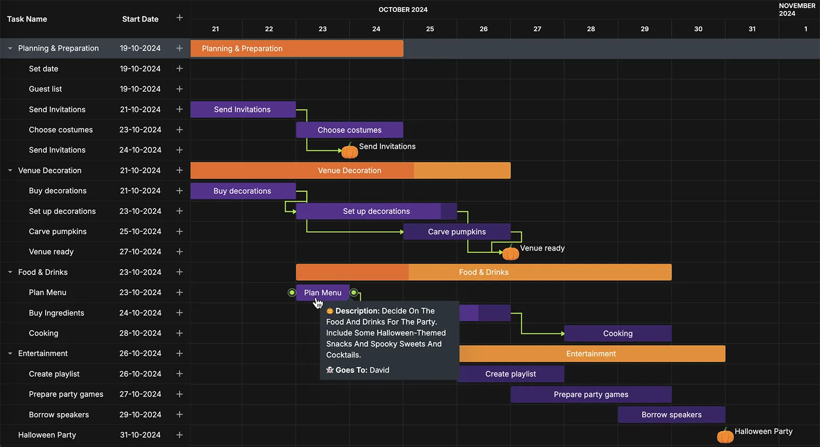
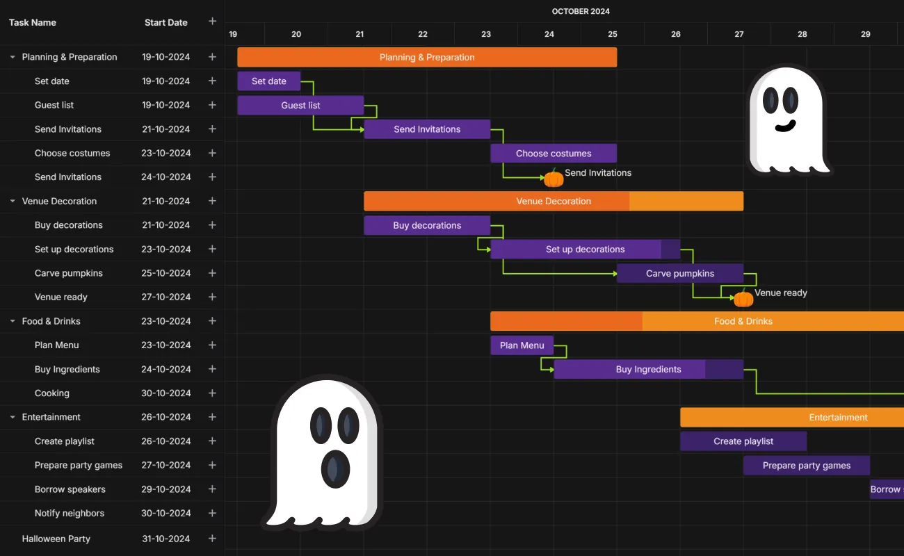
As Halloween draws near, our daily routines take on a bit of mystery, and even project management could use a hint of the eerie spirit of the season. Imagine managing your pre Halloween party tasks on a Gantt chart that feels like stepping into a haunted house — where each deadline is a lurking shadow and each milestone a point of light through the fog. Are you excited? Let’s make a dream come true!
In this tutorial, we’ll walk you through creating a Halloween-inspired task manager using our lightweight, open-source Svelte Gantt Chart. Our goal is to help you to create and stylise a task management tool with a spooky twist, adding both flair and functionality to planning your projects, be they big or small.
While we’re using this fun theme for this demo, the same principles can be applied to create professional project management solutions in your Svelte apps.

Online Demo: see the Halloween-styled Gantt chart demo
Demo Package: download the demo package
Get Started Guide: see the docs
Prerequisites: Svelte framework and a Vite-based toolchain.
Including Sources
We start from installing SVAR Gantt Chart source files as described here. For npm it will be as follows:
npm install wx-svelte-gantt⚠️ UPD: Starting from version 2.3 SVAR Svelte Gantt has been moved to @svar-ui namespace and should be installed as follows:
npm install @svar-ui/svelte-ganttAdding Gantt Chart on a Page
Import SVAR Gantt and the desired theme. The task manager comes with the light and dark skins: Willow and WillowDark. In our tutorial we are going to use the dark one. After all, it’s Halloween, right?
Gantt.svelte
<script> import { Gantt, WillowDark } from "wx-svelte-gantt";</script>Add the Gantt on page and define a theme for it:
Gantt.svelte
<WillowDark> <Gantt /></WillowDark>Filling Gantt Chart with Initial Data
To bring our Halloween task manager to life, we need to provide the initial data for tasks and their links that form the project’s structure at the initialization stage. Tasks represent key activities, while links define the dependencies between them.
data.js
export const tasks = [    {        id: 11,        start: new Date(2024, 9, 19),        end: new Date(2024, 9, 20),        text: "Set date",        progress: 100,        parent: 1,        type: "task",        details:            "Finalize the date and time for the Halloween party. Make sure it suits everyone's availability",        to: 1    },    // ... Other task data];
export const links = [    {        id: 1,        source: 11,        target: 13,        type: "e2s"    },    // ... Other link data];
Since we keep our data on client side in a separate file, we need to import them from the file and pass the corresponding data items to the Gantt constructor as props:
Gantt.svelte
<script>    import {        Gantt,        WillowDark    } from "wx-svelte-gantt";
    // Import predefined data from a separate file    import { tasks, links } from "./data/data";</script>

<WillowDark>    <Gantt {tasks} {links} /></WillowDark>
For more information about preparing and loading data, refer to the following documentation section: Loading data.
Making Task Tree More Compact
The Gantt widget includes a left-hand panel that displays a task tree, providing users with an overview of project details. By default, this tree features four columns: Task Name, Start Date, Duration, and Action. While this layout provides detailed insights, it can also take up extra screen space, which is especially valuable in busy project views.
To create a more streamlined interface, we can adjust the task tree structure using the columns property. If we exclude the default Duration column, we can free up space on the screen, allowing for a cleaner view that keeps the focus on the most critical information.
<script>    import {        Gantt,        WillowDark    } from "wx-svelte-gantt";
    // Import predefined data from a separate file    import { tasks, links } from "./data/data";
    // Define the new structure of the Task Tree    const columns = [        { id: "text", header: "Task name", width: 210 },        {            id: "start",            header: "Start date",            width: 106,            align: "center"        },        { id: "action", header: "", width: 40, align: "center" }    ];</script>
<WillowDark>    <Gantt {tasks} {links} {columns} /></WillowDark>
Adding Custom Editor
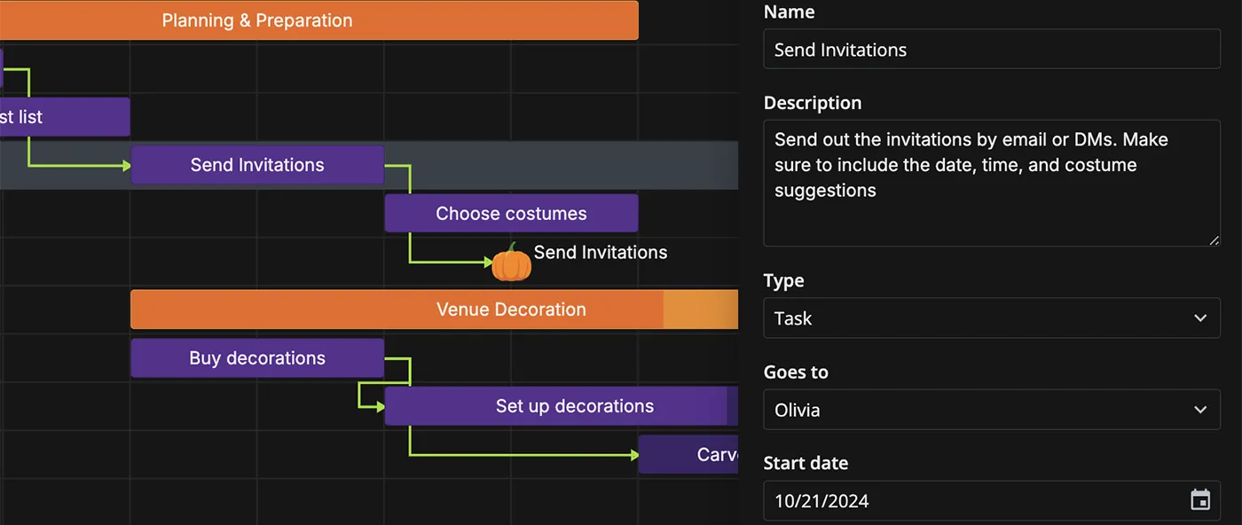
The default editor of the Gantt chart provides a straightforward way for users to edit tasks and save changes directly on the chart. However, for our Halloween-themed project tracker, we’ll enhance the standard editor by adding a custom field to assign responsibilities to each task.

Gantt.svelte
<script>    import {        Gantt,        WillowDark,        defaultEditorShape, // Import the default settings of the Gantt editor    } from "wx-svelte-gantt";
    // Import data for USERS that can be assigned on the corresponding tasks    import { tasks, links, users } from "./data/data";
    // ...
    // Reshape the default editor settings to exclude unnecessary fields    const editorShape = defaultEditorShape.filter(op => op.key != "duration");
    // Add a custom field to assign the responsible user    editorShape.splice(3, 0, {        key: "to",        type: "select",        label: "Goes to",        options: users,        config: { placeholder: "Select the person" }    });</script>
<WillowDark>    <Gantt {tasks} {links} {columns} {editorShape} /></WillowDark>
For more information about configuring the task editor, refer to the following documentation section: Configuring the editor.
Adding Custom Context Menu
The Gantt widget includes a default context menu packed with a wide range of options for managing tasks: editing, deleting, creating subtasks, and much more. While this full menu offers extensive functionality, our Halloween Gantt app requires a more compact, streamlined set of options to keep the interface clean and focused.

Let’s customize the default context menu and select only the essential options that suit our app’s needs.
Gantt.svelte
<script>    import {        Gantt,        WillowDark,        ContextMenu, // Import the built-in context menu        defaultMenuOptions, // Import default menu options        // Import other configurations    } from "wx-svelte-gantt";
    // Import predefined data from a separate file    import { tasks, links, users } from "./data/data";
    // ...
    // Initialize the key to bind the context menu to the Gantt api    let api;
    // Specify a set of available options within a custom context menu    const ids = ["add-task", "edit-task", "delete-task", "move-task"];
    // Reshape the default menu options considering the custom options    const options = defaultMenuOptions.filter(op => ids.indexOf(op.id) >= 0);</script>
<WillowDark>    <ContextMenu {api} {options}>        <Gantt {tasks} {links} {columns} {editorShape} bind:api/>    </ContextMenu></WillowDark>
Please note, that to activate the context menu features, you need to access Gantt API and pass the bound API to the <ContextMenu {api}></ContextMenu> constructor. In this case we use the bind directive.
For more information on how to configure the context menu, refer to the following documentation section: Configuring the context menu.
Adding Custom Tooltip
By default, the SVAR Gantt chart doesn’t show tooltips. But we can easily activate this feature. All we just need is to import the Tooltip constructor and wrap our

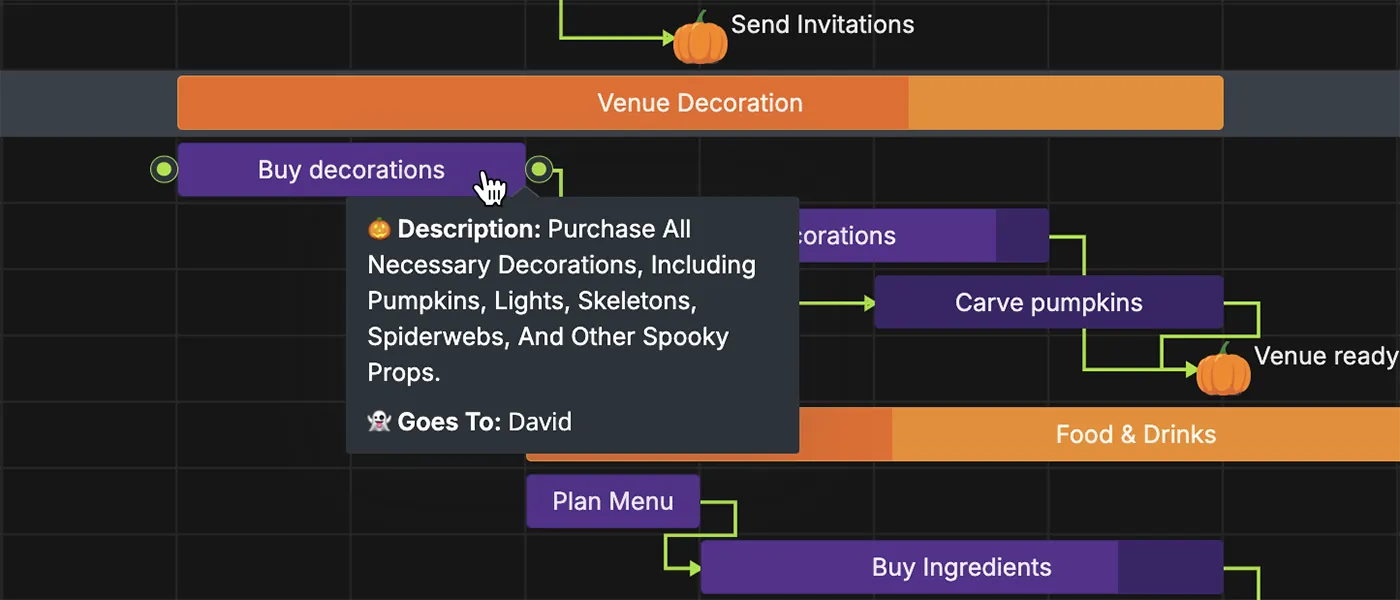
This simple setup will allow users to hover the pointer over a task or project and see a tooltip with the task’s info.
Gantt.svelte
<script>    import {        Gantt,        WillowDark,        Tooltip, // Import the built-in tooltip        // Import other configurations    } from "wx-svelte-gantt";
    // ...
    // Initialize the key to bind the context menu and tooltip to the Gantt api    let api;</script>

<WillowDark>    <ContextMenu {api} {options}>        <Tooltip {api}>            <Gantt {tasks} {links} {columns} {editorShape} bind:api/>        </Tooltip>    </ContextMenu></WillowDark>
For our Halloween-themed app, though, a simple title won’t capture the full story. To make task details more accessible and engaging, we’ll create a custom tooltip that displays the task description and assigned user.
First of all, we need to create a custom template for a tooltip. For convenience, we can put it in a separate file.
CustomTooltip.svelte
<script>    import { users } from "../data/data"; // Import data for USERS to be displayed in a tooltip    export let data;    $: ({ to, details } = data);</script>

{#if to || details}    <div class="data">        {#if details} // Create a view for details (if exist)            <div class="text">                <span class="caption">🎃 Description:</span>                <span class="details">                    {details}                </span>            </div>        {/if}        {#if to} // Create a view for assignee (if exists)            <div class="text">                <span class="caption">👻 Goes to:</span>                {users.find(u => u.id == to)?.label}            </div>        {/if}    </div>{/if}
After the tooltip template is ready, we can import and apply it via the Tooltip content property.
Gantt.svelte
// ... <Tooltip {api} content={CustomTooltip}> <Gantt {tasks} {links} {columns} {editorShape} bind:api/> </Tooltip>// ...For more information about configuring tooltips, refer to the following documentation section: Adding tooltips.
Tuning Look and Feel
When initializing the project, we applied the WillowDark skin, which provides a clean and elegant design. However, to truly capture the essence of Halloween, we need to go beyond the basics and incorporate custom styles that resonate with the season’s spirit.
To change the default theme settings, we can create a separate CSS class, change values of the required CSS variables and apply it to our Halloween Gantt app.
<script>// ...</script>
<WillowDark>    <div class="content">        <ContextMenu {api}>            <Tooltip {api} content={CustomTooltip}>                <Gantt {tasks} {links} {columns} {editorShape} bind:api/>            </Tooltip>        </ContextMenu>    </div></WillowDark>
<style>    .content {        --wx-background: #161616;        --wx-color-primary: #3c2369;        --wx-color-danger: #eb691f;        /* Other styles */    }    .content :global(.wx-bar.wx-milestone .wx-content) {        background-color: transparent;        transform: rotate(0deg) scale(1);        background: url("./pumpkin.svg") no-repeat center / cover;    }    /* Other styles */</style>
You can find the complete list of rules in the related demo.
Conclusion
As you can see, creating a Svelte task manager is as easy as pumpkin pie if you are using the SVAR Gantt Chart. Of course, you still will need to build client-server relationships for CRUD operations but the frontend Svelte part is explained above.
We invite you to try our open-source SVAR Svelte Gantt Chart and share your feedback by email or on our community forum. We’ll be happy to hear from you!


