
SVAR Core — Svelte UI Library
30+ lightweight Svelte UI components for common web app needs. Built for performance, easy to integrate, open-source. Now with full TypeScript support!
Also available for:


30+ lightweight Svelte UI components for common web app needs. Built for performance, easy to integrate, open-source. Now with full TypeScript support!
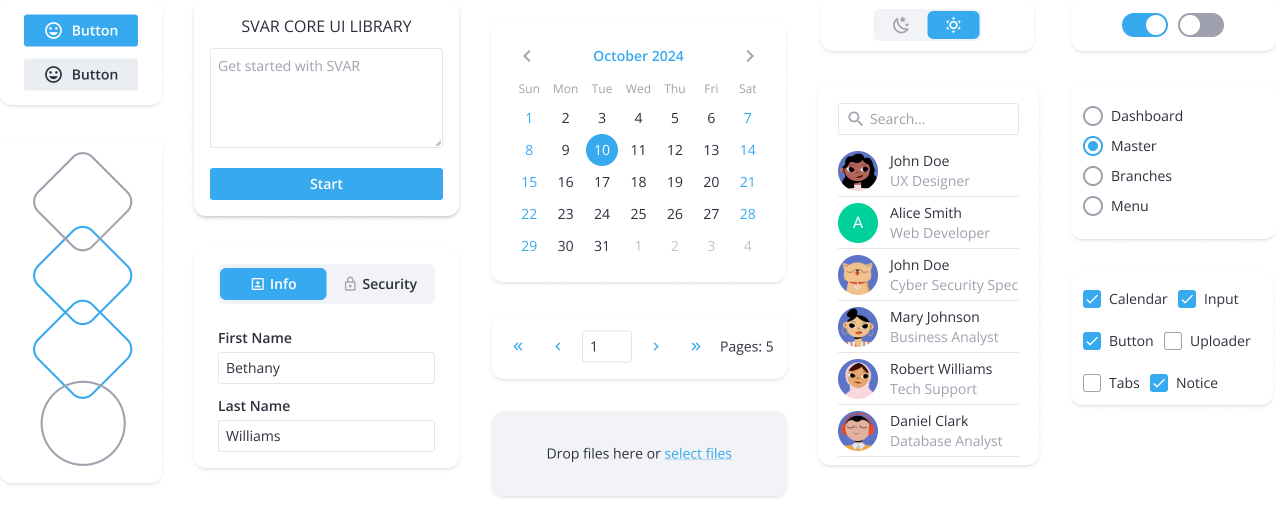
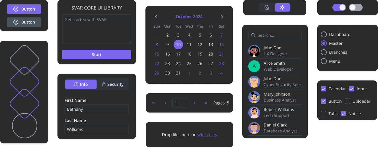
SVAR Svelte Core offers UI components that are ready-to-use and designed to create fast, responsive and visually appealing apps. See what's inside the pack:
Core
SVAR Svelte Core library includes form controls and UI elements for basic app needs: combo, select, date picker, tabs, popups, messages, and more.
Menu
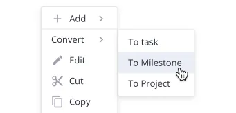
A lightweight Svelte menu component for adding dropdown, navigation, action or context menus. Easily customize menu options: text, icons, sub-items, and menu position.
Toolbar
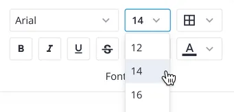
A Toolbar component that allows you to create button and icon panels with multiline toolbars, collapsed icon groups, and wrapping options to move icons to the next line.
Comments
A neat and simple Svelte comments section that displays comments in bubbles or flow views, supports paging, and handles markdown content.

Tasklist
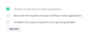
A Svelte UI component that enables you to add a simple Svelte to-do list, with the ability to add, edit, delete tasks, and mark them as completed.


SVAR offers an AI integration kit — an MCP server, skills, and context packs — to help your coding agent write correct SVAR Svelte Core code on the first try.
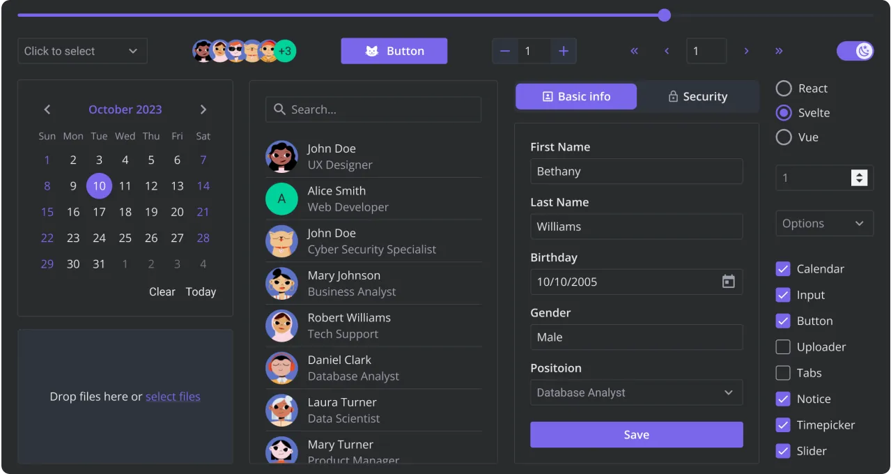
This demo is built with the SVAR Core library. Explore how the components look in light and dark themes, and interact with various UI elements like buttons, checkboxes, radio buttons, calendars, and more. For the best experience, view this page on a desktop device to enjoy the live demo, as it looks great on larger screens!
Need custom features or integration help? Our experienced team provides priority support, custom development, and consulting services.


