

When building an application that handles tasks, projects, or business processes, a Gantt chart is usually the default way to visualize project work. It provides a reliable framework for displaying and organizing projects with hundreds of tasks, complex dependencies, parallel workstreams, and tight resource constraints.
However, sometimes rendering an intricate schedule complete with milestones and dependency links can feel excessive for smaller or simpler projects.
If you are looking for the best way to visualize project data in your product, this article reviews the most common Gantt chart alternatives. It will help you choose the right approach for your tasks, schedules, or workflows.
Gantt Chart Alternatives for Project Management at a Glance
The best visualization tool depends entirely on what specific data the team needs to see. Some teams need to track strict work sequences, while others care entirely about daily workflows, exact calendar dates, high-level project phases, or the overall strategic picture.
Besides a Gantt chart, you have several other ways to structure project information on a screen. Here are some popular alternative visualization approaches:
- Timeline: Displays major project phases and key milestones along a chronological axis;
- Kanban board: Organizes tasks into columns based on their current stage in a defined process;
- Project calendar: Plots assignments on a traditional weekly or monthly grid for date-driven scheduling;
- Task list: Works as a simple, linear inventory of pending work;
- Network diagram: Maps the logical relationships and sequences between tasks without anchoring them to a rigid timeline;
- PERT chart: Analyzes the time required to complete individual tasks to determine the absolute minimum duration of a project;
- Flowchart: Illustrates the step-by-step progression and distinct decision points within a specific workflow;
- Sheet view / Grid view: Displays project data in columns and rows for fast editing and sorting.
These tools are more than a bunch of interchangeable variants of the same solution. Each of them answers a distinct question about the project lifecycle. They clarify the workflow, pinpoint when events happen, define the exact deliverables, structure the project hierarchy, or map out task dependencies.
Among these options, there are three key approaches that are particularly relevant when you need to choose a user interface component for a project management web application and don’t need a Gantt-level complexity. We’re talking about timeline, calendar, and Kanban board. Let’s examine how each one addresses specific user needs.
Timeline: When Chronology Is the Key
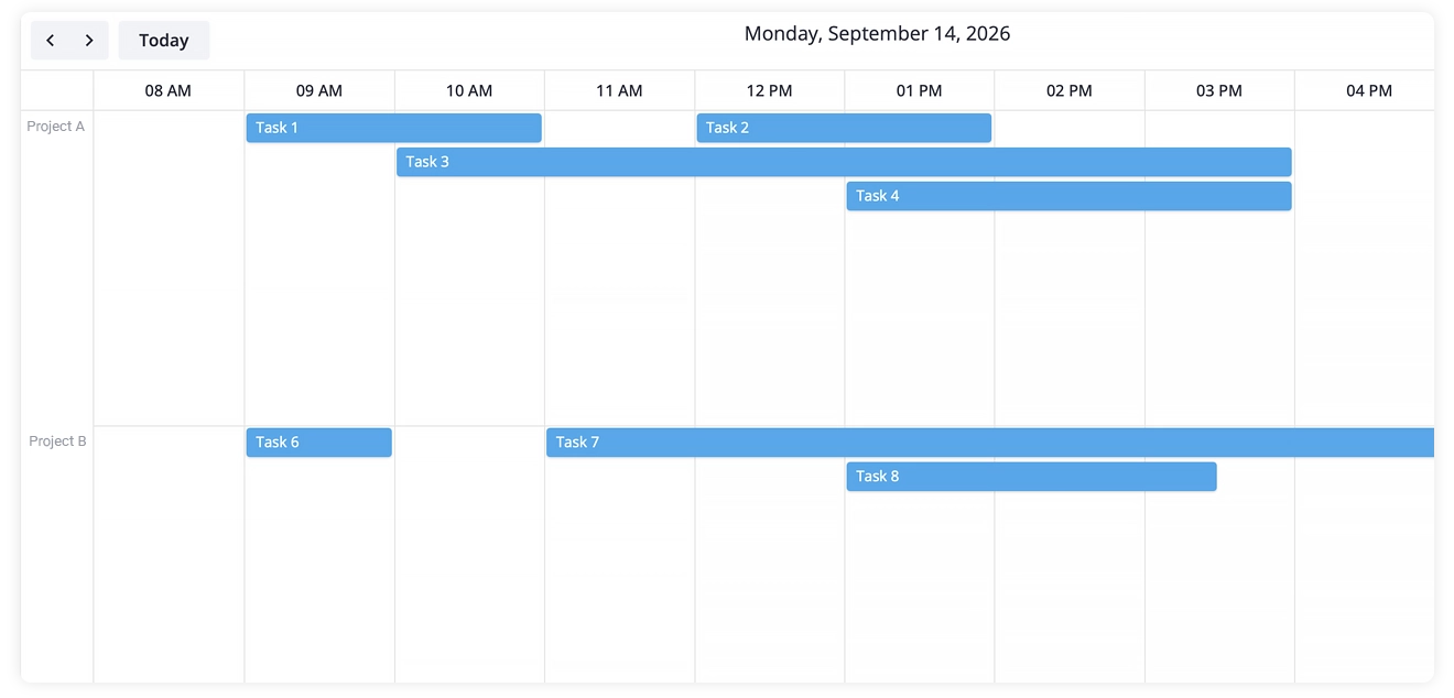
Similar to a Gantt setup, a timeline component works with a horizontal time scale, tracks task durations, and highlights project milestones. The primary distinction lies in the level of abstraction. Timelines provide a much higher-level representation of the work.
When to Use It
Timelines excel during executive presentations and roadmap planning. Stakeholders rarely need to see which specific developer is writing a database query on a Tuesday. They need to know when the beta phase ends and when the marketing push begins. Because the component does not execute heavy scheduling and task dependencies logic, it renders quickly and remains easy to configure when you only need to show major chronological milestones.
Timeline vs Gantt Chart: Key Differences
Unlike a Gantt chart, a timeline focuses strictly on the chronology of major events rather than detailed scheduling and task dependencies.
Calendar: When Dates Matter More than Dependencies
An event calendar or task scheduler fits perfectly into workflows where users naturally think in terms of specific calendar days. For many teams, project management sounds exactly like this: the design review happens on Monday, QA testing takes place on Tuesday, and the production release is scheduled for Friday.
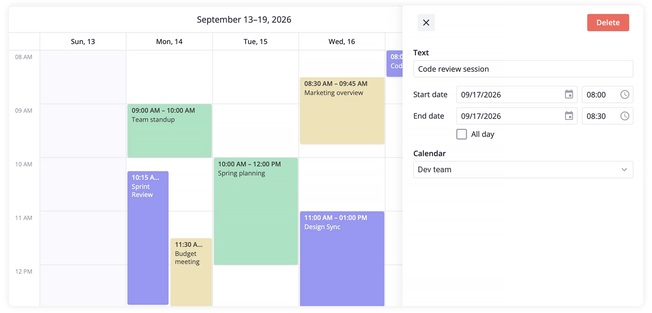
Calendar components typically offer standard display modes, including Day, Week, Month, Agenda, and specialized Resource views. With a Resource view, you can display tasks as individual events assigned directly to specific team members or workers. Calendars also natively handle recurring events, such as weekly team syncs, daily standups, or monthly maintenance windows.
From a usability perspective, a calendar interface has virtually zero learning curve. Users already know how to drag an event to a new time slot or switch between weekly and monthly grids, making onboarding effortless.
When to Use It
Calendars are the optimal choice for resource booking, editorial planning, and daily task management. They perform exceptionally well in domain-specific applications like hotel reservation, vehicle fleet management, room bookings, and doctor appointment systems.
Calendar vs Gantt Chart: Key Differences
A calendar focuses heavily on specific dates, recurring time slots, and distinct events, while a Gantt chart is engineered to display task durations, hard dependencies, and cascading schedule recalculations.
Kanban: When Status Matters More than Scheduling
Kanban is not merely a different type of chart. It operates as a complex, standalone component for project management systems. The primary organizing principle is no longer time. Instead, Kanban visualizes the specific path a task takes through a workflow: from “To Do” to “In Progress”, then to “Review”, and finally to “Done”.
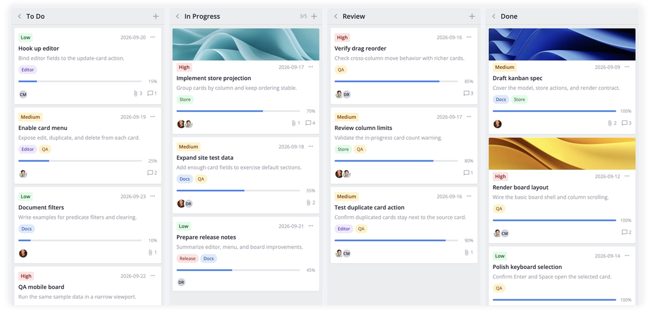
Kanban introduces a “pull” system rather than a “push” system. In a Gantt chart, tasks are pushed onto team members based on a predetermined timeline. In Kanban, team members pull work from a backlog only when they have actual capacity, often enforced by Work in Progress (WIP) limits on specific columns.
This setup makes Kanban ideal for ongoing, repeatable processes such as customer support queues, bug tracking, and content pipelines. Scrum teams use the same board mechanics: work is pulled through stages, just inside a time-boxed sprint.
When to Use It
Agile software development teams, support desks, and content marketing departments rely heavily on Kanban. It works best when teams pull work from a backlog at a steady pace and need to identify bottlenecks in the current process. If your main goal is seeing which tasks are stuck in code review or who currently owns an active ticket, Kanban provides that transparency faster than any timeline view. Strict delivery dates matter less than maintaining a smooth, continuous flow of completed work.
Kanban Board vs Gantt Chart: Key Differences
A Kanban board focuses heavily on workflow stages and current task status rather than anchoring work items to a continuous time scale.
When Is a Gantt Chart Actually the Right Choice?
You need a Gantt implementation when your users must view multiple schedule parameters as a single, unified system. More importantly, the users need to understand how all these different parameters influence each other.
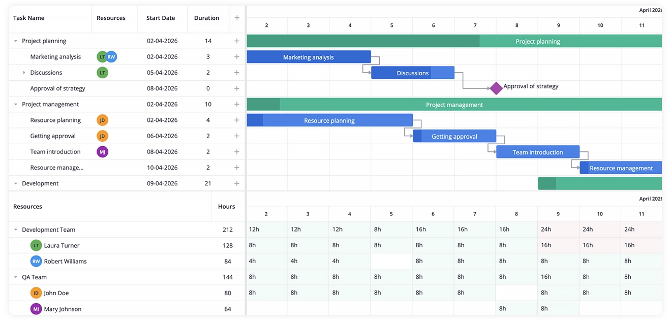
Several distinct scheduling elements require this level of complex visualization:
Concrete dates and task durations
Managers need to see exact start and end dates tied to project deadlines, as well as the total block of time each task consumes across a shared timeline.
Dependencies
Many tasks physically or logically cannot start or finish until prerequisite work is completed. In advanced Gantt engines this includes multiple link types (Finish‑to‑Start, Start‑to‑Start, Finish‑to‑Finish, Start‑to‑Finish) that drive automatic rescheduling across the whole plan.
Parallel activities
Large projects feature multiple workstreams running at the same time, and managers must track where these efforts intersect. Hierarchy and summary tasks of the Gantt chart let you group work by project or phase so parallel streams stay visible.
Milestones
The schedule contains critical checkpoints tied to major deliverables or project phases. Milestones make these dates obvious on the timeline and serve as anchors for status reporting and deadline tracking.
Progress tracking
Teams need a visual method to compare their planned execution baseline against the actual work completed. Besides, each task bar usually shows percent‑complete, and a progress or status line highlights where work is ahead or behind the baseline.
Critical path analysis
Project managers must identify the specific sequence of tasks that directly affects the final project delivery date.
Automated schedule changes
Altering the duration or dates of a single task must update the entire schedule automatically. Users need to see which downstream tasks are delayed, how the final deadline shifts, and whether team members become overallocated as a result.
Resource management
Managers need to see who is assigned to each task and how much work is planned for every person or team. The chart shows workload and overallocation directly on the timeline so allocation decisions stay tied to the schedule.
Consider a warehouse automation project moving through sequential phases: planning, construction, installation, testing, and commissioning. If construction slips by two weeks, installers cannot enter the site, testing is delayed, and the final launch date shifts. A Gantt component recalculates and visualizes this entire chain reaction automatically.
In practice, real-world projects are far more chaotic, featuring multiple parallel workstreams with a mix of independent and strictly linked tasks. A minor shift in one assignment can cause a ripple effect across dozens of downstream items. Critical path analysis cuts through this noise by identifying the exact sequence of dependent tasks that directly dictates the final delivery date.
This specific capability to dynamically recalculate linked task chains and highlight the critical path is precisely what simpler alternatives, such as spreadsheets, calendars, or Kanban boards, cannot replicate.
If you want a deeper dive into when and why a Gantt chart becomes essential, see our article When and Why Use Gantt Charts.
The Real Source of Gantt Complexity
A Gantt chart is not inherently difficult to use. Its perceived complexity is almost always the result of excessive, unnecessary detailing. Pain points rarely stem from the UI component itself, but rather from confusing low-level task execution with high-level reporting.
The exact same project requires completely different levels of detail depending on who is looking at it.
For the engineering team executing the work, viewing 47 distinct tasks connected by complex dependencies is completely normal and necessary. For external stakeholders and executives, that same view is overwhelming and unreadable. They only need to see 5 major project phases and a handful of milestones.
Frustration arises when an application forces everyone to look at the same cluttered view instead of providing proper data abstraction.
By keeping high-level views broad and introducing fine details only where strictly necessary, you eliminate the visual clutter that gives Gantt charts a bad reputation. The goal is not to avoid the Gantt chart entirely, but to match its detail level to what your users actually need to see.
Choosing the Right Visualization Tool
The differences between described visualization components become obvious when you examine the exact type of data they are designed to display. Every component serves a specific primary purpose:
| Solution | Best for | Key question | Time & Dates | Task Relationships |
|---|---|---|---|---|
| Gantt Chart | Detailed scheduling | When does work happen, and what depends on what? | Tracks precise start/end dates and total task duration | Visualizes strict dependencies and critical paths |
| Timeline | Phases & milestones | What are the major stages and milestones? | Shows broad chronological phases while hiding daily details | Usually ignores task links to keep the focus on the big picture |
| Calendar | Date-based planning | What exactly is scheduled for a particular date? | Anchors every assignment or event to a specific day or week | Does not show if one scheduled task blocks another |
| Kanban | Workflow tracking | What is the current status of the work? | Time is secondary; the focus is on a continuous workflow | Tracks stage changes instead of task dependencies |
There is no universally superior option for displaying project data. The correct choice depends entirely on whether your application users need to track complex task relationships, pinpoint specific calendar dates, or monitor workflow states.
The goal is to match the UI component to the exact project management scenario a user faces. Providing a heavy scheduling tool to a team that just needs a task list creates friction.
What Does SVAR UI Offer?
If you’ve settled on any of these views for your application, SVAR UI provides ready-to-use UI components for React, Vue, and Svelte designed to handle varying levels of project complexity right out of the box:
🔹 SVAR Gantt Chart can handle heavy, detailed project planning. It manages task durations, milestones, dependencies, and hierarchical view of sub-tasks. For advanced enterprise applications, the PRO Edition adds auto-scheduling capabilities, resource management, critical path logic, project baselines, and more.
Available for → React · Vue · Svelte
🔹 SVAR Calendar targets workflows centered around concrete events, dates, strict schedules, and resource-based planning. With PRO Edition, among other extra features, you can gain access to a Timeline and Resource Views that plot both your resources and your scheduled events on a clear horizontal time axis.
Available for → React · Vue · Svelte
🔹 SVAR Kanban streamlines workflow and task state management. It provides a fluid drag-and-drop task board interface equipped with highly customizable task cards and status columns.
Available for → React · Vue · Svelte
🔹 SVAR DataGrid covers the task list and sheet views from our overview. It manages complex project datasets and allows users to view, sort, filter, and bulk-edit task attributes, such as assignees, deadlines, and statuses, in a fast, spreadsheet-style interface.
Available for → React · Vue · Svelte
Explore SVAR Project Visualization Tools in Action
You can test these project visualization solutions from SVAR UI and evaluate how they fit your software requirements – explore:
- Demos: Check out the live demos to see the Gantt, Calendar, Kanban, and other UI components functioning in real time.
- Documentation: Read the technical guides with API references, code examples, and step-by-step integration instructions.
- GitHub: Find the free, open-source versions of SVAR Gantt, Calendar, Kanban and DataGrid components that provide a solid foundation for your app.
Explore all SVAR UI components for your framework → React · Vue · Svelte.