

New React UI Library from SVAR
We’re excited to release SVAR React Core, a library of open-source, pre-styled UI components and form controls built for React 18 and 19. It provides a lightweight and flexible solution to build MVPs, prototypes, admin dashboards, and enterprise-grade applications faster by handling the UI so you can focus on business logic.
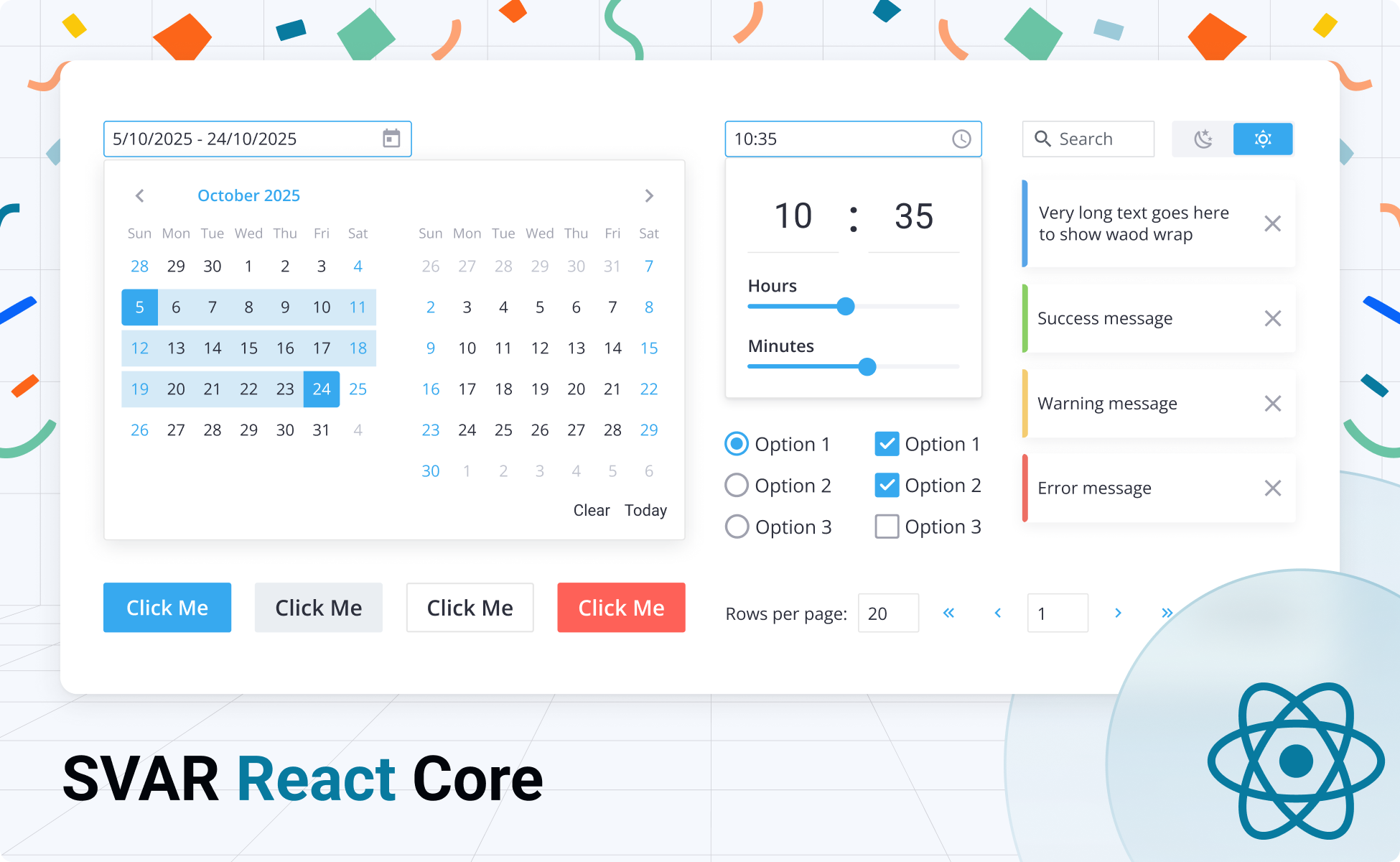
The library offers 20+ most commonly used components: from buttons and form inputs, to date and time pickers, autocomplete, toast notifications, menus, toolbar, comments section, and more. Each component follows React best practices and modern component patterns and can be easily styled with CSS, if needed.
SVAR React Core is free to use under the MIT license. Here is how to try the Core components and get started:
- Check the GitHub repository ⭐
- Read the getting started guide
- View demos for: Core library and additional components that come standalone, such as menu, toolbar, comments, and tasklist.
SVAR Core complements our advanced React UI components - React DataGrid and React Gantt - with a set of commonly used UI elements that perfectly fit into web apps of any scale. So, if you’re already using SVAR React components, the Core library helps you to keep up with consistent design, API, and theming.
Don’t be surprised by the 2.2 version number for this new SVAR library. Since SVAR React Core mirrors the functionality of the latest SVAR Svelte Core, we aligned the versioning to keep them consistent.
Why Use SVAR React Core?
The library is performance-focused, beautifully styled and especially useful for apps dealing with forms, data entry, and productivity tools.
What’s included:
- Form inputs: button, checkbox, radio button, color picker, slider, toggle button, and more,
- Calendar: can be used as a date picker, range picker, or month calendar,
- Messages & Alerts: notifications, popup alerts, custom modal dialogs,
- Dropdowns & Selects: Multi-combo, select, and rich select,
- Navigation: segmented buttons, tabs, menus, toolbar,
- Layout & Modals: sidebar and modal area for additional content display,
- Tasklist: a simple to-do list to add, edit, delete tasks and mark them as completed,
- Comments: a neat comments section with the bubble or flow views.
SVAR React Core supports these key features that make it a reliable React UI library:
- Modular packages: install only components you need,
- Minimal bundle size: no unused code,
- React 18 & 19 support,
- Intuitive, well-thought-out API,
- Easily customizable with CSS,
- Mobile friendly,
- Light and dark themes,
- Virtualization for lists & dropdowns,
- Helpful documentation and demos,
- TypeScript support is in active development and planned for the next release.
Quick Start
SVAR React Core library can be easily installed via npm:
npm install @svar-ui/react-coreThis is how you insert a button:
import { Button } from "@svar-ui/react-core";
function App(){ return <Button>Click Me</Button>;}
Note that some components should be installed as separate packages, which is good for keeping your bundle size minimal by only installing what you actually use:
npm install @svar-ui/react-toolbarnpm install @svar-ui/react-menunpm install @svar-ui/react-tasklistnpm install @svar-ui/react-commentsGive it a try and see how it can help you in your development process!
Your feedback and bug reports, if any, are always welcome - post an issue on GitHub or in our community forum. We built SVAR Core to speed up UI development in our projects. If it helps you too, we’d love to know about it.
This release is the first step towards the release of React 19-compatible version of SVAR React DataGrid and Gantt chart.