

We’re happy to announce the release of the React version of SVAR Editor. It is a free, open-source UI component that helps you create custom editing forms for any element of your web app that has structured content.
If your React app requires users to edit structured data – such as info cards, user profiles, or any kind of records with repetitive fields – SVAR React Editor can significantly save your development time.
Get Started
Here are the useful links to learn more about SVAR React Editor and see it in action:
To get started with the Editor component, you can install it via npm (note that you also need to install SVAR Core library to get access to all the form controls):
npm install @svar-ui/react-corenpm install @svar-ui/react-editorThen import the component into your React app and render it with the desired configuration. Below is a simple example of an editor form with three input fields:
import { Willow } from '@svar-ui/react-core';import { Editor } from '@svar-ui/react-editor';
const items = [  { comp: "text", key: "name", label: "Name" },  { comp: "text", key: "descr", label: "Description" },  { comp: "text", key: "role", label: "Role" }];
const values = {  name: "John Doe",  descr: "Lorem ipsum dolor sit amet",  role: "admin"};
export default function App() {  return (    <Willow>      <Editor items={items} values={values} />    </Willow>  );}
The Editor comes with lots of customization options, so you can define its layout, appearance, saving options, and required fields via intuitive API.
Read the docs for the details.
Display Options
The edit form can be displayed inline or opened as a modal (popup or sidebar) triggered by user action. All UI aspects can be adjusted to your design needs with CSS styling. You can also choose from two built-in, clean-looking themes: light and dark.
Currently SVAR React Editor supports one or two column layouts so you can place additional form inputs or other components in a separate column for compact view. Also, there is the ability to make form sections collapsible so users can focus on less information at a time.
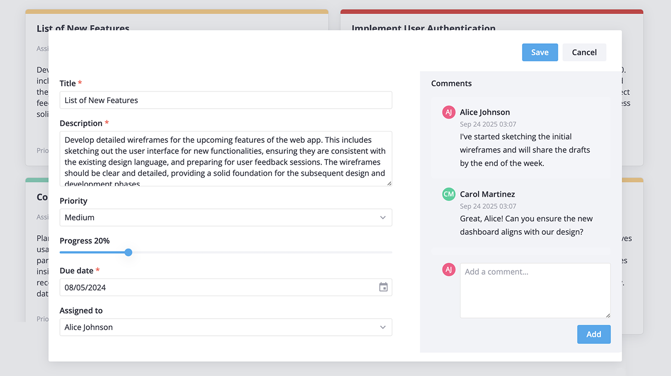
Here is how two-column layout looks like:
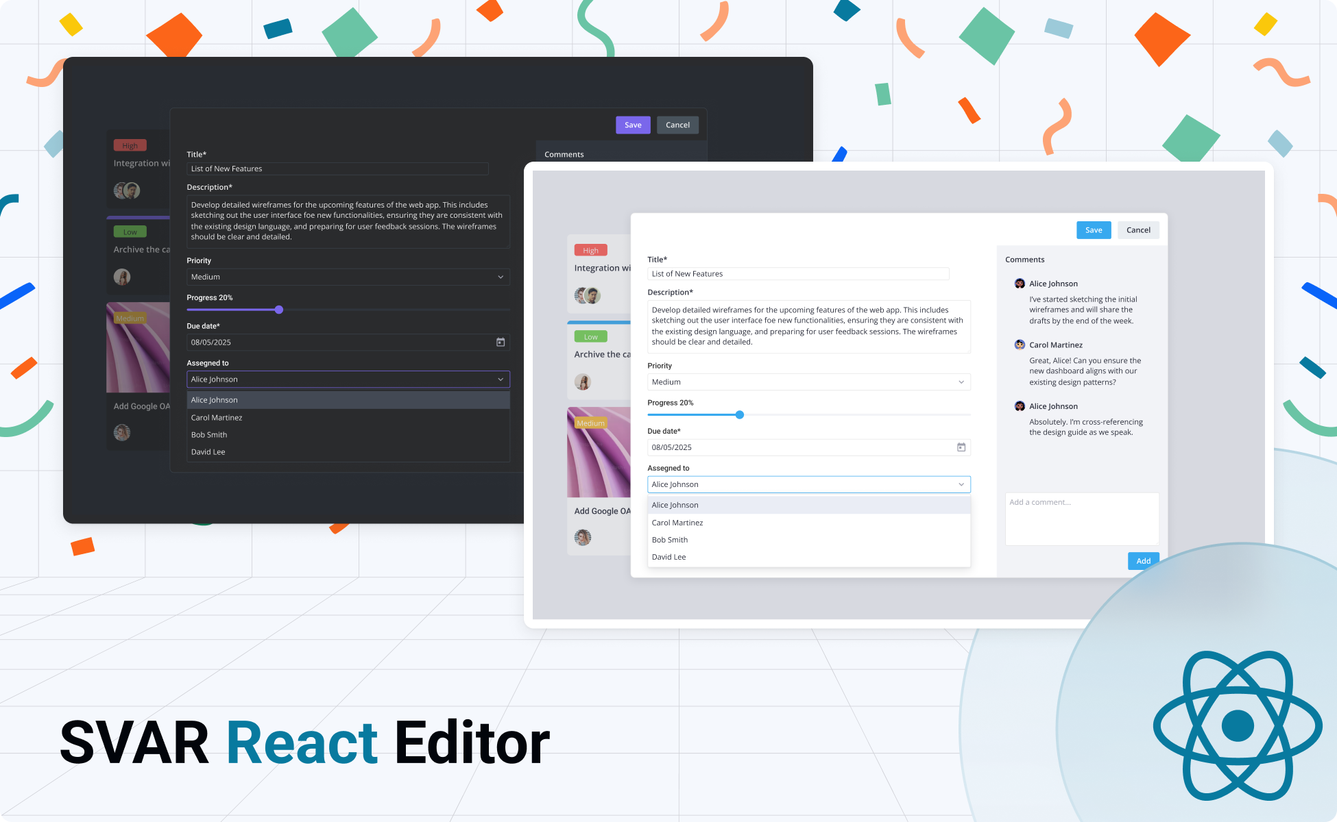
In addition to form controls, you can add a menu, toolbar or tabs to navigate between form sections. This makes SVAR React Editor particularly useful for complex forms with multiple sections or categories of data.
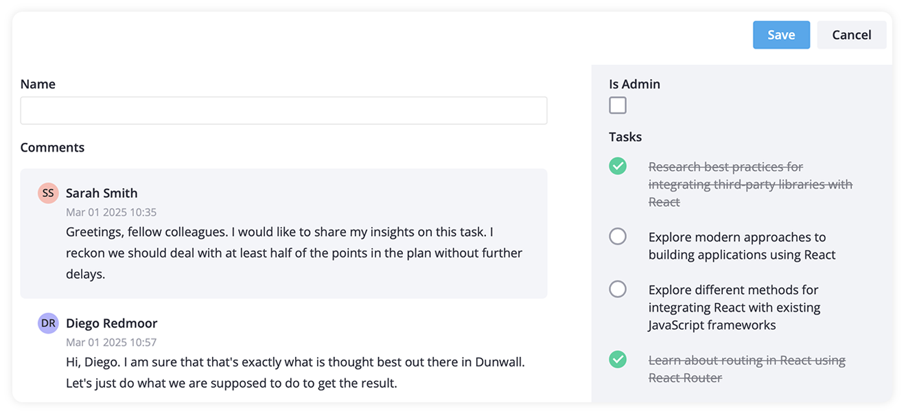
If you need a comments block or to-do list attached to a form, just use Comments and Tasklist components from SVAR React Core library.
Key Form Features
The key features of SVAR React Editor include:
- Built-in form controls: all the controls and components from SVAR React Core can be used in the Editor: input fields, checkboxes, radio buttons, selects, date picker, and more
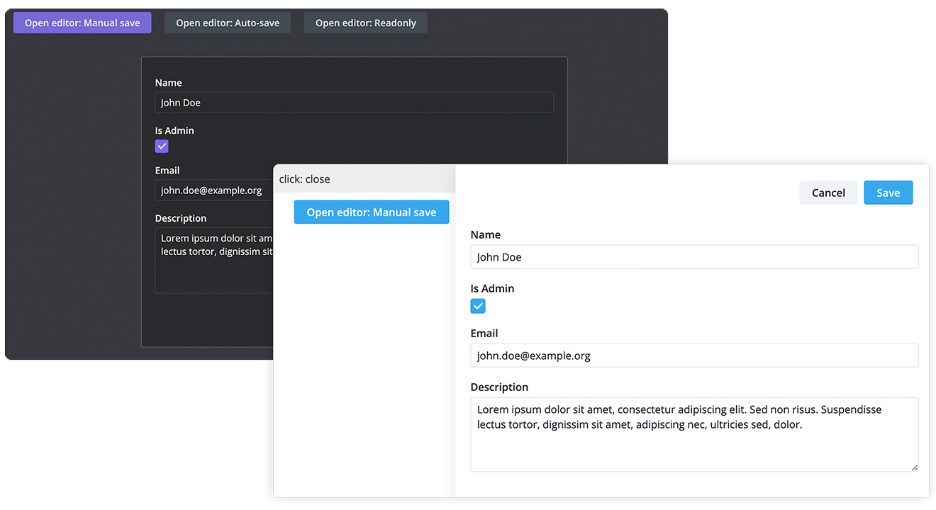
- Saving options: auto-save when data is edited, or by user actions (pressing button Save, for example)
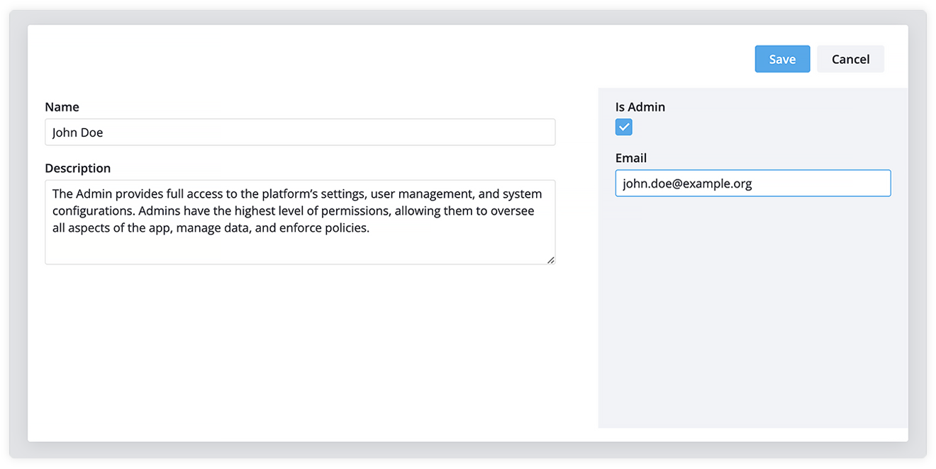
- Basic data validation: the Editor widget supports basic field validation, and you can also define custom validation rules to enforce specific formats or value ranges
- Required fields: you can set fields as required to ensure valid user input
- Editable or read only modes to control whether users can edit fields or only view them.
Give It a Try
SVAR Editor is a useful addition to SVAR React components and can be a great help if you’re developing React web apps, together with the SVAR React Core library, SVAR React DataGrid, and SVAR React Gantt Chart component for project planning visualization.
Visit Editor’s GitHub page, leave your feedback, feature requests, and give it a star if you find this component useful! ⭐