

Nowadays every web developer knows about JS frameworks. According to the State of JS 2022 survey, the most popular are React, Angular, Vue.js and Svelte. Each one of them is loved and has a strong following for a good reason.
We understand that the web development landscape is dynamic, with teams often working on projects that span multiple frameworks. To avoid reinventing the wheel with each new framework, our SVAR Cores - Svelte Core, Vue Core, and React Core offer ready-made solutions. Svelte Core is now available, with Vue Core and React Core slated for release later this year. As for the Angular Core, its development is ongoing and its release is planned for the future.
We designed SVAR components to align with the strengths of each major framework. Whether you prefer the component-based architecture of React, the simplicity of Vue.js, or the efficiency of Svelte, our library is your go-to solution.
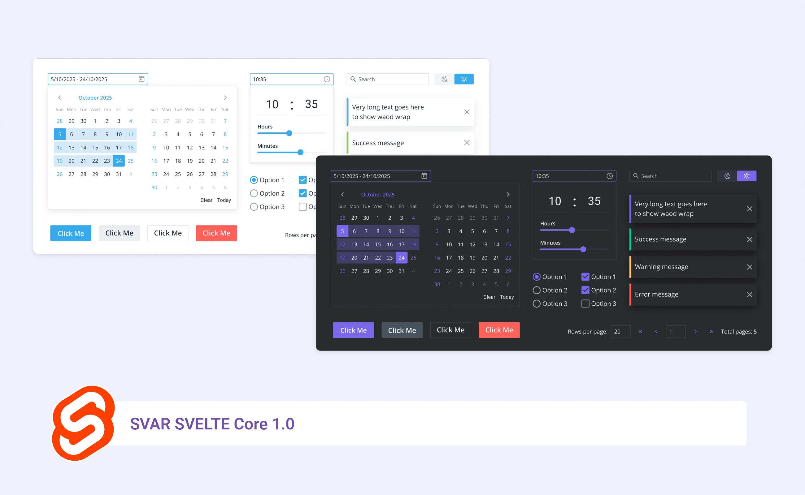
With our widgets you will be able to enjoy a consistent user experience across diverse projects. Svelte Core, for example, offers 16 free controls covering all basic needs - from simple Switch Buttons to complex ones, like Combo and Calendar. In addition to the controls, navigation tools such as Menu and Toolbar will soon be added to this Core.
Why SVAR
Here’s a glimpse of what SVAR offers:
- Time efficiency - Get pre-built UI optimized solutions to accelerate development
- Cross-framework compatibility - The same API and behavior across different frameworks.
- Ease of maintenance - No need to rewrite or retest custom controls.
- Uniform style - Maintain consistent look and feel across projects.
- Responsive design - Adapts to any screen size out of the box
- Feature rich - Packed with advanced capabilities like filtering and validation.
- Ease of use - Clean readable code and docs for easy integration.
- Regular updates - Frequent improvements and new feature additions.
SVAR in action
Let’s take a look at a couple of the controls: Combo and Button, from the Svelte Core.
Combo
Combo is a component that allows you to select an option from a dropdown list.
To start working with SVAR, install its package via npm and run the following commands:
npm config set @wx\:registry https://npm.svar.devnpm install @wx/svelte-coreThen import the component source file on the page (In this case, the component is Combo):
import { Combo } from "@wx/svelte-core";And finally, initialize the component with the tag:
<Combo />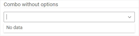
Now a Combo is rendered on a page.
Adding Options
Populate the Combo with options either during initialization or afterward. To load options during initialization, use the options property:
const users = [ { id:1, name: "Berni Mayou", email: "bern.mayour@mail.com", }, { id:2, name: "August Dvorak", email: "dvor.august@gmail.com", }, { id:3, name: "Elly Soyer", email: "elly.soyer@example", }];<Combo options={users} />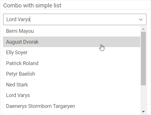
This renders a Combo with a list of options on the page.
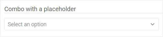
Adding a Placeholder
Guiding users to select an option, use the placeholder property to set a placeholder message:
<Combo options={users} placeholder="Select an option"/>This displays the “Select an option” text when no option is chosen yet.
Refer to the Combo docs and demos for additional features such as validation and styling.
Button
Button control triggers actions upon being clicked. Initialize a button with:
import { Button } from "@wx/svelte-core";<Button>Click Me</Button>Styling a Button
Using the type property, you can change the look of a button. As a value, this property requires the name of the button type:
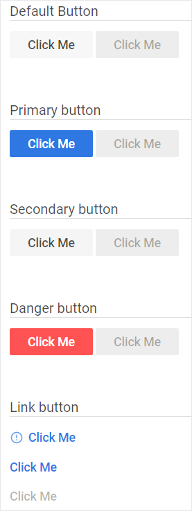
<Button type={'primary'}>Click Me</Button>SVAR offers a variety of predefined types of buttons:
- default,
- primary,
- secondary,
- danger,
- link
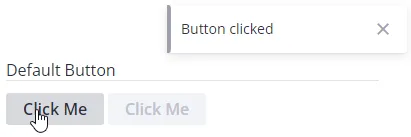
Handling a Button Click
Once the button’s appearance is chosen, adding functionality is straightforward. To add a click handler function, use the click property. SVAR allows you to declare it in two ways. You can specify the function name as the click property’s value:
function myFunction() { showNotice({text: "Button clicked",});};<Button click={myFunction}>Click Me</Button>Alternatively, use the {click} shorthand. Ensure the handler function’s name matches the property name:
function click() { showNotice({text: "Button clicked",});};<Button {click}>Click Me</Button>Both of these ways provide a stylized button with a click handler.
Check the Button docs and demos for further information on styling, icons, and behaviors.
Licensing
The Core library of form controls in SVAR is offered under the MIT license, embracing open-source principles.
What’s next
Upcoming releases will add new controls and components, as well as complex widgets like Grid, Gantt, and Kanban.
Visit the documentation website to learn more about all the possibilities of SVAR components.