
SVAR Core — Vue UI Library
Say goodbye to clunky and outdated web interfaces with SVAR Core library for Vue 3. It will provide everything you need to create beautiful, responsive apps with Vue framework.
Also available for:


Say goodbye to clunky and outdated web interfaces with SVAR Core library for Vue 3. It will provide everything you need to create beautiful, responsive apps with Vue framework.
SVAR Vue Core offers a set of essential UI components built specifically for Vue 3, written from the ground up to feel right at home in your Vue projects
Core
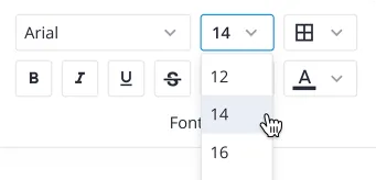
A solid foundation of Vue UI elements: form controls, buttons, date pickers, modals — all reactive, composable, and ready for real-world use.
Menu
A flexible Vue 3 menu component for building dropdown, navigation, context, and action menus. Configurable items, icons, submenus, and positioning.
Toolbar
Build structured button and icon panels with ease. This Vue toolbar component supports multiline layouts, collapsible icon groups, and automatic wrapping.
Comments
Add a polished comments block to any Vue app. Supports bubble and flow view modes, pagination, and Markdown rendering.

Tasklist
A clean, reactive to-do list component for Vue 3. Lets users create, edit, complete, and delete tasks with minimal setup — ideal for dashboards.

<script setup>, reactive props, and Vue's built-in event model. The library integrates naturally into any Vue codebase without friction or workarounds.
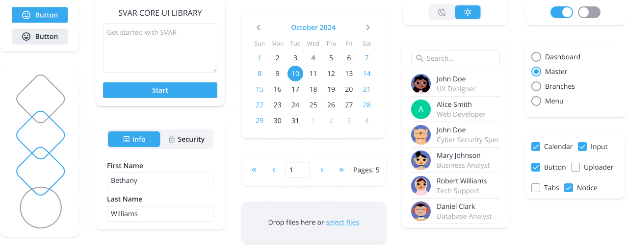
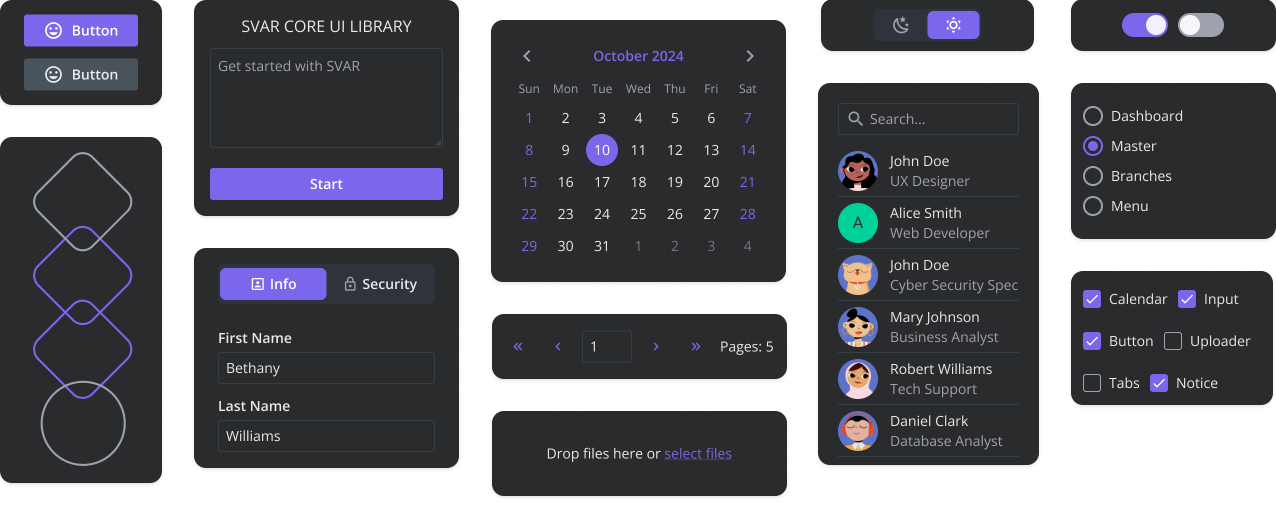
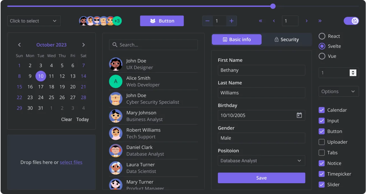
Explore how our Core Vue components look in light and dark themes, and interact with UI elements: buttons, checkboxes, date pickers, and slider. For the best experience, view this page on a desktop device to enjoy the live demo, as it looks great on larger screens!
Need custom features or integration help? Our experienced team provides priority support, custom development, and consulting services.