
Feature-Rich Svelte DataGrid
A lightweight, Svelte 5 compatible datagrid that works fast with large datasets. Now with TypeScript support! Easily integrate Svelte data tables with sorting, filtering, in-cell editing, and more.
Also available for:


A lightweight, Svelte 5 compatible datagrid that works fast with large datasets. Now with TypeScript support! Easily integrate Svelte data tables with sorting, filtering, in-cell editing, and more.
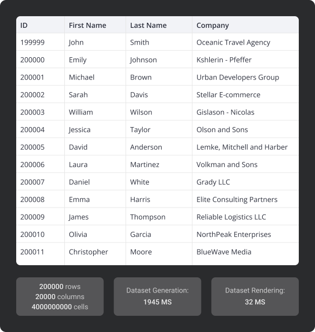
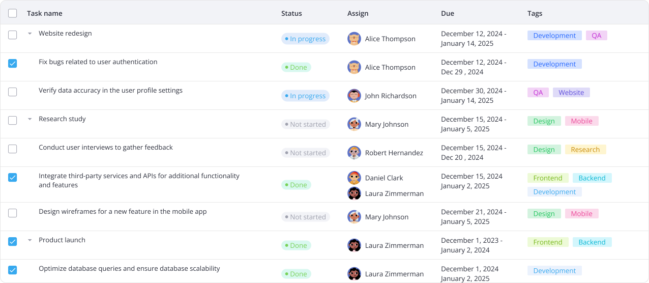
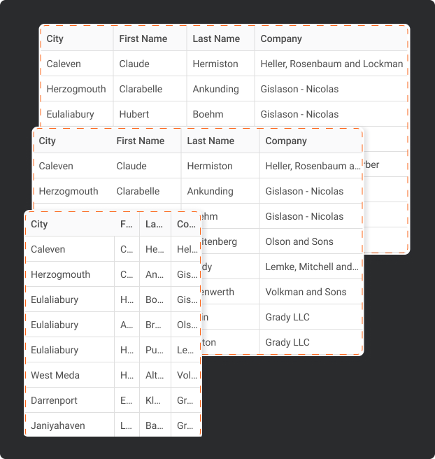
SVAR Svelte DataGrid offers lightning-fast performance with large datasets, providing a responsive user experience. Features like virtual scrolling, dynamic loading, and pagination help manage data efficiently.

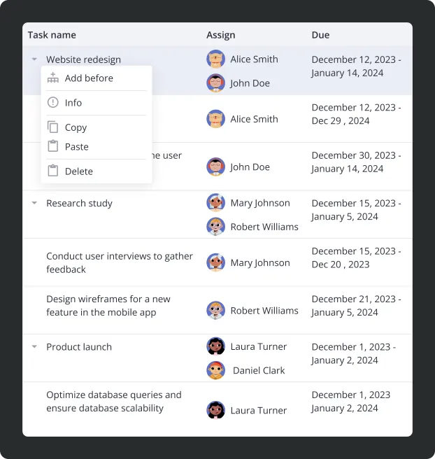
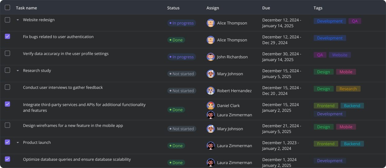
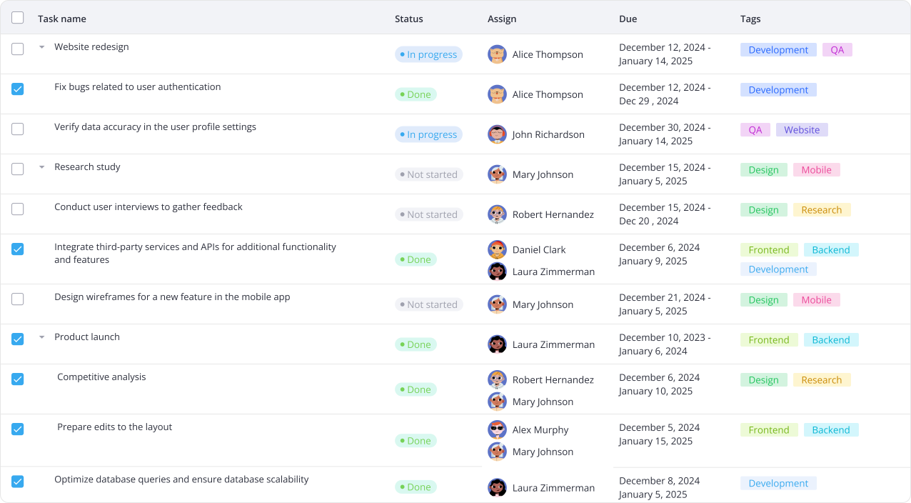
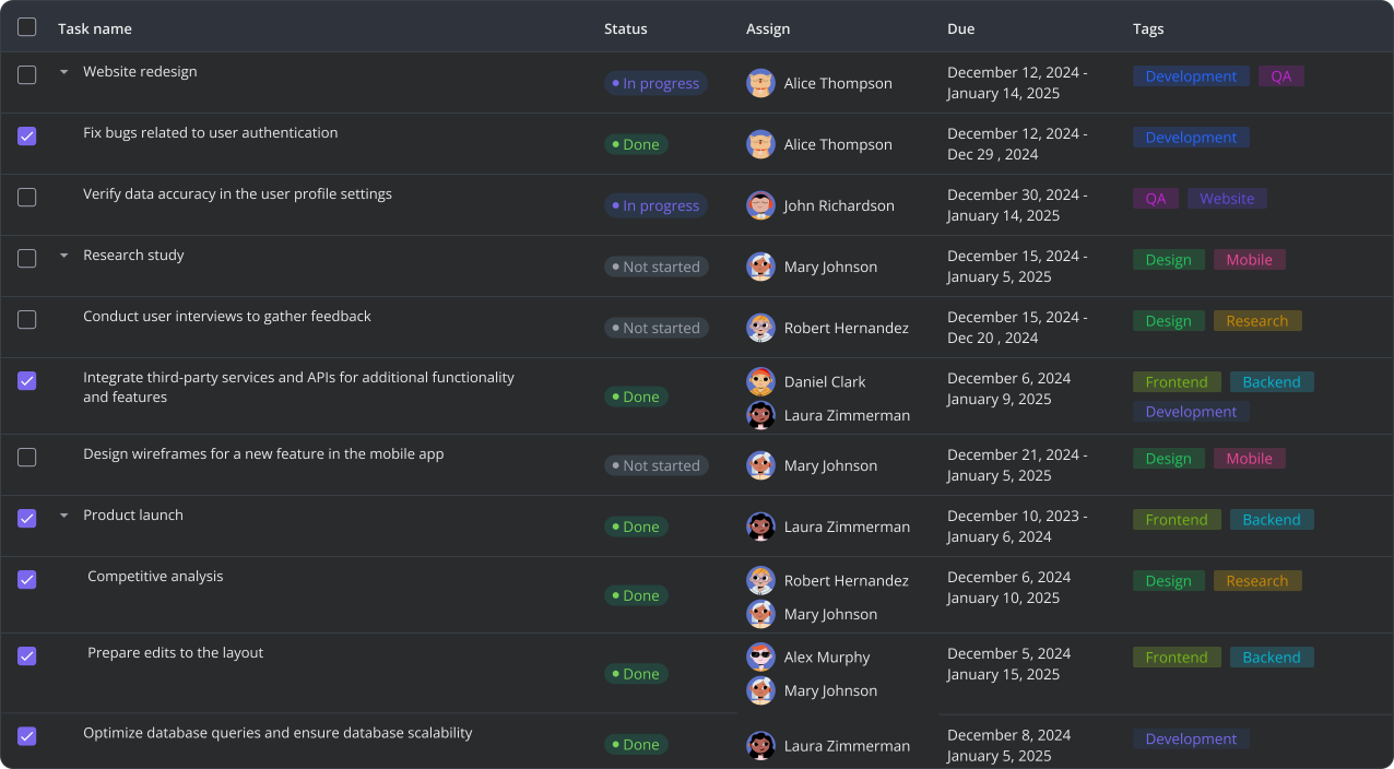
Try selection with checkboxes, tree data, in-cell editors in columns Status and Due, and switch between light and dark themes. For the best experience, view this page on a desktop device to enjoy the live demo, as it looks great on larger screens!
Need custom features or integration help? Our experienced team provides priority support, custom development, and consulting services.
Version 2.6
March 18, 2026
What's new
Multiselect in-cell editor
Ability to register custom editors
AI-powered filter with FilterQuery
Fixed initialization with SvelteKit
Version 2.4
December 12, 2025
What's new
Built-in toolbar
Custom row height
Customizable sorting
More actions for context menu
Version 2.3
September 19, 2025
What's new
TypeScript definitions
The package migrated to
@svar-ui/svelte-grid
Minor fixes
npm install @svar-ui/svelte-grid. 