
SVAR Core — React UI Library
Looking to build fast, reliable user interfaces? SVAR React Core library offers a rich collection of ready-made, open-source UI components and form controls.
Also available for:


Looking to build fast, reliable user interfaces? SVAR React Core library offers a rich collection of ready-made, open-source UI components and form controls.
Build enterprise-grade web applications faster with this set of customizable, pre-styled UI components. Fully compatible with React 19 & TypeScript-powered.
Core
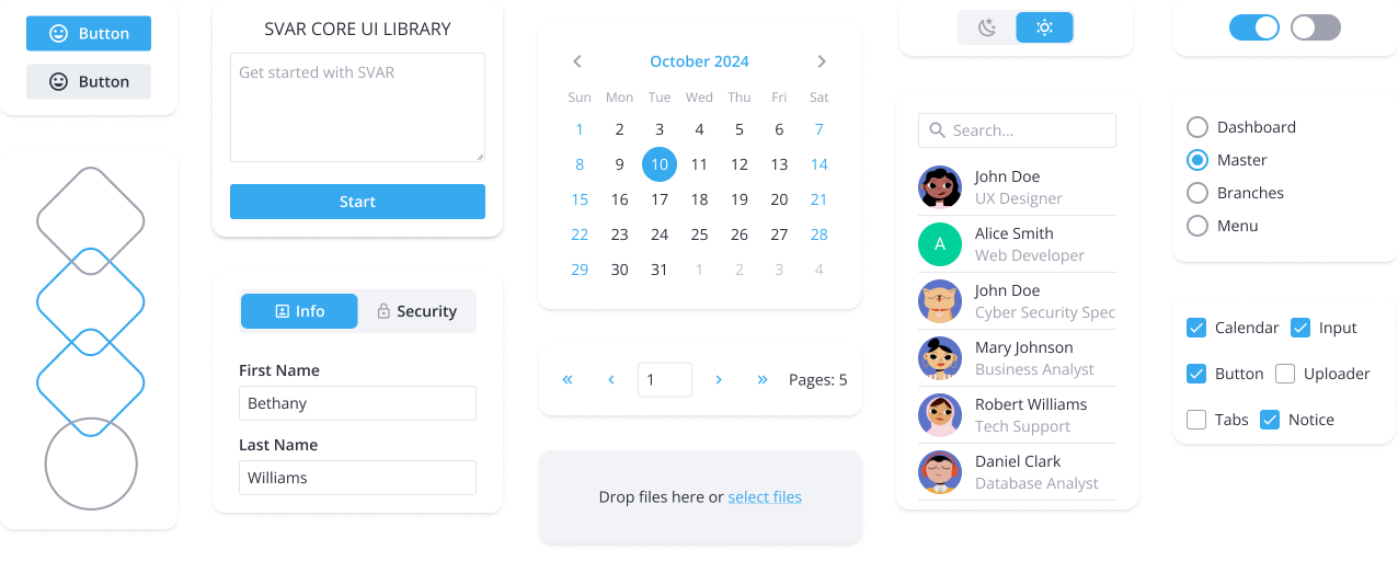
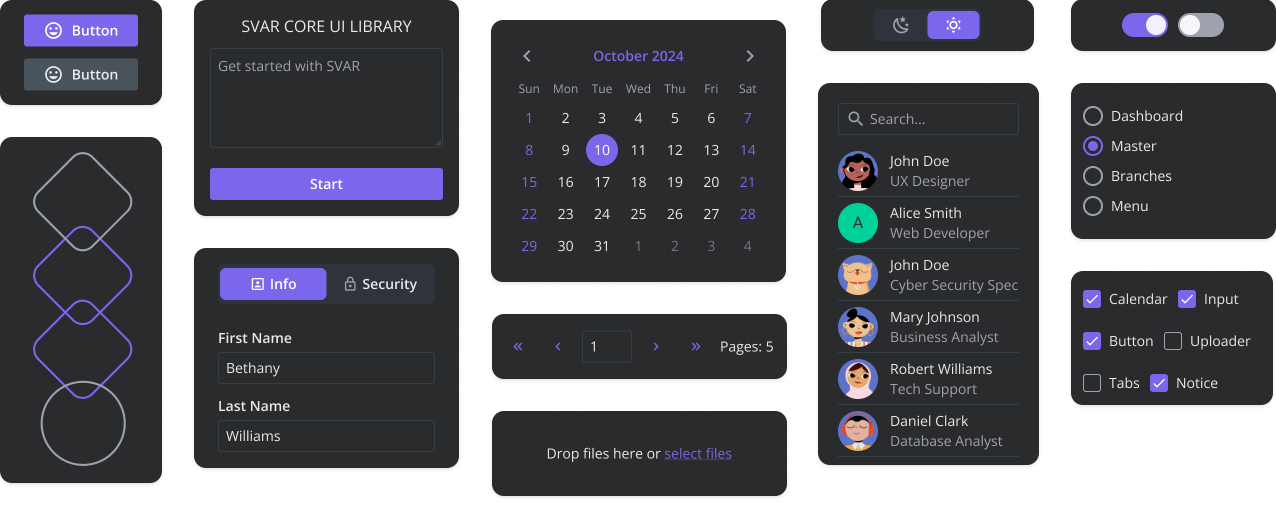
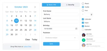
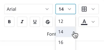
SVAR React Core provides 30+ form controls and UI elements for everyday app needs: buttons, checkbox, radio button, dropdowns, tabs, popups, alerts, date picker, and more.
Menu
A flexible React menu component for creating menu bars, navigation, action or context menus. Supports sub-menus and can be attached to any UI element.
Toolbar
An easy-to-use toolbar component for creating button panels with support for multiple button types, compact views, and multi-line layouts.
Comments
A clean and lightweight React component that helps you build a comments section with support for adding, editing, and deleting comments.

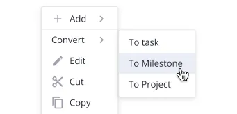
Tasklist
With Tasklist, you can create simple to-do lists, letting users easily add, edit, delete tasks, and mark them as completed.

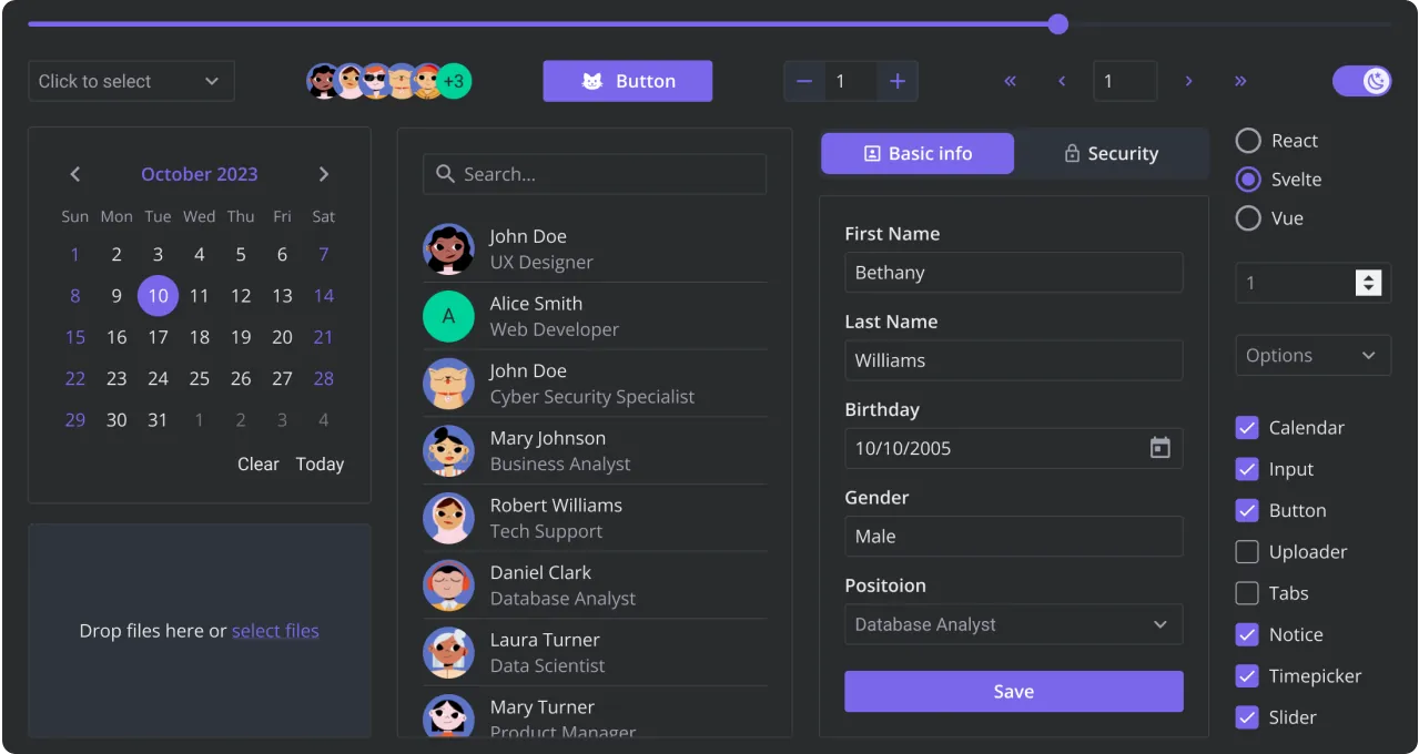
Explore the look and feel of SVAR React Core. Toggle between light and dark themes and test interactive UI elements like buttons, checkboxes, radio buttons, calendars, dropdowns, etc. For the best experience, view this page on a desktop device to enjoy the live demo, as it looks great on larger screens!
Need custom features or integration help? Our experienced team provides priority support, custom development, and consulting services.