

We’re happy to announce the release of SVAR Svelte DataGrid version 2.1! This release introduces several major features, UI enhancements, and bug fixes. It makes the grid a perfect choice for data-driven Svelte 5 apps where a comprehensive data table is needed.
Here is what’s new in v2.1:
- Accessibility features
- Filtering support
- Row reordering with drag-and-drop
- Print support
- Custom HTML content to header and footer
- UI improvements for collapsible columns
- Popup editing form
See the full list of new features, feature updates, bug fixes, and some breaking changes introduced in v.2.1. As usual, you can install the most recent version of SVAR Svelte DataGrid via npm:
npm install wx-svelte-gridAnd don’t forget to give it a star on GitHub, we really appreciate your support! Now, let’s see what’s been added in the new version in more details:
Accessibility Features
The new version adds accessibility to SVAR DataGrid, making it compatible with WAI-ARIA standard and more user-friendly for people with disabilities. The new accessibility features include:
- Screen reader support - Table content can now be read by screen readers, thanks to special markup on table elements.
- Keyboard navigation improvements - An extended list of hotkeys allows for smoother and more efficient navigation.
Users who rely on keyboard navigation will now experience improved interaction with the DataGrid. Overall, these updates make the component more accessible and intuitive for a wider audience.
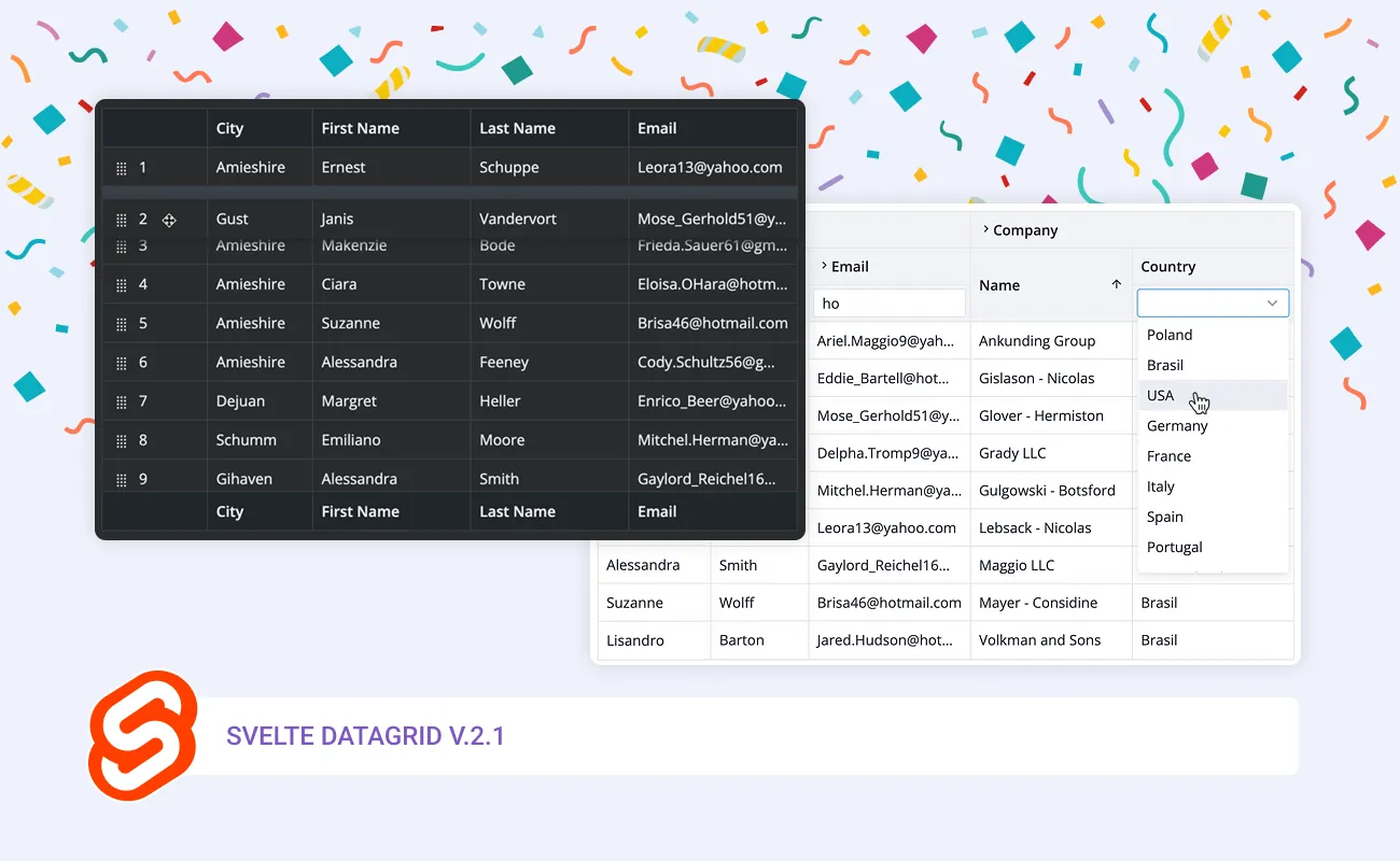
Filtering Support
You can now add header filters to datagrid and configure them to your needs. By default, AND logic is used when combining multiple filter conditions, but you can easily customize filtering behavior to use OR logic, if needed.
SVAR DataGrid includes two built-in filter types:
- Text - a simple input that filters data as you type;
- Richselect - a dropdown list with options and the ability to clear selection.

The updated DataGrid comes with a filtering API that allows using external controls as filters - whether it’s plain custom HTML or the controls of SVAR Core library like date range picker, text, select, and other.
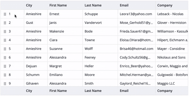
Row Reordering
With this release, we’ve added the support for drag-and-drop rows reordering. It’s a powerful feature that allows users to organize table rows in an intuitive and easy way.
You can enable rows reordering with or without a drag handler, depending on your needs. Note that currently this feature will only work for tables with plain, non-hierarchical data.
Print Support
This release brings the possibility to print table data directly from the DataGrid. Print support ensures that all data is included in the printout - not just the visible portion - regardless of the number of rows and columns.
While printing a data table, you can specify:
- Paper size - Adjust the print layout to fit different formats.
- Orientation - Choose between portrait and landscape, which is especially useful for tables with a large number of columns.
This update makes it easy to generate well-formatted print versions of your tables, ensuring clear and structured output for reports, documentation, or data reviews. View the printing demo to see this feature in action.
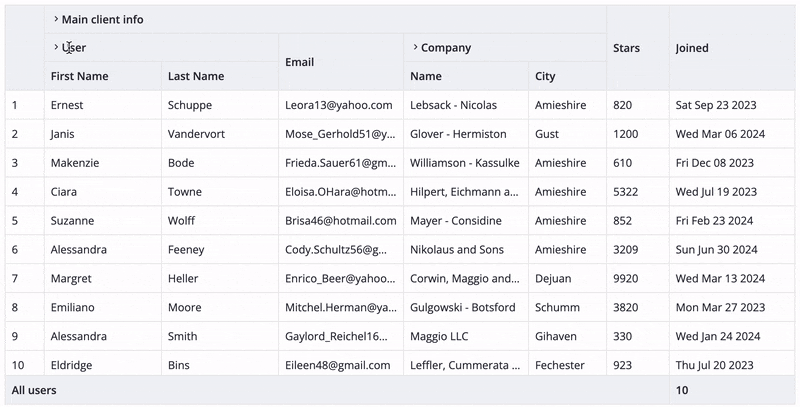
Custom HTML in Header/Footer
Version 2.1 allows you to add custom HTML in the header and footer cells, providing even more flexibility to adjust DataGrid to your application’s needs. Integrate either custom HTML code or SVAR Core controls to the header/footer and give your users more control over the table structure and data.
View the demo with custom cells in header
UI Improvements for Collapsible Columns
Another improvement that we would like to mention is changing the look of fully collapsed columns. When a column is set to collapsible: true, it can be fully collapsed. In this update, we’ve enhanced the UI by adding a full-height placeholder in the collapsed state. Users can now simply click on this placeholder to expand the column again.
View the demo with collapsible columns
This change improves the user experience without any modifications to the API — just a more intuitive and visually clear way to handle collapsible columns!
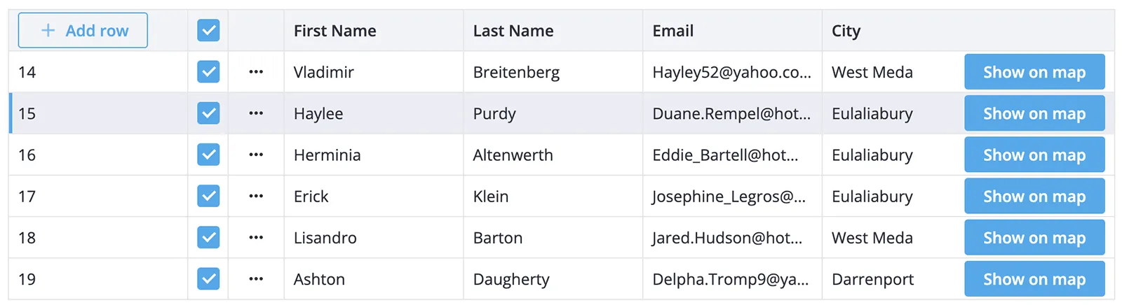
Popup Editing Form
We’ve introduced a new way to edit row data — using a popup editing form. Instead of modifying individual cells one by one, users can now open a structured form to edit an entire row at once. This feature improves usability by providing more space for complex inputs, better validation, and a smoother experience, especially on mobile devices.
View the external editor demo.
Summing Up
We’re really proud of this release since it makes SVAR Svelte DataGrid a more powerful tool for building accessible, first-class data tables in Svelte 5. With enhanced customization, improved accessibility, and new features like filtering, row reordering, and print support, this update expands the possibilities for developers, making it easier to tailor DataGrid to various application needs.
Stay tuned for more updates as we continue improving the library - sign up for our newsletter or follow us on social media!