

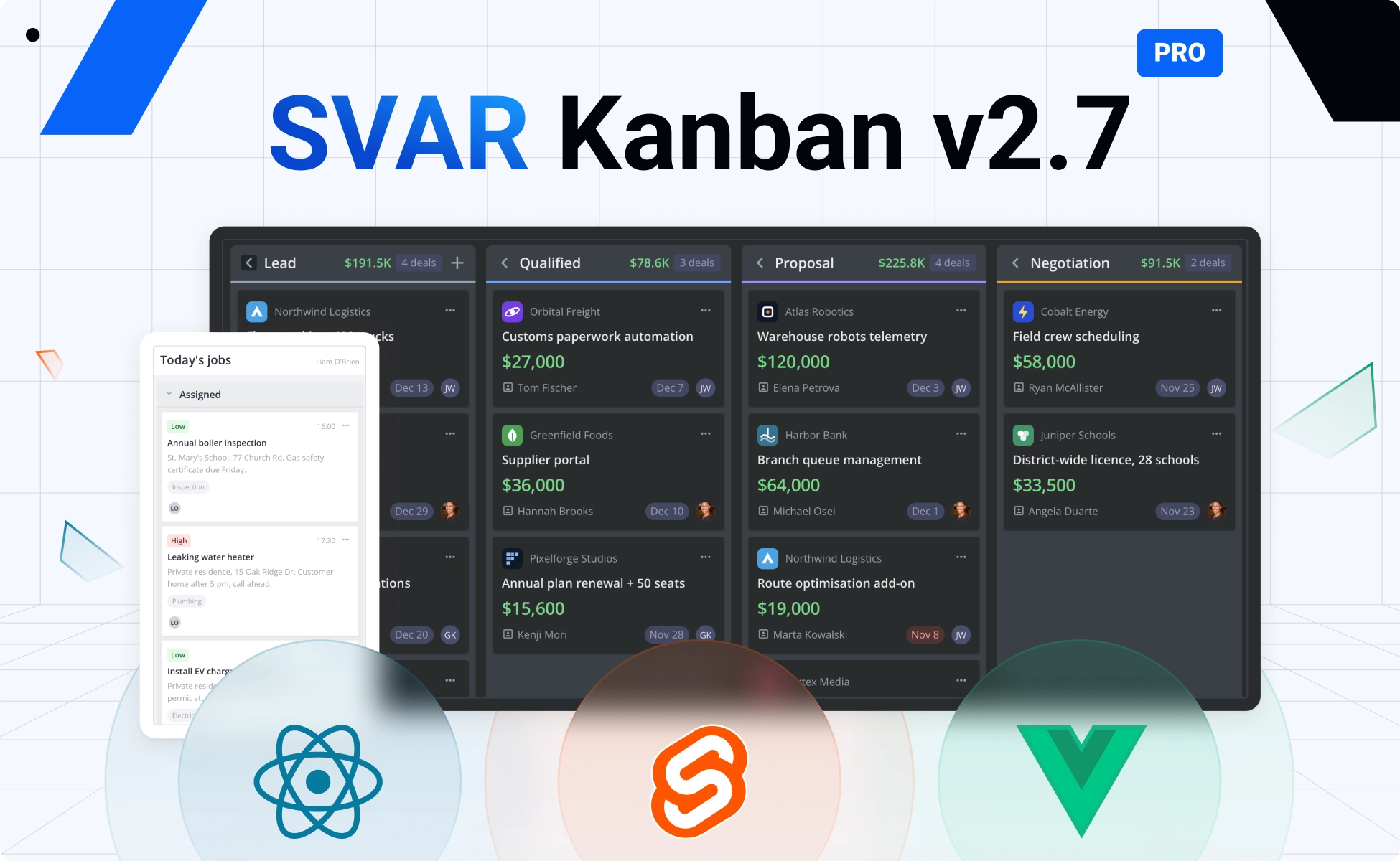
We’re happy to introduce version 2.7 of SVAR Kanban for React, Svelte, and Vue. This release focuses on making the board more adaptable to real-world workflows: mobile-friendly layouts, flexible column summaries, ready-made menus, dynamic columns, richer card content, and live multi-user updates.
A Kanban board might look simple, but the challenges begin when a real team starts using it: different devices, different usage scenarios, collaborative work, and evolving workflows. SVAR Kanban 2.7 addresses many of these needs, and its PRO edition brings powerful new features that enterprise applications need for managing workflows with complex data and large numbers of tasks.
Here’s what changed, why, and what you need to update when upgrading.
🔹 View demos for v2.7: React Kanban • Svelte Kanban • Vue Kanban
What’s New in Open-Source SVAR Kanban
The MIT edition is where the board itself lives, and version 2.7 adds UX improvements that make the board more flexible and easier to use: mobile-friendly layout, column summaries, card and column menus, a richer card editor, and live updates.
The Board Has to Fit on a Phone
Using a Kanban board in its original view on a mobile phone can be challenging, as side-by-side columns do not work well at 375px. You either scroll sideways indefinitely or squeeze cards until labels wrap into unreadable text.
The new stack layout introduced in version 2.7 places all columns into one vertical list. Each column becomes a group with its own header, and users scroll down through the entire board. Here is how to enable it in Svelte Kanban:
<Kanban {cards} {columns} render={{ layout: "stack" }} />There is no “auto” mode, and that is intentional. The widget does not detect the viewport, so your application decides when to switch layouts. A matchMedia("(max-width: 640px)") listener is enough. The value is reactive, and cards, filters, sorting, and summaries work the same in both layouts.
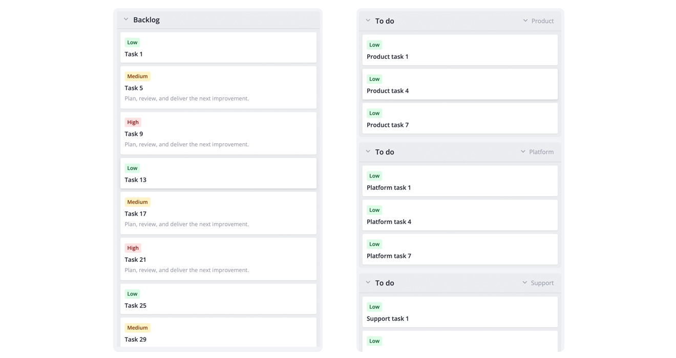
One thing to note: cards cannot be dragged in stack mode, since a finger on a card scrolls the board, so moving a card goes through the editor or a menu.
👉 Stack layout demo: React • Svelte • Vue
The Column Header Does More Work
In version 2.6, a column could communicate only one thing about itself: whether it was over cardLimit. That option did two jobs at once: it put a counter of cards in the header, and it worked as a soft work-in-progress cap — once the card count went past the limit, the badge turned red and the column got an extra CSS class.
With this update, we replaced cardLimit with column summaries that you define yourself. A summary is a small tag in the column header, and you decide what it calculates: the number of cards, total estimate, number of high-priority tasks, or any other value derived from the cards in that column.
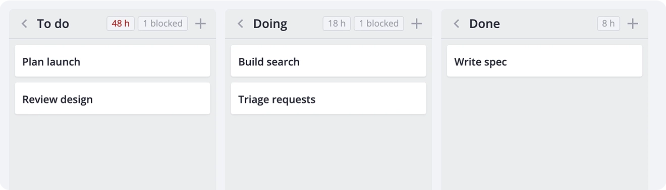
Here is how a summary is defined in the API:
const summaries = [    {        id: "effort",        calculate: cards =>            cards.reduce((sum, card) => sum + (card.estimateHours ?? 0), 0),        format: value => (value ? `${value} h` : ""),        css: value => (value > 40 ? "effort-over-capacity" : ""),    },];
const columns = [    { id: "todo", label: "To do", summaries },    { id: "doing", label: "Doing", summaries },];
The board recalculates summaries after every card change, filter, sort, and undo/redo operation.
A WIP limit is now simply another summary. For example, you can store the limit in a custom column property such as wipLimit, calculate the number of cards in the column, and apply a CSS class when that number exceeds the limit. It takes a few more lines than cardLimit: 5, but you decide what “full” means.
👉 Column summaries demo: React • Svelte • Vue
Menus You Do Not Have to Build
Every board eventually needs custom card operations, and a dropdown menu with a list of options is probably the most common pattern. Version 2.7 of SVAR Kanban ships four wrapper components to add a menu to a card or column:
CardActionMenuopens from the card⋯buttonCardContextMenuopens on right-click on a cardColumnActionMenuopens from the column⋯buttonColumnContextMenuopens on right-click on a column header
To wrap <Kanban> in these components, you need:
<CardContextMenu {api}> <CardActionMenu {api}> <Kanban bind:this={api} {cards} {columns} card={{ menu: true }} /> </CardActionMenu></CardContextMenu>card={{ menu: true }} displays the menu button on each card. A column gets its button through menu: true in its configuration. The button is only markup: without the matching wrapper around the board it does nothing, so you decide which boards get menus at all.
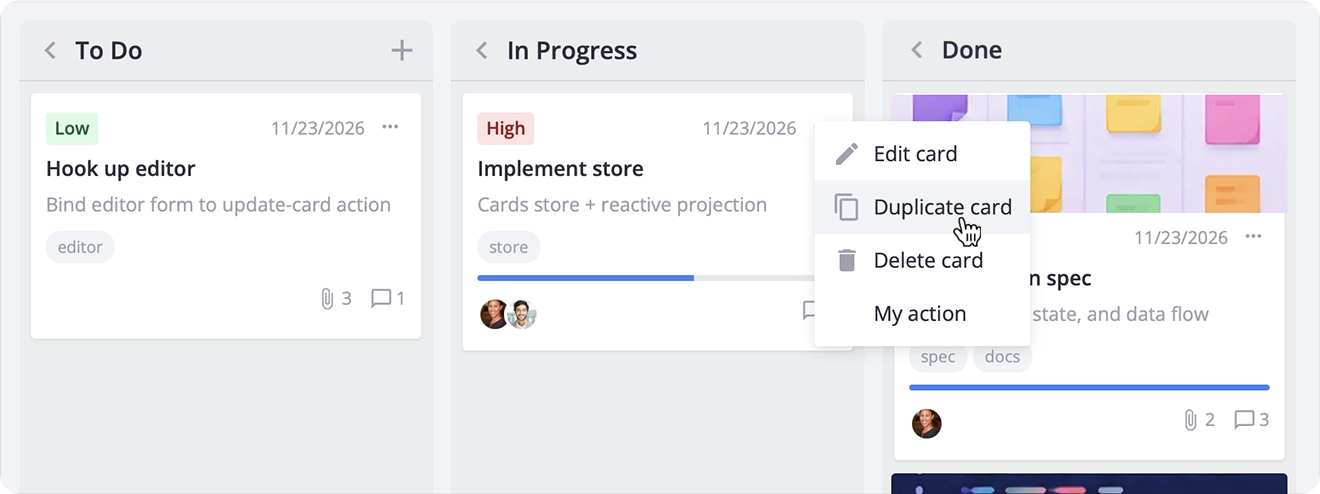
Each menu wrapper accepts an options prop: either a static array or a function that runs when the menu opens and receives the target card or column. This lets menu items reflect the current state of the card or column.
Menus can be static or dynamic, and their items can depend on the selected card or column. Built-in actions cover editing, duplicating, and deleting cards, as well as adding a card to a column. You can also add custom actions and control which options appear.
👉 Card menu demo: React • Svelte • Vue
👉 Column menu demo: React • Svelte • Vue
Columns Stop Being Static Config
On many boards, the column list stays the same. On others, users may add a “Review” stage on Tuesday and remove it on Friday. Version 2.7 covers both scenarios: you can now omit the columns array altogether and let the board create a column for each distinct value that columnAccessor reads from the cards.
<Kanban {cards} columnAccessor="status" />This is useful for prototypes and read-only boards built over data you do not control. For an editable board with fixed stages, keep an explicit columns array. Inferred columns are rebuilt on every card change, so empty columns disappear.
To change columns at runtime, use three new actions:
api.exec("add-column", { column: { id: "review", label: "Review" }, before: "done",});api.exec("move-column", { id: "backlog" }); // moves to the endapi.exec("delete-column", { id: "review" });These actions modify only column configurations. Cards from a deleted column remain in the data and reappear when a column with the same ID is added again. All three actions clear the undo/redo history – and undo/redo itself is a PRO feature.
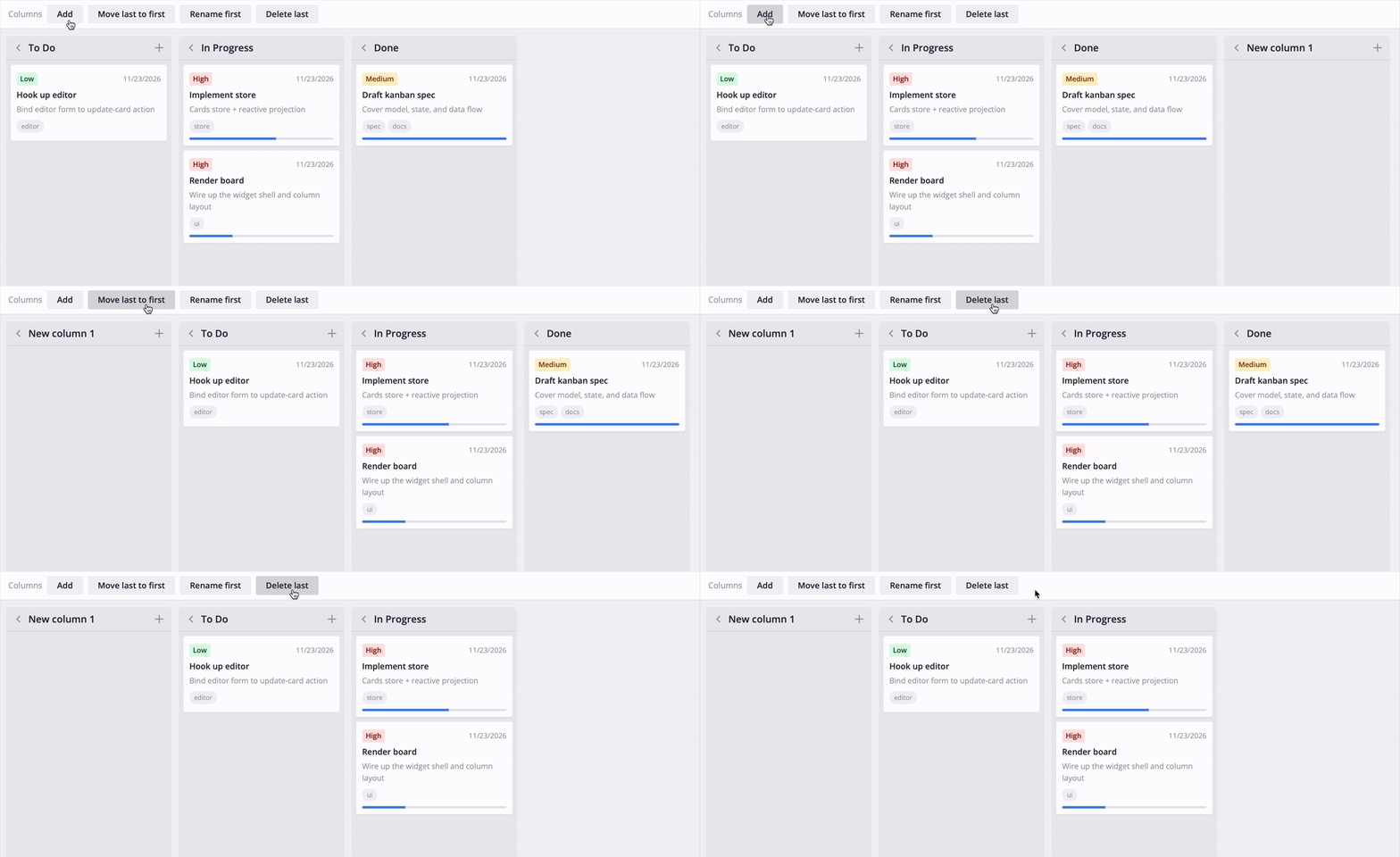
Columns can now also have their own width, so a wide backlog can sit next to a narrow “Done” column:
const columns = [ { id: "backlog", label: "Backlog", width: 360 }, { id: "doing", label: "In Progress" }, { id: "done", label: "Done", width: 200 },];👉 Column actions demo: React • Svelte • Vue
👉 Column from data demo: React • Svelte • Vue
Cards Carry More: Rich Text, Markdown, Attachments
A card title and a one-line description go a long way until someone needs to paste a specification or attach a screenshot. In version 2.7, the card editor now works with three components from SVAR Editor:
- TinyMCE for rich text stored as HTML
- CodeMirror for code or Markdown
- Attachments for file uploads
Register them and use the component name as comp:
import { getEditorItems, registerEditorItem } from "@svar-ui/svelte-kanban";import { TinyMCE, Attachments } from "@svar-ui/svelte-editor";
registerEditorItem("tinymce", TinyMCE);registerEditorItem("files", Attachments);
const items = [    ...getEditorItems(),    { comp: "tinymce", key: "details", label: "Details" },    {        comp: "files",        key: "attachments",        label: "Attachments",        uploadURL: "https://example.com/api/files",    },];
When a user adds a file, the attachments field sends it to uploadURL and keeps only the metadata your server returns — for example, { id, name, size, url }. If you want to handle uploads on your side, pass a function instead of a URL.
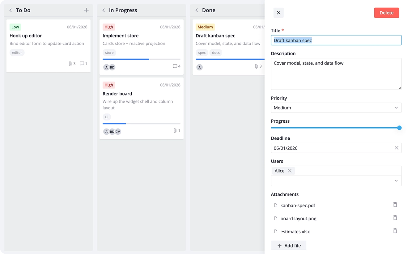
👉 Rich text demo: React • Svelte • Vue
👉 File attachments demo: React • Svelte • Vue
Two People, One Board - Live Updates
A shared board that does not update live becomes a board where people overwrite each other’s work. That’s why we introduced KanbanEventBridge from @svar-ui/kanban-provider that listens to a server-sent events (SSE) stream and replays remote changes into the kanban board:
bridge = new KanbanEventBridge(`${url}/events`, clientId, api, provider, { "add-card": CARDS, "update-card": CARDS, "move-card": CARDS, "delete-card": CARDS,});The bridge keeps the board in sync with the backend and prevents your own changes from being applied twice. Remote updates are applied locally without being sent back to the server.
For the user, the board starts behaving like a shared document: a card someone drags in another tab appears in yours with the summary tags already recalculated, and nobody has to refresh to find out that the data is stale.
👉 Multi-user demo: React • Svelte • Vue
What’s New in SVAR Kanban PRO
The PRO edition is for the production boards that stopped being a side project. It adds swimlanes, a group manager panel, drag-in from a backlog, and tile cards.
Swimlanes: A Second Axis
This update brings swimlanes feature to the SVAR Kanban PRO. Columns answer the question, “What stage is this in?” Swimlanes answer another: “Whose is it?” Each lane is a horizontal row—for example, one per team, project or customer, and each card belongs to both a column and a lane:
<Kanban {cards} {columns} {swimlanes} swimlaneAccessor="team" />Users can drag cards between lanes and collapse the ones they do not need. Filtering, sorting, and summaries work the same as on a board without lanes.
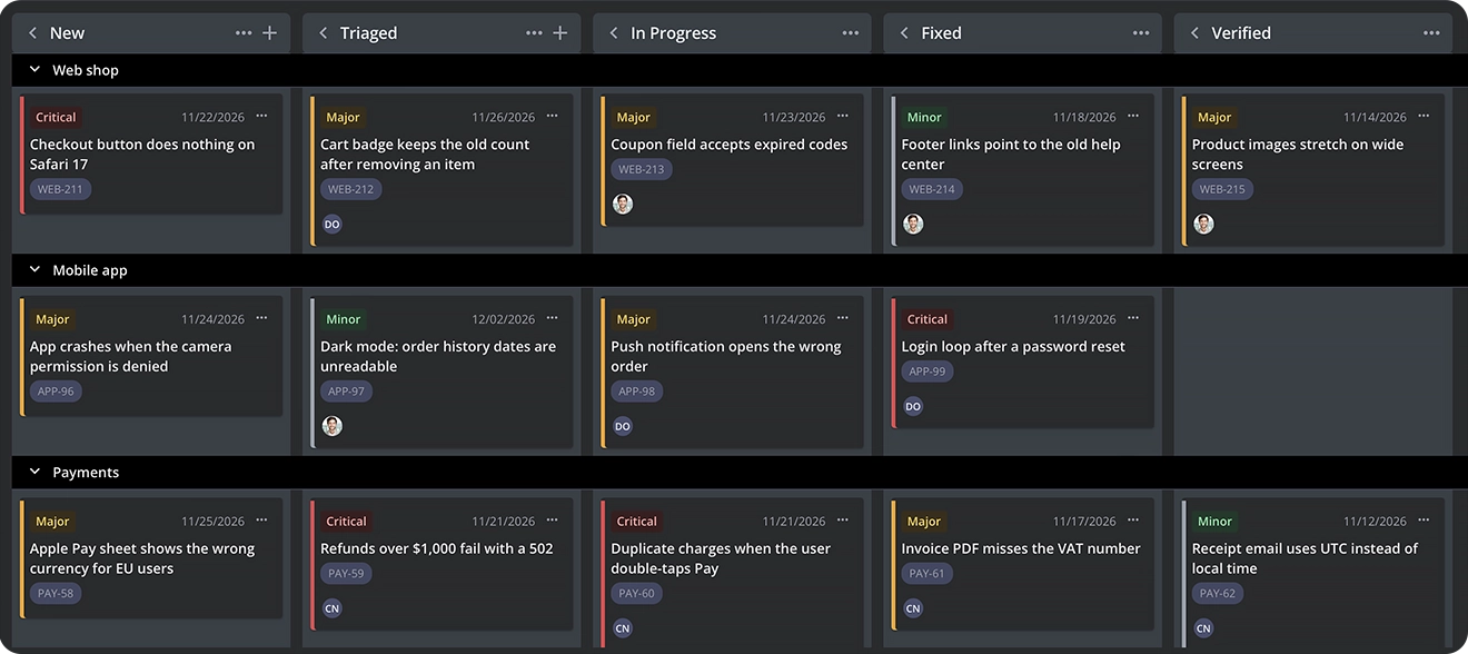
👉 Swimlane demo: React • Svelte • Vue
Drag-in Tasks from Outside
The other PRO addition in SVAR Kanban 2.7 is drag-in from outside the board. With the cardProjection prop, users can drag items from a backlog list or search results directly into a column. Your application handles the native drag events. The board identifies the drop target, displays a preview, and provides the destination column and swimlane. On drop, you dispatch add-card.
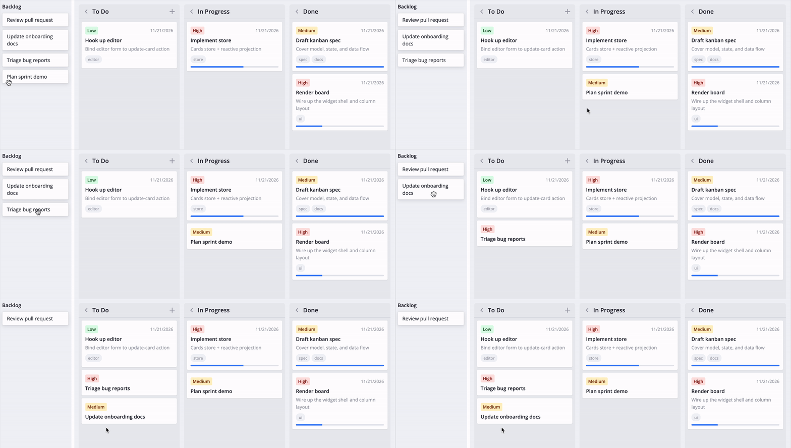
👉 Drag from outside demo: React • Svelte • Vue
Tile Cards in One Column: Grid Layout
In SVAR Kanban PRO 2.7, cardWidth and cardHeight on a column turn its cards into fixed-size tiles in a grid. A wider column fits more tiles per row.
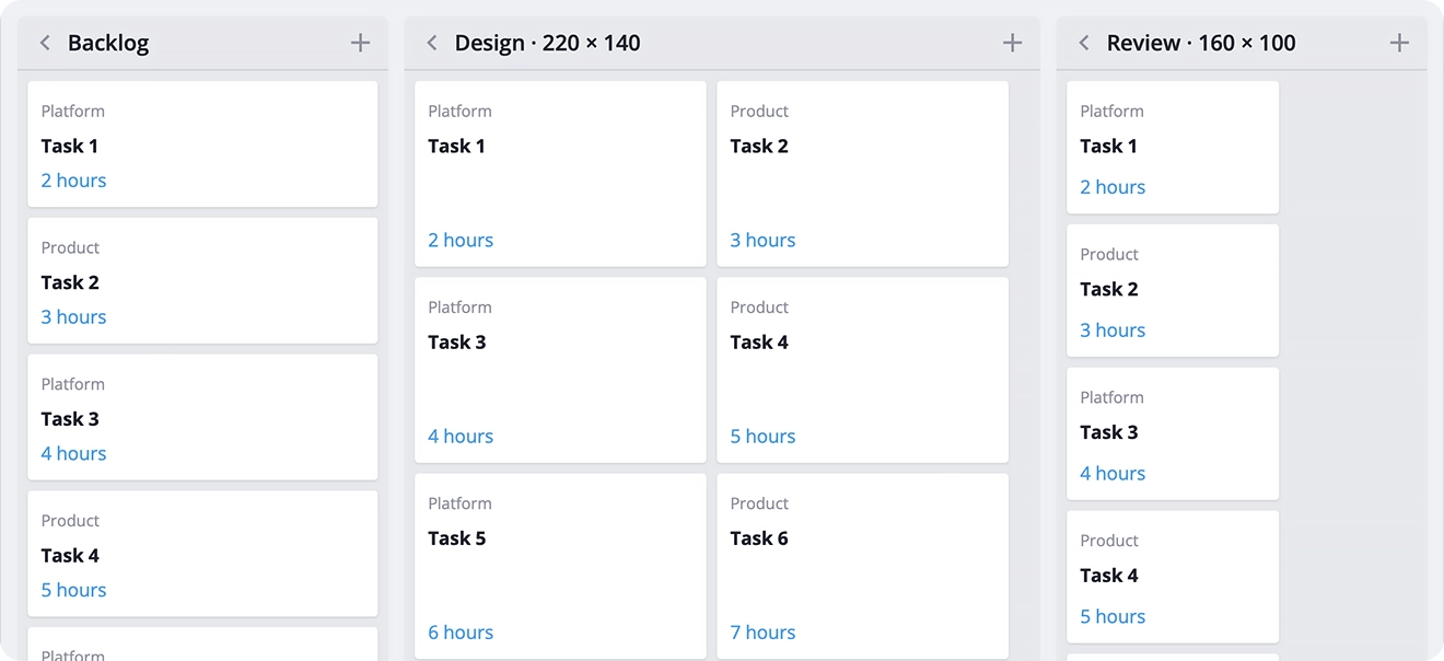
Use this feature for columns with image previews and a compact cardContent template that fits the tile:
const columns = [ { id: "backlog", label: "Backlog" }, { id: "design", label: "Design", width: 480, cardWidth: 220, cardHeight: 140 },];This works well for boards where cards are visual rather than text-heavy: design reviews, candidate shortlists, content calendars, or product backlogs with image previews. Instead of scanning a long list of titles, users see the work at a glance and compare options side by side.
👉 Card grid demo: React • Svelte • Vue
Easily Structure Board with Group Manager
If you do not want to build this UI yourself, the PRO edition of SVAR Kanban now includes GroupManager. It is a ready-made panel where users can add, rename, reorder, and delete columns and swimlanes.
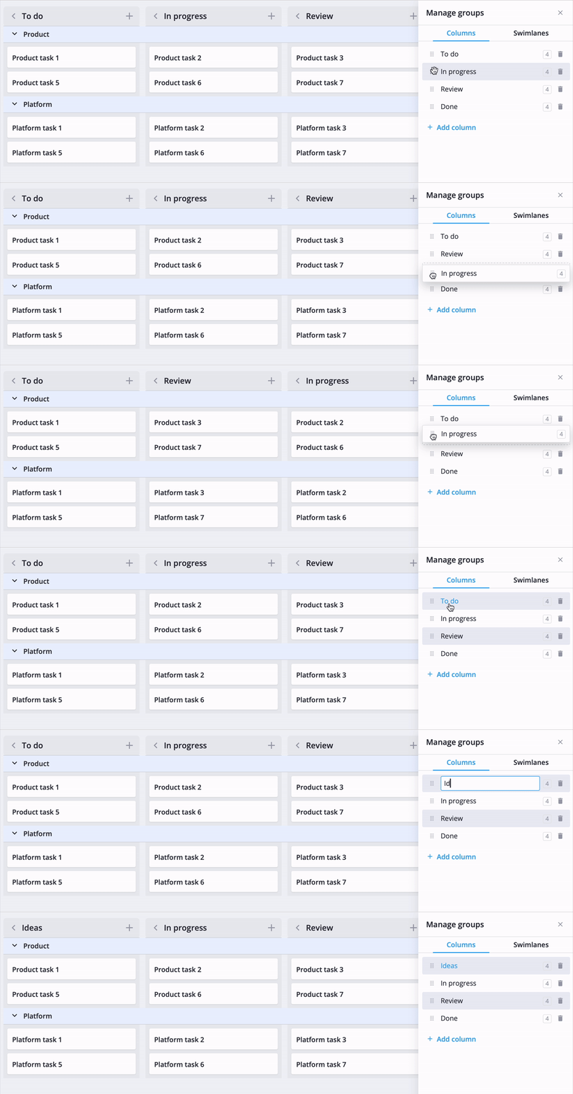
<GroupManager {api} placement="sidebar" onclose={() => (open = false)} />The panel never moves or deletes cards. Every edit goes through the regular actions, so RestDataProvider saves it like any other change.
The panel also shows how many cards each group contains. If cards still refer to a deleted group, you can restore that group with one click. Changes made in the UI go through the same actions as changes made in code, so they are saved in the same way.
👉 Group manager demo: React • Svelte • Vue
Before You Upgrade
⚠️ The new update introduces some breaking changes, but none of them should take long to fix:
cardLimitandoverLimitare removed. Use a column summary with your ownwipLimitkey, andcolumnCssto highlight a full column.card.menuaccepts only a boolean. Move the items from the old object form to the options prop ofCardActionMenu.ContextMenuis deprecated. UseCardContextMenu.deadline.formatuses wx format strings. Write"%Y-%m-%d"instead ofYYYY-MM-DD.users.sizeis removed. Usemaxinside theuserssection of the card shape to limit visible avatars.
Getting Started
Install the SVAR Kanban package for your framework:
npm install @svar-ui/react-kanbannpm install @svar-ui/svelte-kanbannpm install @svar-ui/vue-kanbanFor PRO features, try the 30-day trial with:
npm install @svar-ui/trial-react-kanbannpm install @svar-ui/trial-svelte-kanbannpm install @svar-ui/trial-vue-kanbanSVAR Kanban PRO requires a commercial license, see pricing: React • Svelte • Vue
Find the open-source, MIT-licensed version of SVAR Kanban on GitHub and give it a star to help other developers find the component:
Wrapping Up
SVAR Kanban 2.7 makes the board more flexible for real teams and real products. With a mobile-friendly stack layout, customizable column summaries, built-in menus, dynamic columns, richer card content, live updates, and swimlanes, it gives you more of the building blocks needed for a production-ready task board. And it is available as a native React, Svelte, and Vue component.
If you are updating an existing board, column summaries are a good place to start. They turn a hard-coded rule into a flexible way to track what matters to your team, while the rest of the board picks up the changes automatically.
Happy coding, and keep your tasks moving!