

Introduction
The major update of SVAR React DataGrid v2.3 is here – now with TypeScript support and React 19 compatibility!
This release is packed with powerful enhancements, including advanced filtering, accessibility, responsive mode, print support, and improved usability – all in a bundle of just 234 kB unpacked.
The React DataGrid is now available on GitHub under the MIT license, so feel free to fork the repo, post your feedback and feature request, or simply give it a star if you like it ⭐
Before we dive into the details, let’s take a look at the key new additions in v2.3:
- Accessibility - compatibility with WAI-ARIA
- Basic header filters
- Advanced filtering with React Filter (Query Builder)
- Popup editing form with React Editor
- Undo/redo support
- Per-cell editor control in columns
- Custom HTML support
- Responsive mode
- Print support
- UX improvements: smarter collapsible columns, row reordering
- React 19 compatibility
- TypeScript support
To get started with the upgraded SVAR React DataGrid, install the latest version of the component via npm:
npm install @svar-ui/react-grid⚠️ Note: starting from this major update SVAR React DataGrid is moved to @svar-ui/ namespace. For detailed installation and setup instructions, check out the getting started guide in the docs.
Now, let’s move on to a more detailed overview of the new DataGrid functionality.
Accessibility Features
This update enhances SVAR React DataGrid accessibility with screen reader support and upgraded keyboard navigation. These features align the component with the WAI-ARIA standard, making it compatible with assistive technologies and enabling smooth, intuitive navigation across the grid powered by the enriched set of hotkeys.
Column Filtering
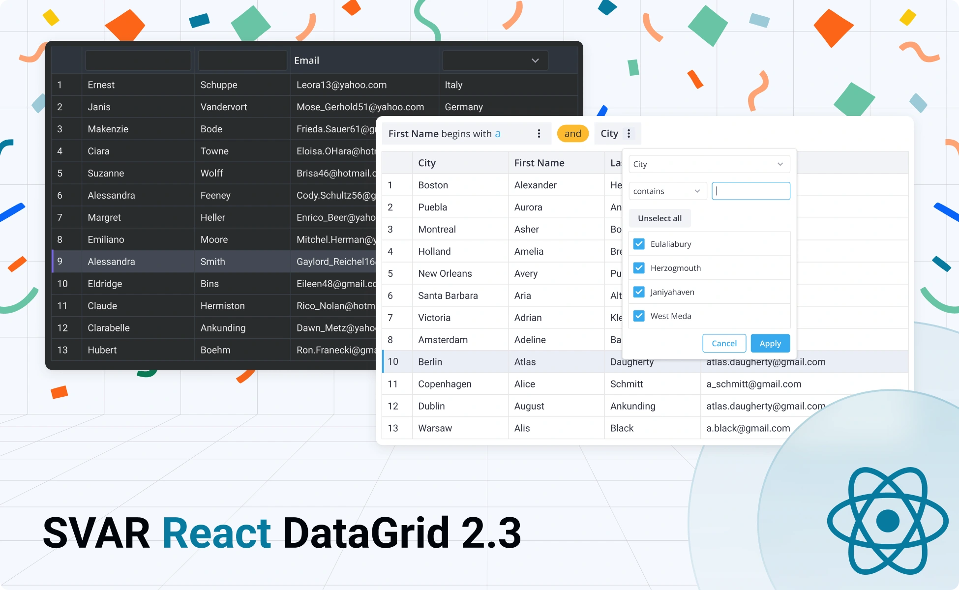
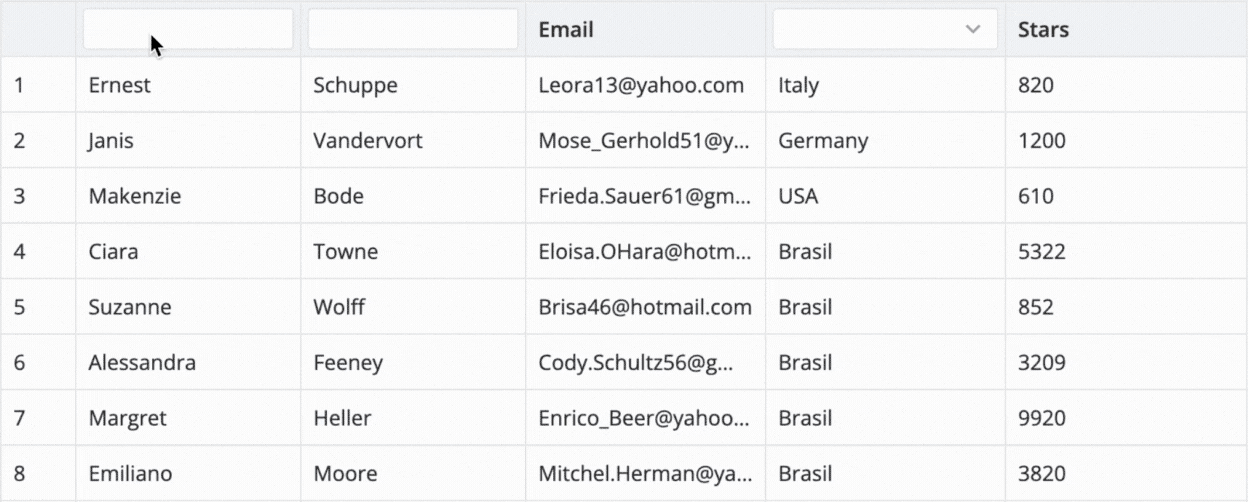
SVAR React DataGrid now supports configurable header filters. You can use built-in options (Text and Richselect) or define your custom filters.
The new filtering API supports integration of external filtering controls – from plain HTML to SVAR Core library components (text, select, date range picker). Multiple filter conditions use AND logic by default, with easy customization to OR logic.
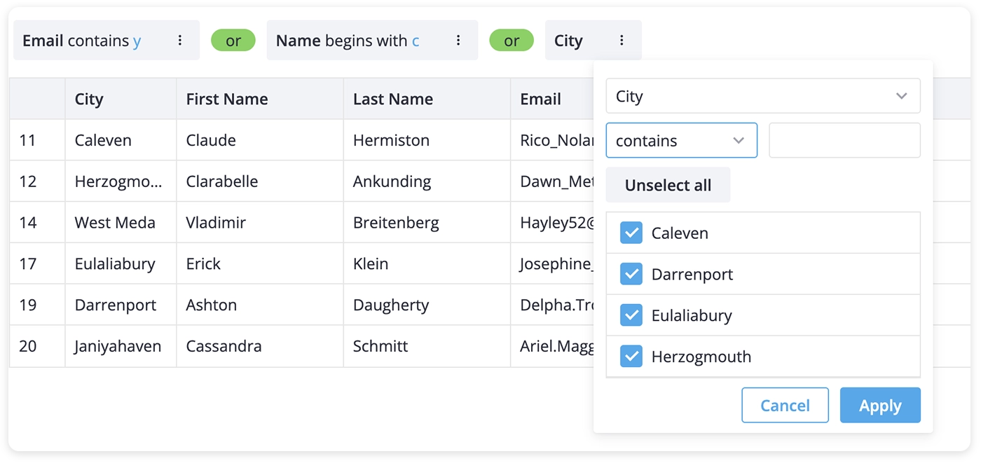
Integration with SVAR Filter
The DataGrid can now be integrated with the SVAR React Filter, a query builder component. This powerful integration allows applying advanced filters, combining multiple filtering conditions simultaneously, as well as mixing filters using AND/OR rules.
Integration with SVAR Editor
Another key update is that you can now integrate SVAR React Editor to provide end users with the ability to edit row data via a popup form or sidebar.
Users can double-click a row to open the Editor form and modify the necessary fields. This enhancement streamlines data entry and ensures a seamless editing experience across both desktop and mobile devices.
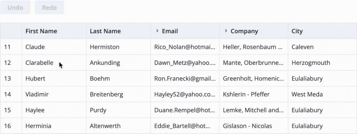
Undo/Redo Support
To complement rich editing capabilities, we’ve equipped SVAR React DataGrid with the Undo/Redo functionality. Whether you are modifying grid data inline or via the editor form, you can now easily undo/redo actions on rows and columns – such as adding, updating, or deleting records or adjusting columns by resizing, hiding or expanding them.
You can use standard ctrl+z and ctrl+y hotkeys or configure the Undo/Redo buttons depending on your project requirements.
Responsive Mode
DataGrid has been upgraded to simplify the creation of smartly scaled tables. The new responsive property activates a responsive mode that allows you to fine-tune your grid based on screen size.
The responsive mode lets you define the set of columns you want to display on different screens, configure grid parameters such as row, column, header, and footer dimensions, and apply your custom styles.
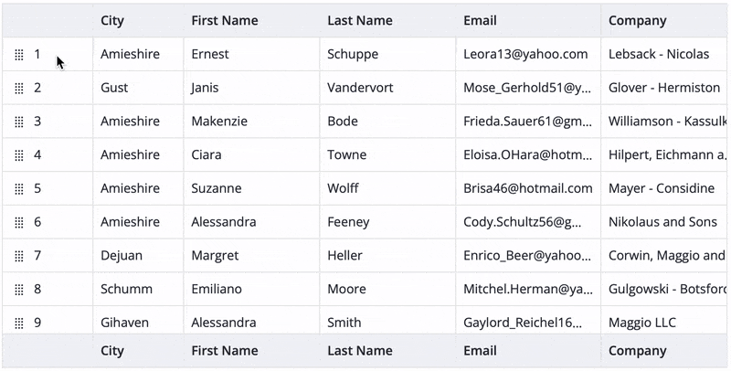
Row Reordering
Drag-and-drop row reordering is now available in SVAR React DataGrid, giving users a fast and intuitive way to rearrange table rows. To enhance usability, you can add a drag handle to explicitly show that the rows are movable, or skip it.
It’s worth noting that the new feature currently applies only to non-hierarchical data and is not compatible with tree-structured tables.
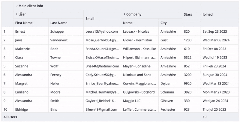
Custom HTML in Cells
Starting with version 2.3 DataGrid introduced support for custom HTML, including header and footer cells. The new functionality gives more control over the look and feel of your table. You are free to add your custom HTML elements or SVAR Core components. Use this new capability to boost interface clarity, guide user flow, or highlight key interface elements.
Different Cell Editors Per Column
Need more granular control over how your grid handles editing? SVAR React DataGrid introduces a new feature that allows you to define editable cells within a column. What’s more, you can add different editors to individual cells and not be limited to a single editor type per column. This is especially useful when your column stores mixed data formats.
Try different cell-editors in columns
Smarter Collapsible Columns
In this release we’ve refined the grid’s UI for collapsible columns. Now, when the setting collapsible: true is enabled, columns do not disappear entirely – users can see a full-height placeholder with the names of collapsed columns. To expand the desired column – just click the placeholder.
Print Support
This release introduces print support for DataGrid, allowing you to generate structured printouts of your tabular data. The print output includes the entire dataset – all rows and columns, even those outside the visible area. Users can choose page orientation (landscape or portrait), along with paper size and format, to match their layout requirements.
Wrapping Up
SVAR React DataGrid v2.3 marks a significant leap forward in accessibility, usability, and customization. With granular editing controls, advanced filtering, React 19 and TypeScript support this release gives you all necessary tools to build powerful data tables with ease.
Explore the demos, learn more about the new features in the documentation, and see how SVAR React DataGrid v2.3 can help you with your tabular data.