

Introduction
If you’re building with Svelte, you probably admire it for its simplicity, speed, and clean reactivity (just like many developers in the 2024 StackOverflow survey). And you likely enjoy building modular components that you can reuse across your apps. But sometimes, you don’t want to waste development time reinventing the wheel, and that’s when a proper UI component library can help. It may also simplify your design process, as UI libraries usually come with built-in styling solutions.
Choosing the right UI library can be tricky. Unlike React or Vue, Svelte’s ecosystem is still growing, and not every library out there is ready for production. In this article we’ll highlight the key factors to help you choose a library that fits your application’s needs and mention the best modern libraries for Svelte.
Why Svelte?
First, let’s quickly revisit why Svelte is a popular choice for projects of all sizes. While there’s a lot to love about it, here are some of the main reasons why we at SVAR chose Svelte for our development:
- Simple and readable syntax – Writing Svelte feels like using plain HTML, CSS, and JavaScript. No virtual DOM or boilerplate-heavy code. JavaScript developers can pick up most of Svelte in a day.
- Small bundles and performance - Svelte compiles your code into efficient JavaScript, producing small bundles and fast load times.
- Built-in scoped styling – Styles are scoped by default, keeping your CSS organized without extra tooling. This makes it easy to customize the look of the components without digging into the JS code.
- Modern reactivity with runes – Svelte 5 introduces runes: a cleaner, more flexible way to manage state and reactivity, especially in complex applications.
So how do you choose a library that actually works with Svelte, not against it?
Choosing a Svelte UI Components Library: 5 Key Factors
Here are some tips on what to look for when picking a UI library for your next Svelte project:
1. Native Svelte Components (No Wrappers)
The first thing to check: is this a true Svelte library or a wrapper around a vanilla JS kit? Svelte can integrate with JS libraries, but native Svelte components offer better reactivity, cleaner integration, and smaller bundles. They behave like any other Svelte component, making your development smoother.
2. Bundle Size and Performance
Svelte is lightweight and your UI library should be too. Look for libraries that support tree-shaking and don’t include unused components in the final build.
3. Styling Approach
Some libraries come with pre-styled components, while others offer flexibility with Tailwind, CSS modules, or plain CSS. Pre-styled libraries can be a great choice for quick prototyping or when you don’t have a dedicated designer, helping you ship faster with a consistent look.
On the other hand, if you already have a design system or prefer full control, choose a library that plays well with your styling approach without locking you into its aesthetics.
4. Component Coverage
It depends on the project. Sometimes you just need a reliable modal, select or datepicker; other times, you need a full set: form controls, tables, dropdowns, tabs, and more. Look for libraries that are composable (easy to mix, match, and extend) and don’t try to be all-in-one unless they do it really well.
Start with what you know you need. If your app is forms-heavy or data-driven, prioritize form inputs, validation, and a full-featured table/grid component. If it’s UI-focused, consider accessibility, animations, and visual consistency. Don’t adopt a huge library just because it might save time later, but test it against your real use cases.
5. Documentation and Maintenance
This one is huge. Check how often the library is updated and how active the maintainers are. Good docs, clean examples, and open issue handling go a long way, even in smaller libraries.
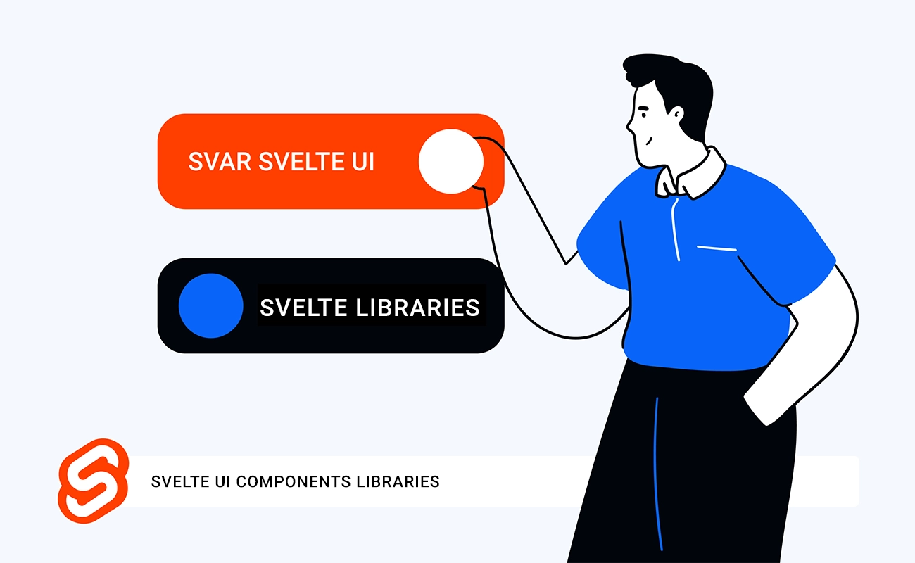
Spotlight: SVAR Svelte - UI Components for Enterprise Apps
With these factors in mind, we built SVAR Svelte components library specifically to address the gaps we saw in the ecosystem, particularly for data-heavy, enterprise applications.
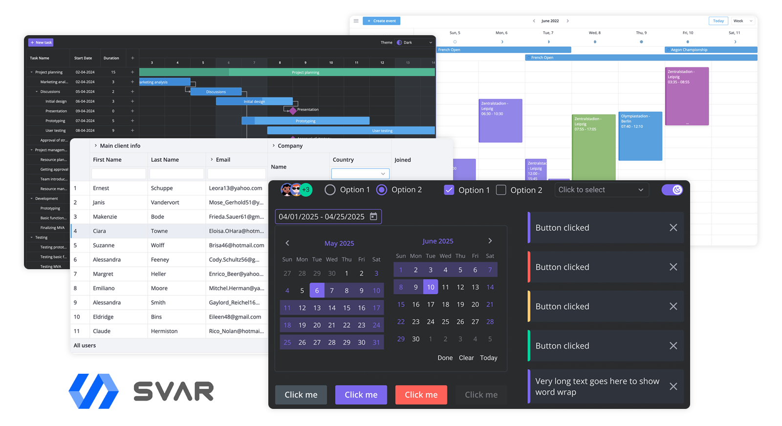
Here is what you find in SVAR Svelte:
- Native Svelte components: Svelte 5 ready, no wrappers.
- Rich Core library: Form controls and components for navigation and user interactions.
- Enterprise-focused components: Advanced DataGrid, Gantt, Filter (Query Builder), File Manager, with Calendar component coming soon.
- Built for data-heavy apps: Virtual scrolling, async data sources, localization, accessible data grid.
- Lightweight: SVAR Core library is just 155 KB (unpacked).
- Great developer experience: Consistent, straightforward API with clear documentation, full TypeScript support.
- Easy customization: Style components with plain CSS.
- Actively maintained: Ongoing updates and responsive issue handling.
SVAR Svelte components are a great fit for apps where data display and interaction are the core experience. Use them as a UI components kit or on its own. All components are free and open-source and available on GitHub.
Other Modern Svelte UI Libraries to Consider
Here are some other solid options, depending on your project needs:
- shadcn-svelte – An unofficial port of the popular React shadcn/ui. A collection of 40+ reusable, highly-customizable components built with Bits UI, Melt UI, and Tailwind CSS. You can copy and paste the components’ code or use the CLI to add a selected component to your app.
- Skeleton – A comprehensive design system built on Tailwind CSS that provides both styling utilities and functional components. It offers an opinionated yet flexible approach to building consistent user interfaces. While framework-agnostic at its core, Skeleton includes native Svelte components built on top of Zag.js primitives, making it easy to create cohesive, accessible interfaces without starting from scratch.
- Flowbite-Svelte – Built on top of Flowbite, this library offers a collection of 60+ modern, accessible UI components and interactive elements for Svelte, styled with Tailwind CSS utility classes. It comes with solid documentation and is actively maintained.
- daisyUI – While not technically a Svelte component library, DaisyUI is a popular Tailwind CSS plugin that works well with Svelte. It provides clean, pre-styled components with built-in theme support and minimal setup. It’s a great choice if you want to build interfaces quickly without writing custom styles from scratch.
Summing Up
The best Svelte UI components library is one that fits your design language, performance goals, and customization requirements. Run a quick prototype, inspect the bundle, skim the docs, and look at open issues.
Svelte makes building your own components easy, but a solid UI library can speed things up and reduce development time on complex projects. If you’re looking for advanced components like a data grid, Gantt chart, or a well-designed set of form controls and UI elements, take a look at our open-source SVAR Svelte components.
Pick smart. Build fast. Stay native.