

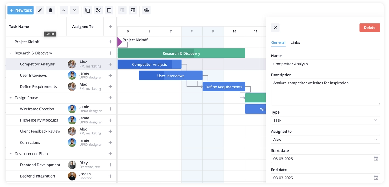
This tutorial walks through building a working Gantt chart in React — the kind you’d actually ship in a project planning tool. It explains how to use SVAR React Gantt to create a full-featured timeline that has phases and milestones, dependency links, and more. We’ll add a custom column for assigning team members, a hover card, a side-panel editor, a toolbar with a bulk action, and shaded weekends. Almost all of it lives in one component.
Getting the code to run is only half the point. Each step is accompanied with a short note on the reasoning behind it — how the data is modeled, how the imperative API threads through the components, how a column config turns into rendered UI.
Follow the tutorial, and you’ll understand how the Gantt component works — adapting it to your own project afterwards is straightforward.
A React Gantt Chart You’ll Build
You’ll end up with a React-based Gantt chart that includes:
- Regular tasks alongside milestones and summary rows
- Dependencies drawn as links
- A custom column that shows each assignee’s avatar and role
- A styled hover card instead of the plain default tooltip
- A side editor with an extra team-member picker
- A toolbar carrying an additional “assign to” menu that acts on the selection
- Grayed-out weekend columns on the timescale
Before You Start
If you’re starting from scratch, spin up a React app with Vite:
npm create vite@latest my-gantt -- --template reactcd my-ganttnpm installAdd the two SVAR React packages:
npm install @svar-ui/react-gantt @svar-ui/react-coreThe first package is the Gantt component. The second, @svar-ui/react-core, is our Core library of shared UI components; the only one we borrow here is RichSelect, which shows up in the editor near the end.
Step 1: Define the Data
The project is described by three plain arrays. Drop them in src/data.js:
export const tasks = [  {    id: 1,    start: new Date(2025, 2, 5),    text: "Project Kickoff",    type: "milestone",    parent: 0,  },
  {    id: 2,    text: "Research & Discovery",    type: "summary",    parent: 0,    open: true,  },  {    id: 21,    start: new Date(2025, 2, 5),    end: new Date(2025, 2, 8),    text: "Competitor Analysis",    parent: 2,    type: "task",    progress: 85,    assigned: 1,  },  {    id: 22,    start: new Date(2025, 2, 6),    end: new Date(2025, 2, 9),    text: "User Interviews",    parent: 2,    type: "task",    progress: 40,    assigned: 2,  },  {    id: 23,    start: new Date(2025, 2, 9),    end: new Date(2025, 2, 11),    text: "Define Requirements",    parent: 2,    type: "task",    assigned: 1,  },
  { id: 3, text: "Design Phase", type: "summary", parent: 0, open: true },  {    id: 31,    start: new Date(2025, 2, 11),    end: new Date(2025, 2, 14),    text: "Wireframe Creation",    parent: 3,    type: "task",    assigned: 2,  },  {    id: 32,    start: new Date(2025, 2, 14),    end: new Date(2025, 2, 17),    text: "High-Fidelity Mockups",    parent: 3,    type: "task",    assigned: 2,  },];
export const links = [  { id: 1, source: 1, target: 2, type: "e2s" },  { id: 2, source: 21, target: 23, type: "e2s" },  { id: 3, source: 22, target: 23, type: "e2s" },  { id: 4, source: 31, target: 32, type: "e2s" },];
export const teamMembers = [  { id: 1, label: "Alex", role: "PM", src: "./assets/pm.jpg" },  { id: 2, label: "Jamie", role: "Designer", src: "./assets/designer.jpg" },  { id: 3, label: "Riley", role: "Frontend", src: "./assets/frontend.jpg" },];
Why a separate file? Keeping data in src/data.js makes the main component easier to read and mirrors how you’d structure a real app — fetch tasks from an API, not inline. For this demo, we export static arrays, but the Gantt doesn’t care where the data comes from as long as it matches the shape shown below.
A few modeling choices worth calling out
Small details in these arrays drive most of the behavior further down:
- The
parentfield is the whole hierarchy:parent: 0means “top level”; point it at another task’sidand the row nests under that task instead. - Notice the summaries carry no dates: The Gantt derives a summary’s span from its children — first child start to last child end. Hard-code
start/endon a summary and you break that link; it will no longer track the tasks beneath it, so just omit them. - Dependencies live in their own array, keyed by id: A task record says nothing about what it depends on. The Gantt stitches
tasksandlinkstogether at render time. The"e2s"type is end-to-start: the target can’t begin until the source wraps up — by far the most common relationship.
Step 2: Render the Basic Gantt Chart
Start with the component itself, src/App.jsx:
import { Gantt, Willow } from "@svar-ui/react-gantt";import { tasks, links } from "./data.js";import "@svar-ui/react-gantt/all.css";import "./styles.css";
function Demo() {  return (    <Willow>      <div className="gantt-container">        <Gantt tasks={tasks} links={links} />      </div>    </Willow>  );}
export default Demo;
The component still needs to reach the page, and that happens in the entry file, src/main.jsx - Vite’s template already generated it. It mounts Demo into the <div id="root"> that sits in index.html:
import { StrictMode } from "react";import { createRoot } from "react-dom/client";import Demo from "./App.jsx";
createRoot(document.getElementById("root")).render(  <StrictMode>    <Demo />  </StrictMode>);
You won’t find this file in the demo snippet - the playground mounts the component for you and keeps its entry file out of sight, so every snippet starts at App.jsx. In your own project it’s the piece that puts the chart on the page.
Give the wrapper a height in src/styles.css:
html, body { margin: 0; padding: 0;}.gantt-container { height: 100dvh;}Start the dev server with npm run dev. The timeline should appear: task bars, diamond milestones, roll-up summaries, and arrows between dependent tasks.
That height rule isn’t optional
If the chart shows up blank, a height rule is almost always the reason. A React component claims no space on its own — its parent has to hand it a height. Skip the height: 100dvh (or a pixel value) and the Gantt collapses to nothing and looks broken. Any component that scrolls its own content behaves the same way; it’s not specific to our Gantt chart component.
100dvh here assumes the chart owns the whole window, which is true for this tutorial. Dropping the Gantt into an existing layout works the same way, only the height comes from the panel around it: size that panel, then go back to height: 100% on the wrapper. What matters either way is that some ancestor resolves to a real height - a chain of height: 100% that never reaches one collapses just like no rule at all.
Willow supplies the default look, the light theme. Leave it off and the chart renders raw, which is only useful when you’re rolling your own theme. One thing to note: all.css gets imported a single time for the whole app, not inside every component that uses the Gantt.
Step 3: Configure the Columns
By default the grid carries four columns - task name, start date, duration, and a ”+” add button. We’ll swap in our own set: the task name, an assignee column with avatars, and a narrow column holding an add button.
Start with the cell that renders an assignee. Save it as src/UserCell.jsx:
import { useMemo } from "react";import { teamMembers } from "./data.js";import "./UserCell.css";
function UserCell({ row }) {  const member = useMemo(    () => teamMembers.find(m => row.assigned == m.id),    [row.assigned]  );
  return (    <div className="container">      {member && (        <>          <div className="avatar">            <img className="user-avatar" alt="" src={member.src} />          </div>          <div className="info">            <span className="name">{member.label || ""}</span>            <span className="role">{member.role || ""}</span>          </div>        </>      )}    </div>  );}
export default UserCell;
With src/UserCell.css for the layout:
.container { display: flex; align-items: center; gap: 12px; width: 100%;}.avatar { width: 32px; height: 32px; border-radius: 50%; background-color: #dfe2e6;}.user-avatar { width: 100%; height: 100%; border-radius: 50%; object-fit: contain;}.info { display: flex; flex-direction: column; align-items: flex-start;}.name { line-height: 16px;}.role { font-size: 12px; line-height: 16px; color: var(--wx-color-font-alt);}Now describe the columns in App.jsx. Keep the array outside the component — it’s a constant, so there’s no point recreating it on each render:
import { Gantt, Willow } from "@svar-ui/react-gantt";import { tasks, links, teamMembers } from "./data.js";import UserCell from "./UserCell.jsx";import "@svar-ui/react-gantt/all.css";import "./styles.css";
const columns = [  { id: "text", header: "Task name", width: 230 },  {    id: "assigned",    header: "Assigned to",    options: teamMembers,    width: 140,    align: "center",    cell: UserCell,  },  { id: "add-task", header: "", width: 50, align: "center" },];
function Demo() {  return (    <Willow>      <div className="gantt-container">        <Gantt tasks={tasks} links={links} columns={columns} />      </div>    </Willow>  );}
export default Demo;
Refresh, and the grid gains its three columns — name, avatar-backed assignee, and a per-row ”+”.
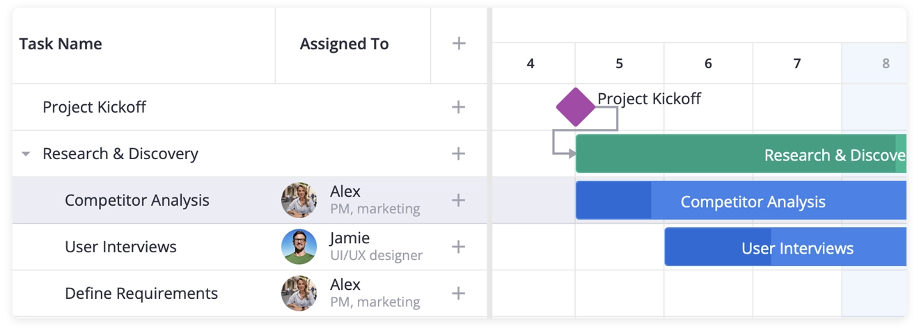
What each column setting does
Three keys carry the weight here:
cell: UserCellswaps out the plain-text default. The Gantt instantiates your component and feeds it the row as arowprop, so the cell can pull whatever it needs off that object.options: teamMemberslooks cosmetic but isn’t. It tells the widget which values this column can legitimately hold, and the built-in editor reads from it. Step 5 relies on that.id: "add-task"is a name the Gantt recognizes. Give a column that id and you get a wired-up ”+” button for free — clicking it fires theadd-taskaction with no handler on your side.
Step 4: A Custom Tooltip on Hover
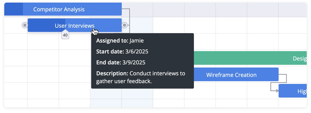
The default tooltip shows the task name and nothing else. Let’s replace that with a card showing dates and the assignee. Create src/TooltipContent.jsx:
import { teamMembers } from "./data.js";import "./TooltipContent.css";
function TooltipContent({ data }) {  if (!data) return null;
  const { task } = data;  const { assigned, start, end } = task;  const assignedMember = assigned    ? teamMembers.find(m => assigned == m.id)    : null;
  return (    <div className="data">      {assigned && assignedMember && (        <div className="text">          <span className="caption">Assigned to: </span>          {assignedMember.label}        </div>      )}      {start && (        <div className="text">          <span className="caption">Start date: </span>          {start.toLocaleDateString()}        </div>      )}      {end && (        <div className="text">          <span className="caption">End date: </span>          {end.toLocaleDateString()}        </div>      )}    </div>  );}
export default TooltipContent;
And its styles, src/TooltipContent.css:
.data { background-color: #2b343b; padding: 8px 12px; width: 260px;}.text { font-family: var(--wx-font-family); color: #ffffff; font-size: 14px; line-height: 20px;}.text + .text { margin-top: 8px;}.caption { font-weight: 600;}To hook it up we finally need a handle on the Gantt’s API, which means introducing component state:
import { useState } from "react";import { Gantt, Willow, Tooltip } from "@svar-ui/react-gantt";import TooltipContent from "./TooltipContent.jsx";// ...other imports
function Demo() {  const [api, setApi] = useState();
  return (    <Willow>      <div className="gantt-container">        <Tooltip api={api} content={TooltipContent}>          <Gantt            init={setApi}            tasks={tasks}            links={links}            columns={columns}          />        </Tooltip>      </div>    </Willow>  );}
Move the pointer over a bar and the card pops up with the assignee name and dates. Note that in the snippet there is also task description visible on the tooltip, but we skipped it in this tutorial so it won’t be too long.
Why the Tooltip wraps the chart — and how the API arrives
Tooltip watches for hover events across everything it contains, then queries the Gantt’s API to figure out which task the cursor is over. That coupling is why it has to sit around the chart and why it needs the API handle.
React has no bind:this, so the Gantt component gives you the API a different way: it invokes an init callback exactly once and passes the API object in. That object exposes the imperative surface — getState, exec, intercept, on, and more. Passing setApi as init stashes it in state, which re-renders the neighbors (Tooltip now, the editor and toolbar shortly) with a working reference. Everything shares that single object.
The hovered task reaches TooltipContent via the data prop as a { task, segmentIndex } object — its task field is shaped exactly like an entry in your tasks array.
Step 5: A Sidebar Editor with a Custom Assignee Field
SVAR React Gantt comes with a right-side editor for editing task data and progress in a simple form. The editor is based on SVAR React Editor component and by default it loads with name, description, type, start and end dates, duration, and progress fields.
As we’ve earlier added a custom “Assigned To” column, we want to add one more field to the editor: an “Assigned to” picker built on RichSelect from @svar-ui/react-core, so it lists each member with their name and role.
RichSelect has to be registered under a name the editor can reference. That’s a one-shot setup, so it belongs at module scope, above the component:
import { useMemo } from "react";import {  Gantt,  Willow,  Tooltip,  Editor,  getEditorItems,  registerEditorItem,} from "@svar-ui/react-gantt";import { RichSelect } from "@svar-ui/react-core";
registerEditorItem("select", RichSelect);
Grab the default field list and insert your own entry. useMemo builds it once instead of on every render:
const fields = useMemo(() => { const items = getEditorItems(); items.splice(3, 0, { key: "assigned", comp: "select", label: "Assigned to", options: teamMembers, config: { placeholder: "Select the team member" }, isHidden: task => task.type == "summary", }); return items;}, []);Render the editor next to the chart, but only once the API is available:
<Tooltip api={api} content={TooltipContent}> <Gantt init={setApi} tasks={tasks} links={links} columns={columns} /></Tooltip>{api && <Editor api={api} items={fields} />}Pick any task and the panel slides in with the standard fields plus your assignee picker.
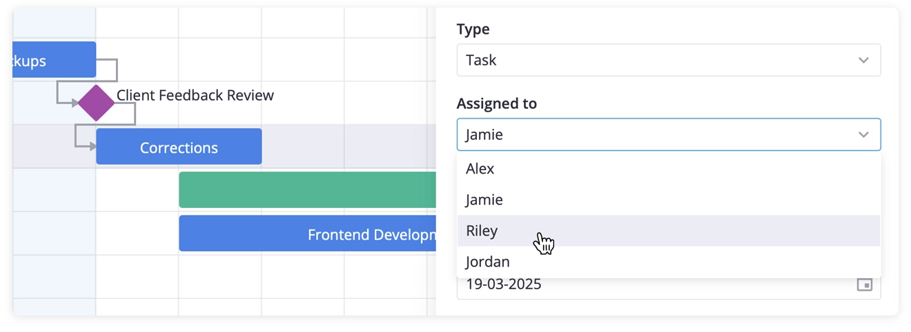
Editing the field list instead of replacing it
getEditorItems() hands back a brand-new array of the built-in field definitions, and it’s yours to modify — splice, push, filter, reorder, whatever. Inserting at index 3 drops “Assigned to” after the task’s “Name”, “Description” and “Type” fields, which is the most natural spot for it.
The comp: "select" value is the name we registered a moment ago; the editor resolves it back to RichSelect and renders that component. isHidden: task => task.type == "summary" pulls the field when a summary is selected — phase rows don’t get an assignee. The callback is handed whichever task is open, so use it for any “show this field only when…” rule.
The {api && <Editor ... />} check earns its keep in React: on the first paint api is still undefined, because init hasn’t run yet. Holding the editor back until the API exists keeps you from handing it a missing reference.
Step 6: A Toolbar with a Bulk-Assign Dropdown
We’ll do the same trick with the toolbar: keep the defaults, tack on a separator, then a collapsible menu of team members. Choosing one assigns every selected task to that person in a single move.
The menu handler needs the live API, so build the button list inside useMemo with api in the dependency array — it rebuilds the moment the API shows up:
import { Toolbar, getToolbarButtons } from "@svar-ui/react-gantt";
const buttons = useMemo(() => {  function actionHandler(ev) {    if (!api) return;    const member = ev.id;    const { selected } = api.getState();    selected.forEach(id => {      api.exec("update-task", {        id,        task: { assigned: member },      });    });  }
  return getToolbarButtons().concat([    { comp: "separator" },    {      id: "assign",      icon: "wxi-assign",      menu: true,      collapsed: true,      layout: "column",      isHidden: task => task.type == "summary",      items: teamMembers.map(t => ({        ...t,        comp: "item",        text: t.label,        handler: actionHandler,      })),    },  ]);}, [api]);
Sit the toolbar on top of the chart, wrapping the pair in a flex column so the chart stretches to fill what’s left:
<Willow> <div className="content"> <Toolbar api={api} items={buttons} /> <div className="gantt-container"> <Tooltip api={api} content={TooltipContent}> <Gantt init={setApi} // We'll replace this with a custom init in Step 7 tasks={tasks} links={links} columns={columns} /> </Tooltip> {api && <Editor api={api} items={fields} />} </div> </div></Willow>Replace the height rule in styles.css with:
.content { height: 100dvh; width: 100%; box-sizing: border-box; display: flex; flex-direction: column; overflow: hidden;}.gantt-container { flex: 1; min-height: 0;}Ctrl/Cmd+click a couple of tasks, open the assign menu, and pick a member — all of them flip to that person in one shot.
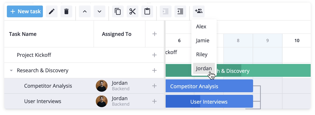
Inside actionHandler
Two calls carry it:
api.getState()hands back the current Gantt state, and we readselectedoff it — the list of ids the user has highlighted.api.exec("update-task", ...)runs the update through the exact pipeline a manual edit would use. Subscribers fire, the chart repaints, and an open editor refreshes itself. Reaching into the task array by hand skips all of that, so always route changes throughexec.
menu: true plus collapsed: true turns the button into a dropdown that shrinks to an icon; items is what fills the dropdown. The button’s own isHidden removes the whole control while a summary row is active.
The [api] dependency is the crux in React. Before init fires the handler would close over an undefined API; once setApi runs, the memo recomputes and rebuilds the buttons around the real thing.
Step 7: Defaults for New Tasks
That ”+” column hands users a quick add button, but the default add-task payload has no assigned key — so the editor opens with an empty picker. We fix it by intercepting the action in init and slotting in a default, which also happens to be where we capture the API.
Trade the bare init={setApi} for a useCallback that does both jobs:
import { useCallback } from "react";
const init = useCallback(api => {  setApi(api);  api.intercept("add-task", ev => {    ev.task = { ...ev.task, assigned: "" };  });}, []);
Hand it to the Gantt and replace init={setApi} with init={init} in the Gantt:
<Gantt init={init} tasks={tasks} links={links} columns={columns} />intercept versus on
The API gives you two hooks that sound alike:
interceptfires ahead of the action and can rewrite the event payload — or stop the action entirely by returningfalse. It’s the place for defaults, validation, and gatekeeping.onfires after the action has gone through. Reach for it when you’re reacting to a done deal: pushing to a backend, recording undo state, logging analytics.
Defaults belong in intercept because we want the new task to already carry assigned: "" as it moves down the pipeline, not to be corrected once it’s landed. And since the Gantt calls init a single time with the API, it’s the tidy place to both save that reference and register the interceptor. The empty dependency array on useCallback keeps the function identity stable across renders.
Step 8: Weekend Shading and Cell Sizing
We’re almost done, with only two finishing touches left. Weekend highlighting first — define these helpers at module scope:
function isWeekend(date) {  const d = date.getDay();  return d == 0 || d == 6;}
function highlightTime(date, unit) {  if (unit == "day" && isWeekend(date)) return "wx-weekend";  return "";}
The Gantt calls highlightTime for each day (or hour) cell on the scale — the zoom levels this demo uses — so gating on unit == "day" keeps the shading confined to the day columns.
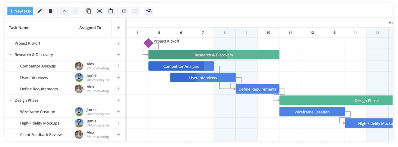
Then loosen up the cells, to give the chart more space and better UX:
<Gantt init={init} tasks={tasks} links={links} columns={columns} cellWidth={80} cellHeight={42} highlightTime={highlightTime}/>Reload and you’ve got shaded weekends and a roomier grid.
Tutorial Recap
Across one App.jsx and a handful of supporting files — data.js, UserCell.jsx, TooltipContent.jsx, and their stylesheets, we’ve created a basis for production-ready Gantt chart that supports:
- Tasks, summary tasks, milestones, and dependency links
- Custom columns, including one with avatars and roles for assignees
- Custom tooltips that display task details on hover
- A sidebar editor extended with a
RichSelectassignee field - A toolbar that pairs the standard buttons with a bulk-assign menu
- Weekend shading and custom cell sizing
Each step came with detailed explanations, so you should now understand how the API works and how to customize it. From here, retargeting the demo at your own data is mostly find-and-replace.
Get Started with SVAR React Gantt
In this tutorial, we used the open-source version of SVAR React Gantt to show you what’s possible with its free features. If you need more, SVAR React Gantt PRO builds on this foundation with enterprise-grade capabilities: critical path analysis, resource management, auto-scheduling, split tasks, baselines, summary tasks automation, and more.
Whether you’re building project management software or any app with task/process workflows, SVAR React Gantt can help you ship faster. To get started:
- Quick start - get a basic chart running in 5 minutes, plus integration guides with Next.js and state management libraries
- Live demos — explore each feature with working code
- AI tools — MCP server, skills, and context packs for your coding assistant
If you found this guide and SVAR React Gantt useful, give it a star on GitHub - it helps the project grow and evolve.
Happy coding!