

Introduction
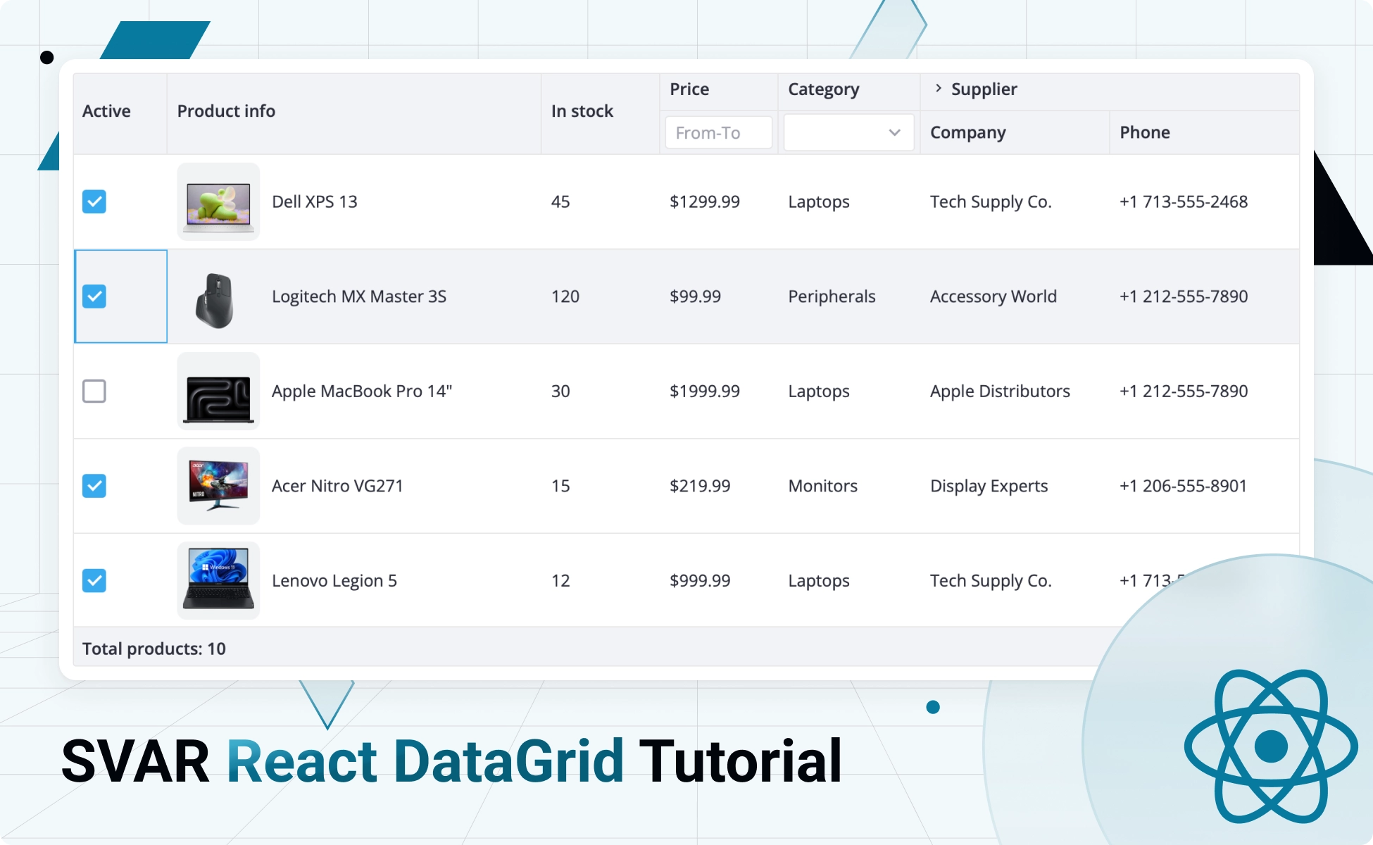
In this guide, we’ll show you how to create an interactive, full-featured data table with SVAR React DataGrid. You’ll learn how to build an inventory table and add all the essential functionality it needs to both display and manage product details, stock levels, pricing, categories, and supplier information.
You’ll build a table with the following features: sorting, in-cell editors (text, numbers, select, custom HTML), filters (from-to, select), collapsible columns, and checkbox selection.
- Demo package: see the demo with code (use the menu in the top right corner to download the package)
- How to get started: SVAR React DataGrid docs
- Prerequisites: React version 18 or higher.
Why SVAR React DataGrid?
Here is why SVAR DataGrid is a good choice for building fast and reliable React data tables:
- MIT license: the component is completely free (see it on GitHub)
- Feature rich: sorting, filtering, frozen columns, rows reordering, responsive mode, in-cell editing, and more
- Really fast: virtual scrolling for both rows and columns
- Accessible: WAI-ARIA compliance and keyboard support
- Easy-to-use: comprehensive docs, extensive API references, and TypeScript support.
How to Set Up and Feed Table with Data
Installing the packages
To start using SVAR DataGrid in a React application, you need to navigate to your project directory and install the grid package with npm:
npm install @svar-ui/react-gridTo reproduce the demo grid, we also need to include SVAR React Core in our project. This free UI library provides essential controls that can easily be integrated into React apps: buttons, form controls, popups, calendar, etc. In our DataGrid, we’ll use a checkbox control for one of the columns.
npm install @svar-ui/react-coreAdding DataGrid to a React App
Once all the required packages are installed, we can move on to the next step – adding DataGrid to our app. This is how we’ll do that.
First, we need to import the DataGrid itself, the desired built-in theme (Willow or WillowDark) and the entire stylesheet that ensures the table is rendered correctly:
import { Grid } from "@svar-ui/react-grid";import { Willow } from "@svar-ui/react-core";import "@svar-ui/react-grid/all.css";Then, we can add the DataGrid component to JSX and wrap it with the theme we’ve chosen:
<Willow> <Grid /></Willow>To finally see our DataGrid rendered on the page, we need to set up its structure and provide the data it will display.
Defining Structure and Populating the DataGrid
As we use the DataGrid for rendering and managing product inventory details, we’ll need the following columns: Active (shows the product’s status), Product info, In stock (shows the number of available units), Price, Category, Supplier (with Company and Phone subcolumns).
Now that we’ve settled on the column names, let’s create an array of JavaScript objects that will reflect the structure of the grid. Each object will describe the corresponding column of the table and will have the following properties:
id– to identify the data field to be displayed in the column;header– to define the name of the column header;widthandflexgrow– to set a fixed width or make the column flexible;resize– to enable column resizing.
const columns = [ { id: "available", header: "Active", width: 80, resize: true, }, { id: "name", header: "Product info", width: 270, flexgrow: 1, resize: true, },/* other columns */];Later in this guide, we are going to extend the number of properties to add interactive features to the columns.
We’re done defining the DataGrid structure – great! Let’s move on to filling our table with data. The DataGrid expects a JS array of plain objects, so we’ll pass this array directly to the component. The dataset should look this way:
export const data = [ { id: 1, name: "Dell XPS 13", price: 1299.99, quantity: 45, category: 1, available: true, supplier: "Tech Supply Co.", phone: "+17135552468", photo: "./assets/dell-xps-13.png", }, { id: 2, name: "Logitech MX Master 3S", price: 99.99, quantity: 120, category: 3, available: true, supplier: "Accessory World", phone: "+12125557890", photo: "./assets/logitech-mx-master-3s.png", }, /* other records */];In case your data comes from the server in JSON format, you’ll need to parse it into JS objects. In this guide we use a simplified approach to populating the table, as the interaction with the server is outside its scope.
Nice work! We are almost there. All that remains is to provide columns and data to the DataGrid component via props:
export default function Demo() { return ( <Grid data={data} columns={columns} /> );}Сustom Cell Templates
Now, let’s look closer at the table we’re building – the Active and Product info columns need some extra content: a checkbox for toggling the product’s status and the item’s image with a title.
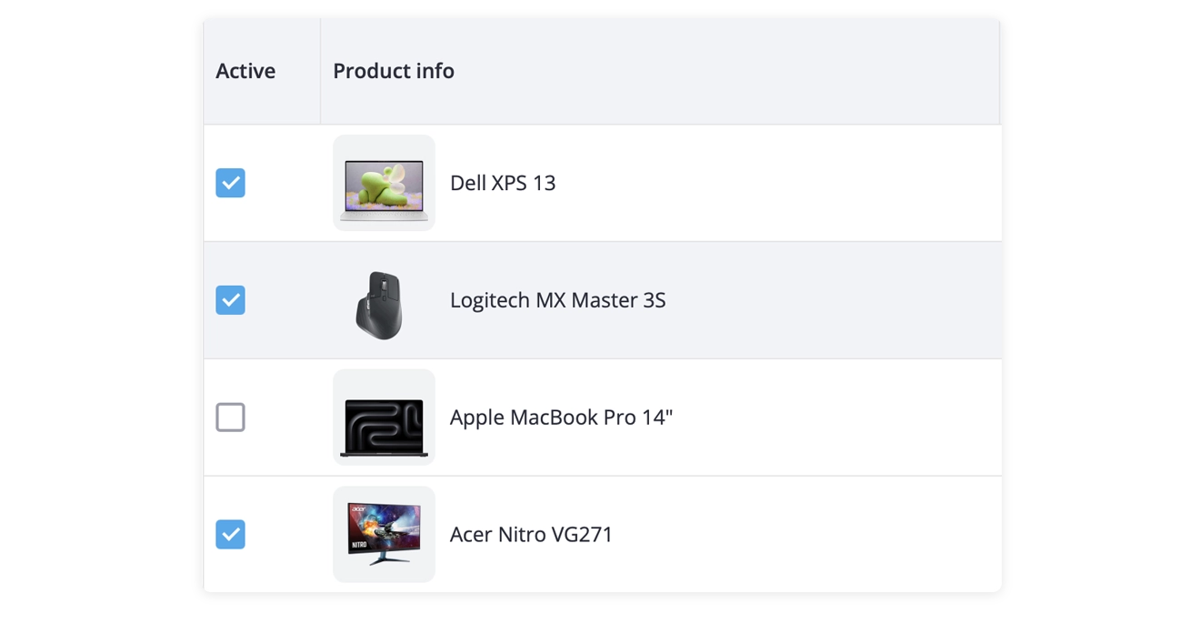
No workaround is required here – SVAR React DataGrid allows you to use custom templates inside table cells. You simply create a separate React component and assign it to the column’s cell property.
Let’s take the Product info column as an example and see how it works:
- creating a React component (it will render the product’s image and title):
export default function ContentCell({ row }) { return ( <div className="content-container"> <div className="img-container"> <img className="img" src={row.photo || ""} alt={row.name} /> </div> {row.name} </div> );}- passing it to the column:
const columns = [... { id: "name", header: "Product info", width: 270, flexgrow: 1, cell: ContentCell, resize: true, },/* other columns */];Column Filters
To enhance the DataGrid with interactive features, we’ll introduce filtering for the Price and Category columns. Here, SVAR DataGrid gives us plenty of flexibility – we can use built-in filters or apply our own custom filtering logic. We’ll add filters via the filter property inside the column’s header configuration.
For the Price column, we’ll use a text filter extended with a custom handler that will allow us to filter products by entering minimum and maximum values.
//The Text filter handlerconst priceFilter = (value, filter) => {    if (!filter) return true;    const [min, max] = filter.split("-").map(v => parseFloat(v.trim()));    if (isNaN(max)) return value >= min;    return value >= min && value <= max;};

//Adding the filter and custom handler to the columnconst columns = [...    {        id: "price",        header: [            { text: "Price" },            {                filter: {                    type: "text",                    config: {                        placeholder: "From-To",                        handler: priceFilter,                    },                },            },        ],        width: 100,        resize: true,    },/* other columns */]
For the Category column, we’ll apply a built-in richselect filter. For this type of editor we also need to specify an array of options and assign it to the options property.
const columns = [... { id: "category", header: [ { text: "Category" }, { filter: "richselect", }, ], width: 120, options: categories, resize: true, },/* other columns */]export const categories = [ { id: 1, label: "Laptops", }, { id: 2, label: "Monitors", }, { id: 3, label: "Peripherals", },];Nested and Collapsible Columns
Let’s now take a look at the Supplier column (which is technically a group header). It is collapsible and has two nested columns – Company and Phone. These features are supported natively in SVAR React DataGrid and can be enabled with only a few configuration options.

To create a grouped header (Supplier in our case) with two child columns (Company and Phone), we need to set the parent header’s colspan to 2 and then define the corresponding number of columns that will be rendered under this shared header.
To make the header collapsible, we just need to add collapsible: true to its config.
const columns = [/* other columns */ { id: "supplier", header: [ { text: "Supplier", colspan: 2, collapsible: true }, "Company", ], resize: true, }, { id: "phone", header: ["", "Phone"], resize: true, },]Footer Spans
Just like headers, we can also span footers. For our inventory table, we’ll create a footer that spans all grid columns and displays the total number of products. This is what we need to add to the column config:
footer: { text: `Total products: ${data.length}`, colspan: 7 }Inline Editors
It is difficult to imagine an inventory table without editable records, so we couldn’t overlook this functionality.
In SVAR React DataGrid, editors can be applied to individual cells or to an entire column – the second option is what we need. In the demo table, we used two inline editors – text and richselect. We added them to the columns via the editor parameter:
const columns = [... { id: "name", header: "Product info", width: 270, flexgrow: 1, editor: "text", cell: ContentCell, resize: true, },]Please, note that for the richselect editor, we need to provide an array of options. In this case, we can simply reuse the one defined for the richselect filter.
Formatting Column Data
For the Price and Phone columns, we want to format data before it’s rendered in the table. In case we want the product’s price to be displayed in dollars, we are expected to:
- write a handler for the Price column;
- pass it to the dedicated column config using the template property.
//Defining a handlerconst priceFormat = v => "$" + v;

//Adding the handler to the columnconst columns = [...    {        id: "price",        header: [            { text: "Price" },            {                filter: {                    type: "text",                    config: {                        placeholder: "From-To",                        handler: priceFilter,                    },                },            },        ],        width: 100,        template: priceFormat,        editor: "text",        resize: true,    },/* other columns */]
You can check the demo code to see how the handler for phone formatting works.
Sorting
Finally, we’ll turn on sorting for the table columns. In SVAR React DataGrid, it’s a native feature that is implemented in a very straightforward way. You just add sort: true to each column config:
const columns = [...    {        id: "quantity",        header: "In stock",        width: 100,        editor: "text",        resize: true,        sort: true,    },

/* other columns */];
Conclusion
This guide highlighted some of the core capabilities of SVAR React DataGrid: custom cell templates, filtering, nested headers, inline editors, formatting, sorting, and more.
These features already allow you to build highly interactive and functional tables, but the grid offers far more capabilities than we could reasonably cover in a single article. If you’d like to explore advanced features, configuration options, and additional examples, visit the DataGrid documentation or check the demos for a deeper dive.
⭐ Give our open‑source SVAR React DataGrid a try and if you like it, star it on GitHub! We’d appreciate your feedback - submit an issue or join the conversation on our community forum.