

If you’re building a project management app with Vue 3 and need a Gantt chart to visualize your project timeline clearly and effectively, you have two options. You can either build the timeline yourself, spending hours if not weeks on it, or use a pre-built Gantt component like SVAR Vue Gantt.
This tutorial explains how to use the open-source version of SVAR Vue Gantt to build a production-ready Gantt chart with drag-and-drop task management, task types (tasks, summary tasks, milestones), dependency visualization, task tooltips, a task edit form, and a custom “assigned to” column for resource allocation.
Adding a Gantt chart is the easy part — the quick start guide has you covered. This tutorial goes through the details behind each step: how the records are modeled, how the API connects to the surrounding components, how a column definition becomes rendered UI. Once that clicks, pointing the demo at your own data is routine.
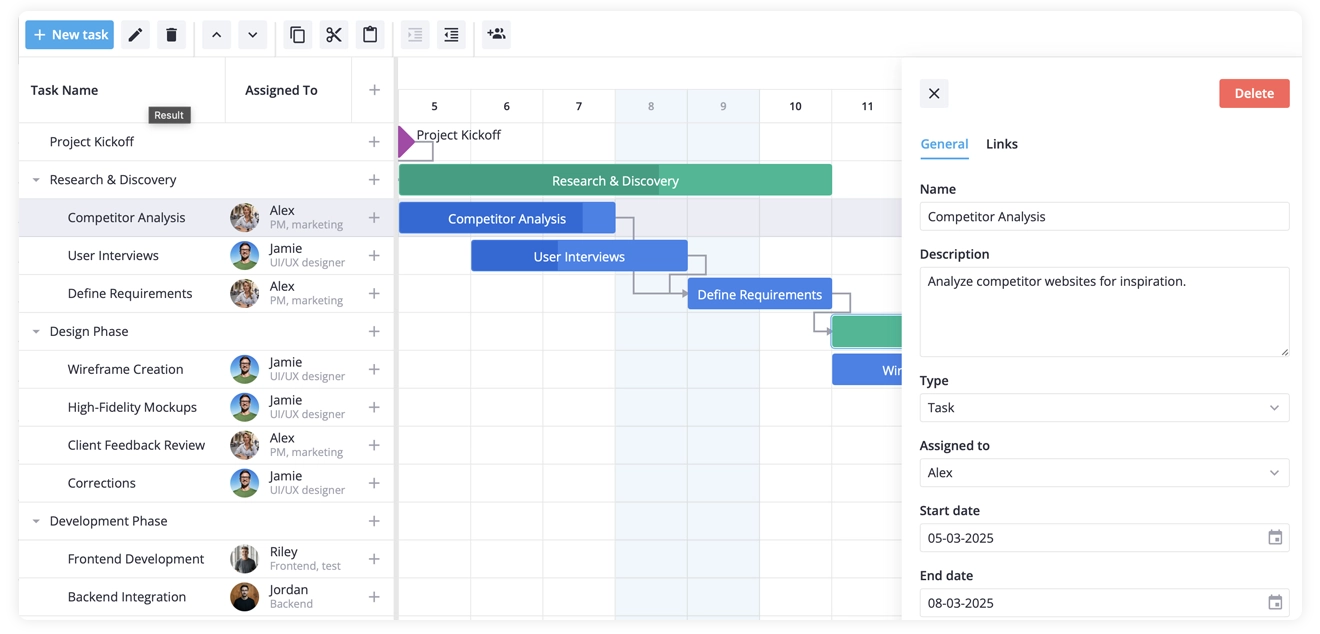
What You’ll Build
You’ll end up with an interactive Vue 3 Gantt chart that visualizes a project, lets users edit tasks on the timeline or in the built-in editor, and supports:
- A hierarchical task structure (plain tasks & summary tasks)
- Milestones and dependencies
- A custom column with each assignee’s avatar and role
- A prebuilt ”+” column for creating tasks
- A styled hover card in place of the default tooltip
- A task editor with an assignee picker
- A toolbar with a custom “assign to” button that works on the selection
- Weekend columns shaded gray
Before You Start
Bootstrap a Vue 3 app with Vite if you need one:
npm create vite@latest my-gantt -- --template vuecd my-ganttnpm installPull in the SVAR Vue Gantt and SVAR Vue Core packages:
npm install @svar-ui/vue-gantt @svar-ui/vue-core@svar-ui/vue-gantt is the Gantt chart itself. @svar-ui/vue-core is a library of shared UI elements used across SVAR components; we use two of them here — RichSelect in the editor and Locale, which supplies localization context around the chart.
Step 1: Define the data
Three ordinary arrays describe the whole project: the tasks themselves, the dependency links between them, and the team members you can assign work to. Put them in src/data.js:
export const tasks = [  {    id: 1,    start: new Date(2025, 2, 5),    text: "Project Kickoff",    type: "milestone",    parent: 0,  },
  {    id: 2,    text: "Research & Discovery",    type: "summary",    parent: 0,    open: true,  },  {    id: 21,    start: new Date(2025, 2, 5),    end: new Date(2025, 2, 8),    text: "Competitor Analysis",    parent: 2,    type: "task",    progress: 85,    assigned: 1,  },  {    id: 22,    start: new Date(2025, 2, 6),    end: new Date(2025, 2, 9),    text: "User Interviews",    parent: 2,    type: "task",    progress: 40,    assigned: 2,  },  {    id: 23,    start: new Date(2025, 2, 9),    end: new Date(2025, 2, 11),    text: "Define Requirements",    parent: 2,    type: "task",    assigned: 1,  },
  { id: 3, text: "Design Phase", type: "summary", parent: 0, open: true },  {    id: 31,    start: new Date(2025, 2, 11),    end: new Date(2025, 2, 14),    text: "Wireframe Creation",    parent: 3,    type: "task",    assigned: 2,  },  {    id: 32,    start: new Date(2025, 2, 14),    end: new Date(2025, 2, 17),    text: "High-Fidelity Mockups",    parent: 3,    type: "task",    assigned: 2,  },];
export const links = [  { id: 1, source: 1, target: 2, type: "e2s" },  { id: 2, source: 21, target: 23, type: "e2s" },  { id: 3, source: 22, target: 23, type: "e2s" },  { id: 4, source: 31, target: 32, type: "e2s" },];
export const teamMembers = [  { id: 1, label: "Alex", role: "PM", src: "./assets/pm.jpg" },  { id: 2, label: "Jamie", role: "Designer", src: "./assets/designer.jpg" },  { id: 3, label: "Riley", role: "Frontend", src: "./assets/frontend.jpg" },];
Reading the Data Model
A few fields here control how the chart behaves:
parentdefines the hierarchy – Set it to0and the row sits at the top level; set it to another task’sidand the row tucks under that one.- Summaries deliberately have no
startorend– The Gantt component works out a summary’s range from its children — the earliest child start through the latest child end. Put your own dates on a summary and you override that calculation, and the bar stops following the tasks inside it. Leave the dates off. - Links are stored separately and joined by id – Tasks don’t store dependency info; the Gantt resolves it from the
linksarray when it draws."e2s"stands for end-to-start — the target task waits for the source to finish — which covers most real schedules.
Step 2: Render the Basic Gantt Chart
With the arrays in place, the chart is one component away. Create the single-file component src/Gantt.vue:
<script setup>import { Gantt, Willow } from "@svar-ui/vue-gantt";import { Locale } from "@svar-ui/vue-core";import { tasks, links } from "./data.js";</script>
<template>  <Willow>    <Locale>      <div class="gantt-container">        <Gantt :tasks="tasks" :links="links" />      </div>    </Locale>  </Willow></template>
<style scoped>.gantt-container {  height: 100vh;}</style>
Then add the entry file src/main.js, which mounts the component and loads the Gantt’s stylesheet:
import { createApp } from "vue";import Gantt from "./Gantt.vue";
import "@svar-ui/vue-gantt/all.css";
const demo = createApp(Gantt);demo.mount("#app");
export default demo;
Launch it with npm run dev. You’ll see the timeline take shape — task bars, milestone diamonds, summary rows, and arrows linking dependent tasks.
The Container Height is Mandatory
If your Gantt renders blank, the container height is almost always the culprit. A Vue component has no size of its own — it takes up no room until its parent gives it some. Without height: 100vh (or a fixed pixel height), the Gantt renders into zero-height space and looks broken. This trips up every self-scrolling component, not just this one.
Willow is the default light theme. If you drop it, the chart renders with no styling — which only helps if you’re authoring a theme yourself. Locale wraps the chart with localization context — dates, labels, and the editor’s built-in text all read from it. And note that all.css is loaded once in main.js, never per component.
Step 3: Configure the Columns
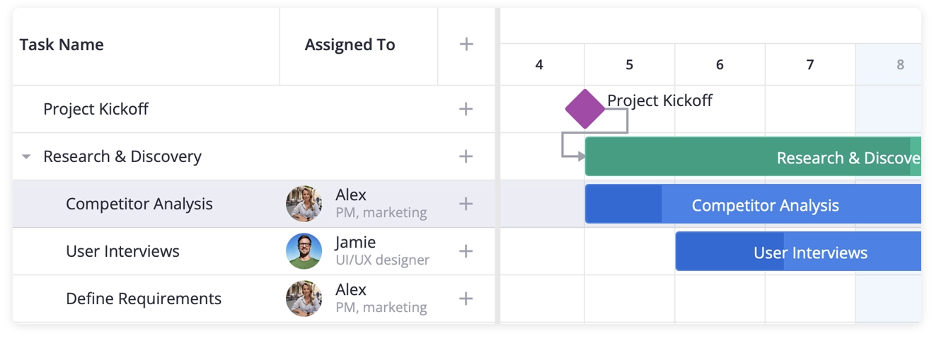
By default the left grid carries a single task-name column. We’ll turn it into three: the task name, an assignee column with avatars, and a slim column with ”+” as an “add a new task” button.
First, add the custom component that draws an assignee. Save it as src/UserCell.vue:
<script setup>import { computed } from "vue";import { teamMembers } from "../data.js";
const props = defineProps({  row: {},});
const member = computed(() =>  teamMembers.find(m => props.row.assigned == m.id));</script>
<template>  <div class="container">    <template v-if="member">      <div class="avatar">        <img class="user-avatar" alt="" :src="member.src" />      </div>      <div class="info">        <span class="name">{{ member.label || "" }}</span>        <span class="role">{{ member.role || "" }}</span>      </div>    </template>  </div></template>
<style scoped>.container {  display: flex;  align-items: center;  gap: 12px;  width: 100%;}.avatar {  width: 32px;  height: 32px;  border-radius: 50%;  background-color: #dfe2e6;}.user-avatar {  width: 100%;  height: 100%;  border-radius: 50%;  object-fit: contain;}.info {  display: flex;  flex-direction: column;  align-items: flex-start;}.name {  line-height: 16px;}.role {  font-size: 12px;  line-height: 16px;  color: var(--wx-color-font-alt);}</style>
Now declare the columns in Gantt.vue. A plain const is enough — the definition never changes:
<script setup>import { Gantt, Willow } from "@svar-ui/vue-gantt";import { Locale } from "@svar-ui/vue-core";import { tasks, links, teamMembers } from "./data.js";import UserCell from "./UserCell.vue";
const columns = [  { id: "text", header: "Task name", width: 230 },  {    id: "assigned",    header: "Assigned to",    options: teamMembers,    width: 140,    align: "center",    cell: UserCell,  },  { id: "add-task", header: "", width: 50, align: "center" },];</script>
<template>  <Willow>    <Locale>      <div class="gantt-container">        <Gantt :tasks="tasks" :links="links" :columns="columns" />      </div>    </Locale>  </Willow></template>
If you reload the page, you’ll see that the grid is extended to three columns: task name, avatar-backed assignee, and a ”+” button on each row that adds a new task.
Breaking Down the Column Config
Three keys do the real work:
cell: UserCellreplaces the default text rendering. The Gantt mounts your component and passes the row in through arowprop, so the cell reads whatever it needs off that object.options: teamMembersisn’t just for show. It declares the set of values this column can hold, and the built-in editor pulls from it — something Step 5 depends on.id: "add-task"is an id the Gantt treats specially. Name a column that and you get a wired-up ”+” button at no cost; clicking it dispatches theadd-taskaction without any handler from you.
Step 4: A Custom Tooltip on Hover
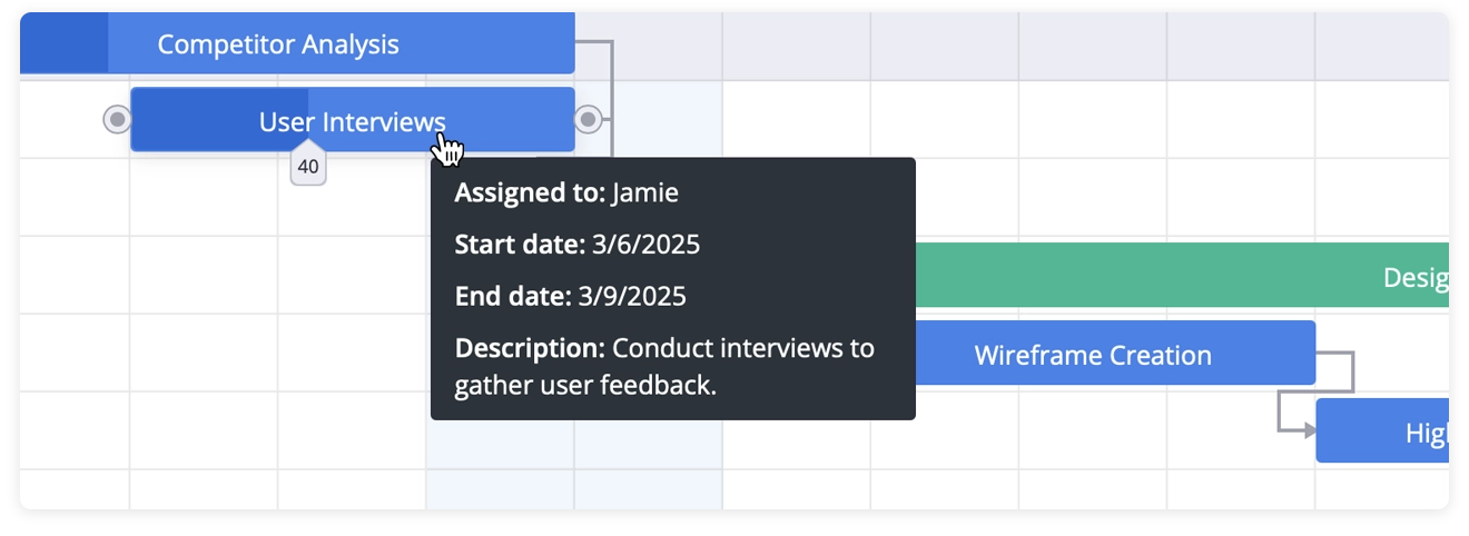
By default, hovering a task bar shows only the task name. Let’s swap in a custom tooltip with dates and the assignee name. Create src/CustomTooltip.vue:
<script setup>import { computed } from "vue";import { teamMembers } from "../data.js";
const props = defineProps({  data: {},});
const task = computed(() => props.data?.task);const assigned = computed(() => task.value?.assigned);const start = computed(() => task.value?.start);const end = computed(() => task.value?.end);</script>
<template>  <div v-if="data" class="data">    <div v-if="assigned" class="text">      <span class="caption">Assigned to: </span>      {{ teamMembers.find(m => assigned == m.id).label }}    </div>    <div v-if="start" class="text">      <span class="caption">Start date: </span>      {{ start.toLocaleDateString() }}    </div>    <div v-if="end" class="text">      <span class="caption">End date: </span>      {{ end.toLocaleDateString() }}    </div>  </div></template>
<style scoped>.data {  background-color: #2b343b;  padding: 8px 12px;  width: 260px;}.text {  font-family: var(--wx-font-family);  color: #ffffff;  font-size: 14px;  line-height: 20px;}.text + .text {  margin-top: 8px;}.caption {  font-weight: 600;}</style>
Wiring it up needs a handle on the Gantt’s API, so we add a ref and bind it to the chart:
<script setup>import { ref } from "vue";import { Gantt, Willow, Tooltip } from "@svar-ui/vue-gantt";import { Locale } from "@svar-ui/vue-core";import CustomTooltip from "./CustomTooltip.vue";// ...other imports
const api = ref(null);</script>
<template>  <Willow>    <Locale>      <div class="gantt-container">        <Tooltip :api="api" :content="CustomTooltip">          <Gantt            ref="api"            :tasks="tasks"            :links="links"            :columns="columns"          />        </Tooltip>      </div>    </Locale>  </Willow></template>
Move over any bar and the card appears with the dates, assignee, and task description (if available).
Why Tooltip Surrounds the Gantt — and Where the API Comes From
Tooltip listens for hover events throughout everything it contains, then asks the Gantt’s API which task the cursor is on. That’s the reason it has to enclose the chart and the reason it needs the API handle.
Vue.js gives you that handle through a template ref. Declaring const api = ref(null) and adding ref="api" to the <Gantt> element binds the ref to the chart’s exposed API once the component mounts. From then on api.value gives you the imperative surface — getState, exec, intercept, on, and the rest. Because api is reactive, the components alongside it (Tooltip now, the editor and toolbar later in this guide) update the moment it’s populated, and they all share one object.
The bar under the cursor arrives as the data prop on CustomTooltip. The task object itself lives at data.task, so you access fields like data.task.assigned, data.task.start, and so on.
Step 5: A Sidebar Editor with a Custom Assignee Field
The Gantt bundles a side editor for the selected task, prefilled with task name, description, date, type, and progress fields. We’ll add one more — an “Assigned to” picker built on RichSelect from @svar-ui/vue-core, listing team members with their name and role.
RichSelect must be registered under a name the editor can look up. It’s a one-time step, so run it at the top of the script:
<script setup>import {  Gantt,  Willow,  Tooltip,  Editor,  getEditorItems,  registerEditorItem,} from "@svar-ui/vue-gantt";import { RichSelect, Locale } from "@svar-ui/vue-core";
registerEditorItem("select", RichSelect);</script>
Take the default field list and drop your entry into it:
const fields = getEditorItems();fields.splice(3, 0, { key: "assigned", comp: "select", label: "Assigned to", options: teamMembers, config: { placeholder: "Select the team member" }, isHidden: task => task.type == "summary",});Place the editor inside the tooltip wrapper, right before the chart:
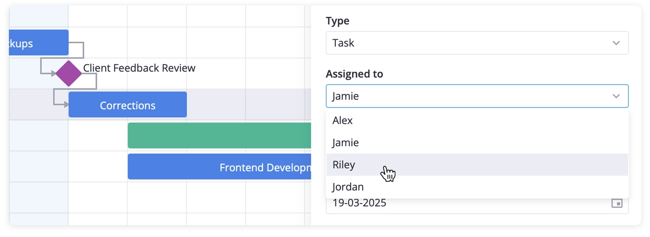
<Tooltip :api="api" :content="CustomTooltip"> <Editor :items="fields" :api="api" /> <Gantt ref="api" :tasks="tasks" :links="links" :columns="columns" /></Tooltip>Double-click a task bar and the right-hand panel opens with the standard fields plus your assignee picker.
Mutating the Default Fields
getEditorItems() returns a fresh copy of the built-in field definitions, and you’re meant to change it — splice, push, filter, reorder, all fair game. Splicing at index 3 slots “Assigned to” between the “task type” and “progress” fields, the spot where it reads most naturally.
comp: "select" is the name we just registered; the editor resolves it back to RichSelect and renders it. isHidden: task => task.type == "summary" removes the field whenever a summary is selected, since phase rows have no single assignee. The callback receives the task currently open in the editor, so lean on it for any conditional field.
Step 6: A Toolbar with a Bulk-Assign Dropdown
We want to add a custom “Assigned to” button to the toolbar above the Gantt chart. The toolbar gets the same treatment as editor: we keep the defaults, add a separator, then a collapsible menu of members. If you’re picking one team member, it reassigns all selected tasks to this assignee.
Because the handler reaches into the API, define it alongside the button list. Since api is a ref, the handler reads api.value at call time — so a plain const for the buttons is fine:
<script setup>import { Toolbar, getToolbarButtons } from "@svar-ui/vue-gantt";
function actionHandler(ev) {  const member = ev.id;  if (!api.value) return;
  const { selected } = api.value.getState();  selected.forEach(id => {    api.value.exec("update-task", {      id,      task: { assigned: member },    });  });}
const buttons = getToolbarButtons().concat([  { comp: "separator" },  {    id: "assign",    icon: "wxi-assign",    menu: true,    collapsed: true,    layout: "column",    isHidden: task => !task || task.type == "summary",    items: teamMembers.map(t => ({      ...t,      comp: "item",      text: t.label,      handler: actionHandler,    })),  },]);</script>
Place the toolbar above the chart and wrap the pair in a flex column so the chart fills the space that’s left:
<template> <Willow> <Locale> <div class="content"> <Toolbar :api="api" :items="buttons" /> <div class="gantt-container"> <Tooltip :api="api" :content="CustomTooltip"> <Editor :items="fields" :api="api" /> <Gantt ref="api" :tasks="tasks" :links="links" :columns="columns" /> </Tooltip> </div> </div> </Locale> </Willow></template>Update the scoped styles for the new layout:
<style scoped>.content { height: 100%; width: 100%; box-sizing: border-box; display: flex; flex-direction: column; overflow: hidden;}.gantt-container { flex: 1; min-height: 0;}</style>Ctrl+click a few tasks, open the assign menu, and choose a member — they all switch to that person in one action.
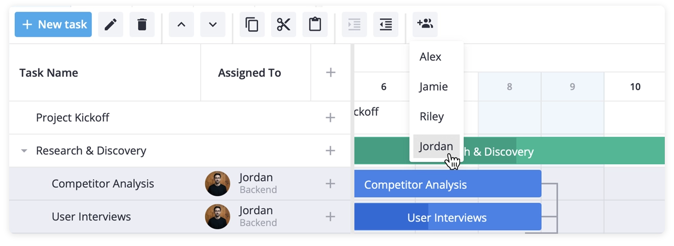
What actionHandler Does
Two calls carry the load:
api.value.getState()returns the current Gantt state, and we readselectedoff it — the ids of the rows the user has highlighted.api.value.exec("update-task", ...)pushes the change through the same path a manual edit takes. Subscribers run, the chart redraws, and an open editor refreshes. Editing the task array directly bypasses all of that, so always go throughexec.
menu: true with collapsed: true renders the button as a dropdown that folds down to an icon; items is its contents. The button’s isHidden hides the control when nothing is selected (task is undefined) or when a summary row is active.
Because the toolbar reads api.value only when a menu item is clicked, there’s no timing problem — by then the template ref has long since captured the API.
Step 7: Defaults for New Tasks
The ”+” column gives users a fast way to add a task, but the default add-task payload has no assigned key — so the editor opens with an empty picker. We patch that by intercepting the action and supplying the default. That’s what init is for:
function init(api) { api.intercept("add-task", ev => { ev.task = { ...ev.task, assigned: "" }; });}Hand it to the chart:
<Gantt ref="api" :init="init" :tasks="tasks" :links="links" :columns="columns"/>Choosing intercept over on
The API offers two listeners that are easy to confuse:
interceptruns before the action is handled and can rewrite the event payload — or cancel the action outright by returningfalse. It’s the home for defaults, validation, and guards.onruns after the action has completed. Use it to react to something already done: syncing to a backend, recording undo state, sending analytics.
Defaults go in intercept because we want the task to carry assigned: "" as it travels through the pipeline, not to be corrected after it lands. Note: the split in how Vue.js handles the API here: the template ref (ref="api") captures the object for the surrounding components, while init — called once by the Gantt with the same API — is where you register interceptors during setup.
Step 8: Weekend Shading and Cell Sizing
We also want to add two cosmetic touches. First, to highlight weekends with color, add these helpers to the script:
function isWeekend(date) {  const d = date.getDay();  return d == 0 || d == 6;}
function highlightTime(date, unit) {  if (unit == "day" && isWeekend(date)) return "wx-weekend";  return "";}
highlightTime returns a CSS class for a date, and wx-weekend comes with Willow theme. The Gantt chart calls it at every zoom level — day, week, month — so testing unit == "day" limits the shading to the day columns.
Then give the cells more room, since the defaults run tight:
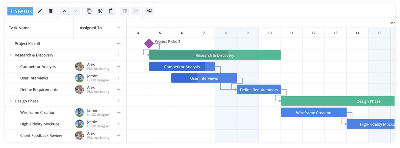
<Gantt ref="api" :init="init" :tasks="tasks" :links="links" :columns="columns" :cellWidth="80" :cellHeight="42" :highlightTime="highlightTime"/>Reload the page, and you’ve got shaded weekends and a more comfortable grid.
Final Thoughts
In one Gantt.vue component plus a few small additional files — data.js, UserCell.vue, CustomTooltip.vue — you’ve built a production ready Vue.js Gantt chart with tasks, summary tasks, milestones, and dependency links. Along the way, you’ve customized the grid with an avatar-backed “Assigned to” column, extended the editor with a custom assignee field, added a bulk-assign toolbar button, swapped in a custom tooltip, and highlighted weekend cells.
This walkthrough focused on explaining the code behind each step, so you should now have a solid grasp of SVAR Vue Gantt’s API and how to adapt the demo to your own project.
What’s Next
To go deeper with SVAR Vue Gantt, check out these resources:
- Docs & quick start — get a basic Gantt chart running in 5 minutes
- API Reference — explore every prop, event, and method
- Live Demos — see more patterns in action, with source code on GitHub
- AI Tools — MCP server, agent skills, and context packs for your coding assistant
If you need auto-scheduling, critical path analysis, or advanced resource planning out-of-the-box, check out the PRO edition. A free trial is available.
Found this guide helpful? Star Vue Gantt repo — it helps us keep building ⭐
Happy coding!