


Introduction
When it comes to integrating complex data grids in React applications, Ag-Grid remains a go-to solution that is associated with reliability and expertise. For sure, the company stands among the market leaders, with its grid widely adopted due to the enterprise-grade, extensive feature set.
However, AG Grid licensing around advanced functionality often guides developers towards free, open-source alternatives. As the React ecosystem never stands still, in 2026 we have quite a number of options capable of fully meeting our needs even if we have limited budget and very specific requirements.
While the alternatives listed below may not replicate every single feature of Ag-Grid’s extensive functionality, they often provide sufficient capabilities for most projects. In some cases, they also offer unique advantages in terms of flexibility, bundle size, or ease of customization.
Below you’ll find the list of the top free alternatives to Ag-Grid – spanning from highly flexible headless libraries to complete, out‑of‑the‑box grid systems.
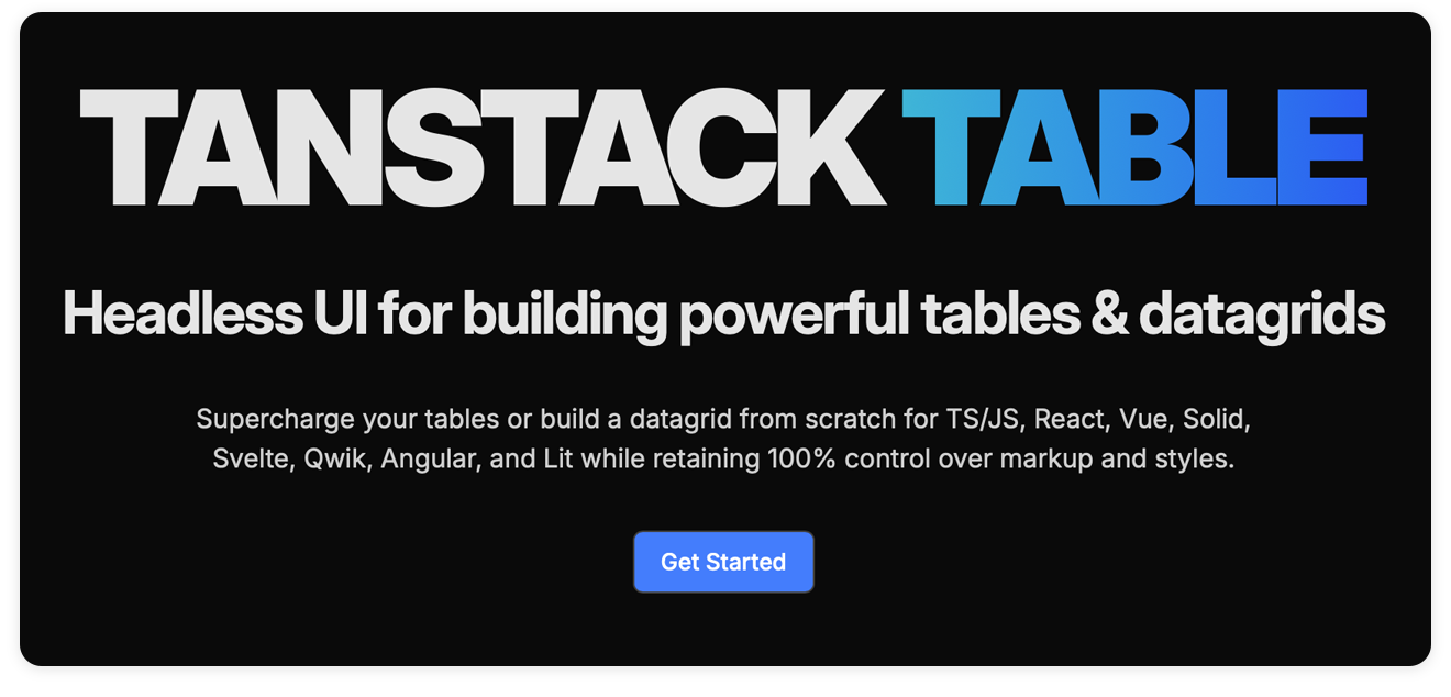
1. TanStack Table
TanStack Table is a data grid library built around the headless UI concept. Literally, this means it does not provide any ready-made UI or default styling, leaving that part to you. Instead, it focuses on delivering complex logic and robust state management for handling table data.
TanStack creators stick to the idea that projects often have highly specific design requirements, so headless libraries give complete freedom to realize any look and feel without constraining creative vision. This approach makes TanStack Table exceptionally flexible and customizable, though it does require more effort for styling and integration.
The snippet below shows a basic React table built with TanStack.
import { useReactTable, getCoreRowModel, flexRender } from '@tanstack/react-table'
const data = [{ id: 1, name: 'Ada' }]const columns = [{ accessorKey: 'name', header: 'Name' }]
export default function SimpleTable() {  const table = useReactTable({ data, columns, getCoreRowModel: getCoreRowModel() })
  return (    <table>      <thead>        {table.getHeaderGroups().map((hg) => (          <tr key={hg.id}>            {hg.headers.map((header) => (              <th key={header.id}>                {flexRender(header.column.columnDef.header, header.getContext())}              </th>            ))}          </tr>        ))}      </thead>      <tbody>        {table.getRowModel().rows.map((row) => (          <tr key={row.id}>            {row.getVisibleCells().map((cell) => (              <td key={cell.id}>                {flexRender(cell.column.columnDef.cell, cell.getContext())}              </td>            ))}          </tr>        ))}      </tbody>    </table>  )}
Technical Characteristics: Due to its headless architecture (no themes, pre-built UI or CSS), the library has a small bundle size of approximately 15 kB (gzipped). It provides all the essential core and advanced features, including sorting, filtering, faceting, pagination, and ordering, as well as support for virtualized rows and columns.
Licensing: the library is distributed under the MIT license. The entire set of TanStack Table features is available for free and is not split into community and enterprise editions.
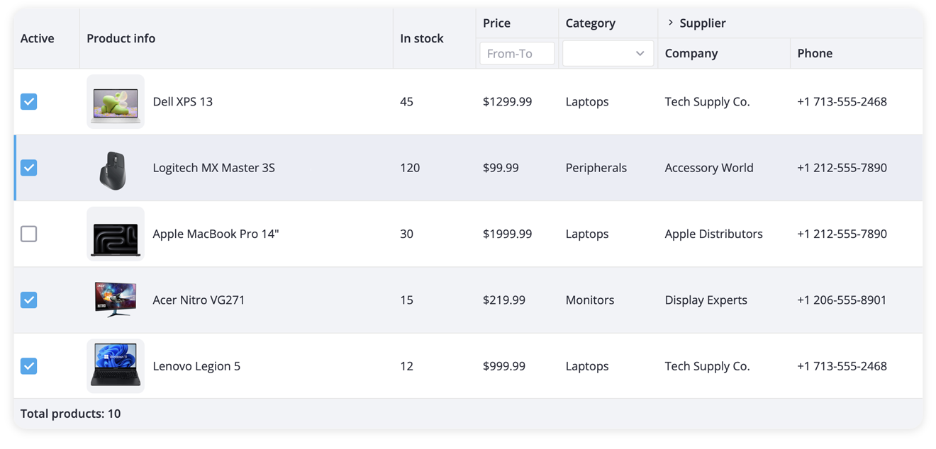
2. SVAR React DataGrid
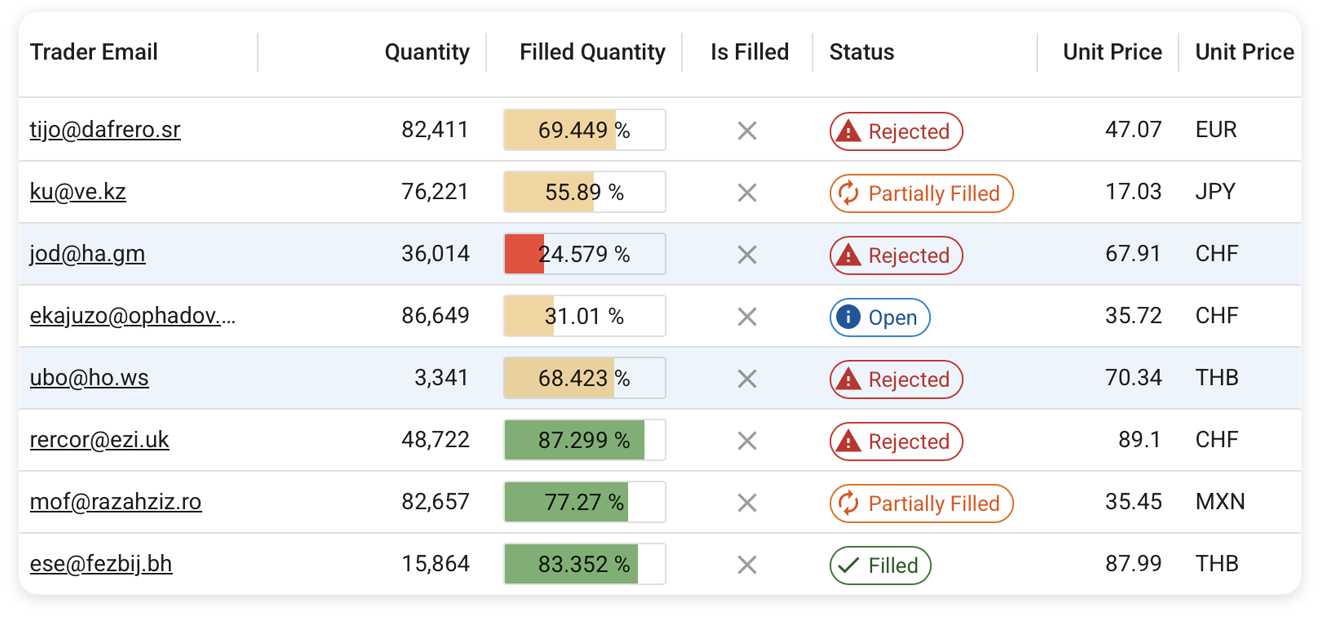
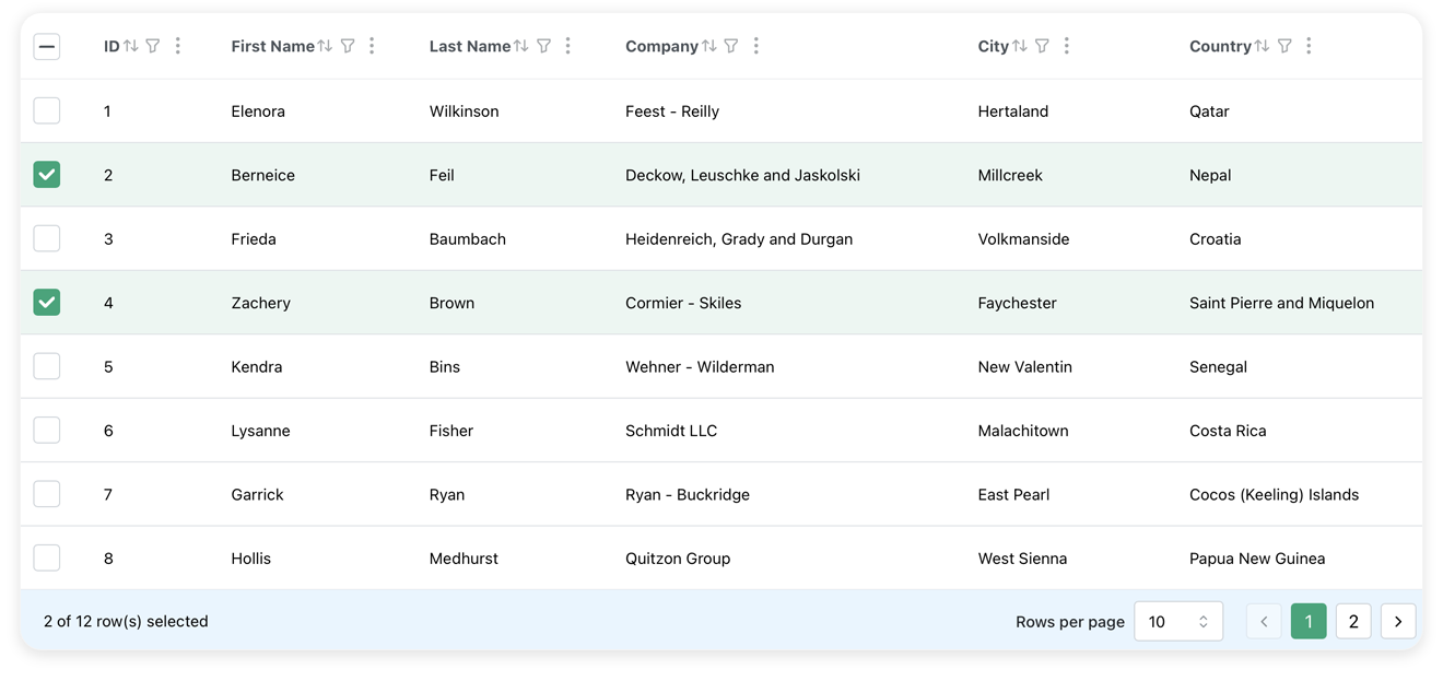
SVAR React DataGrid is a powerful productivity-focused React data grid designed as a practical alternative to Ag-Grid, offering advanced functionality out of the box without paid tiers. Unlike minimal headless components, it offers modern out-of-the-box UI and built-in themes, while remaining highly customizable via CSS.
The component offers hierarchical tree data support, advanced filtering, virtual scrolling for rows and columns, dynamic loading, and follows accessibility (WAI-ARIA) standards, which makes it suitable for complex business scenarios. The grid is easy to get started with and configure for your real-world applications.
Here is the example of a basic grid with sample data built using SVAR React DataGrid:
import { Grid } from "@svar-ui/react-grid";import "@svar-ui/react-grid/all.css";
const data = [  {    id: 1,    city: "Amieshire",    email: "Leora13@yahoo.com",    firstName: "Ernest",    lastName: "Schuppe",    companyName: "Lebsack - Nicolas",  },  {    id: 2,    city: "Gust",    email: "Mose_Gerhold51@yahoo.com",    firstName: "Janis",    lastName: "Vandervort",    companyName: "Glover - Hermiston",  },];
const columns = [  { id: "id", width: 50 },  { id: "city", width: 100, header: "City", footer: "City" },  { id: "firstName", header: "First Name", footer: "First Name", width: 150 },  { id: "lastName", header: "Last Name", footer: "Last Name", width: 150 },  { id: "email", header: "Email", footer: "Email" },  { id: "companyName", header: "Company", footer: "Company" },];
export default function App() {  return <Grid data={data} columns={columns} />;}
Technical Characteristics: As the component comes with advanced functionality and built-in theming, its bundle size is around 80 kB (gzipped), which is larger than headless UI libraries. The grid is React 19-ready with TypeScript support out of the box. Live demos, documentation, and GitHub repo are available for quick start.
Licensing: the data grid is available under the MIT license. It’s an open-source, free component for any type of projects.
3. Simple Table
Simple Table is a React data grid that brands itself as a lightweight alternative to widely used grid libraries. Its minimalist footprint, low overhead and simple API are complemented by advanced features such as sorting, filtering, aggregation and reordering, as well real-time updates, infinite scrolling, and server-side pagination. This combination makes the solution well-suited for projects ranging from small prototypes to production-scale applications.
The code for a basic Simple Table React Data Grid will look like this:
import React from "react";import { SimpleTable, HeaderObject, Theme } from "simple-table-core";import "simple-table-core/styles.css";
// Define headersconst headers: HeaderObject[] = [  { accessor: "id", label: "ID", width: 80, type: "number" },  {    accessor: "name",    label: "Name",    minWidth: 80,    type: "string",  },  {    accessor: "age",    label: "Age",    width: 100,    type: "number",  },  {    accessor: "role",    label: "Role",    width: 150,    type: "string",  },];
// Sample dataconst EMPLOYEE_DATA = [  {    id: 1,    name: "Marcus Rodriguez",    age: 29,    role: "Frontend Developer",  },  {    id: 2,    name: "Sophia Chen",    age: 27,    role: "UX/UI Designer",  }];
const QuickStartDemo = ({  height = "300px",  theme,}: {  height?: string | number,  theme?: Theme,}) => {  return (    <SimpleTable      defaultHeaders={headers}      height={height}      rowIdAccessor="id"      rows={EMPLOYEE_DATA}      theme={theme}    />  );};
export default QuickStartDemo;
Technical Characteristics: with the bundle size of 39 kB (gzipped), the grid offers faster loading and parsing compared to the competitors, though its ecosystem is comparatively less developed.
Licensing: Simple Table is free for individuals and startups (MIT license), with a paid license for companies with any revenue – the pricing starts at $85 per month or $850 per year.
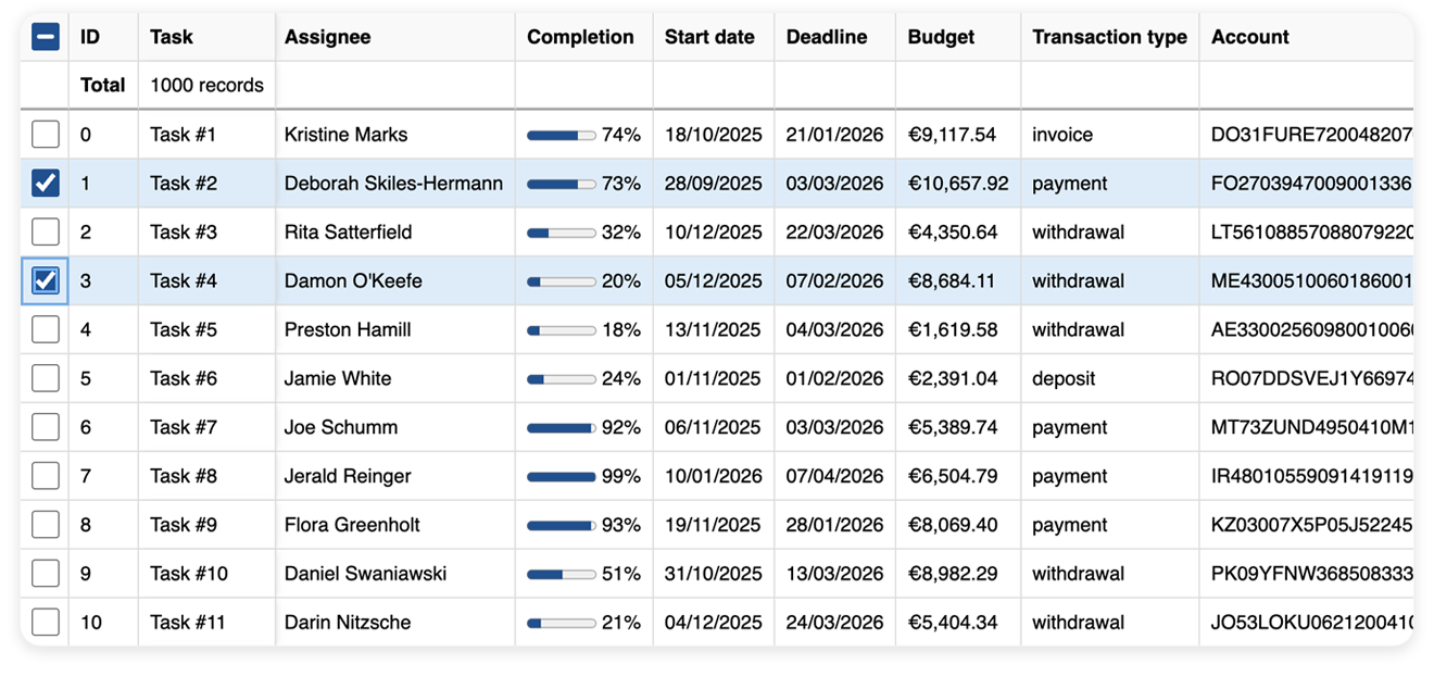
4. react-data-grid (Comcast)
react-data-grid by Comcast is a native React grid component focused on performance and accessibility. The grid is strongly typed and is regularly updated for compatibility with the latest React version, ensuring straightforward integration with modern React apps.
It does not rely on any third-party dependencies, which helps keep its builds lightweight. Despite being minimal in footprint, it efficiently handles large datasets through virtualization and provides numerous interactive features: column grouping, resizing, spanning, multi-column sorting, row grouping and reordering, summary rows, etc.
Check the code snippet below, to see how a basic grid is built.
import 'react-data-grid/lib/styles.css';
import { DataGrid, type Column } from 'react-data-grid';
interface Row {  id: number;  title: string;}
const columns: readonly Column<Row>[] = [  { key: 'id', name: 'ID' },  { key: 'title', name: 'Title' }];
const rows: readonly Row[] = [  { id: 0, title: 'Example' },  { id: 1, title: 'Demo' }];
function App() {  return <DataGrid columns={columns} rows={rows} />;}
Technical Characteristics: the component is dependencies-free, resulting in a lightweight bundle size of just 14.8 kB (gzipped). It fully complies with the accessibility standards, providing RTL and screen reader support along with keyboard navigation.
Licensing: react-data-grid by Comcast is fully open-source and available under the MIT license.
5. MUI X Data Grid
MUI X Data Grid is a React component engineered for seamless integration with the Material Design ecosystem. This grid is a perfect choice if you need a tool that offers enterprise features, native MUI support along with flexible styling options, and robust customization capabilities.
You can use this data management solution within MUI projects or as a standalone component, suitable for both small and large‑scale apps.
Here is how you render a simple MUI X Data Grid:
import { DataGrid, GridRowsProp, GridColDef } from '@mui/x-data-grid';
const rows: GridRowsProp = [  { id: 1, name: 'Data Grid', description: 'the Community version' },  { id: 2, name: 'Data Grid Pro', description: 'the Pro version' },  { id: 3, name: 'Data Grid Premium', description: 'the Premium version' },];
const columns: GridColDef[] = [  { field: 'name', headerName: 'Product Name', width: 200 },  { field: 'description', headerName: 'Description', width: 300 },];
export default function RenderComponent() {  return (    <div style={{ height: 300, width: '100%' }}>      <DataGrid rows={rows} columns={columns} />    </div>  );}
Technical Characteristics: The standalone MUI X Data Grid package is about 90-95 kB gzipped, but the bundle size may approach 200 kB depending on imports and features.
Licensing: MUI X offers several options – a free Community version, which is MIT-licensed, as well as paid Pro and Premium versions packed with advanced data management and analysis functionality. The pricing for the PRO version starts at $180/year/developer, and for the Premium version – $588/year/developer.
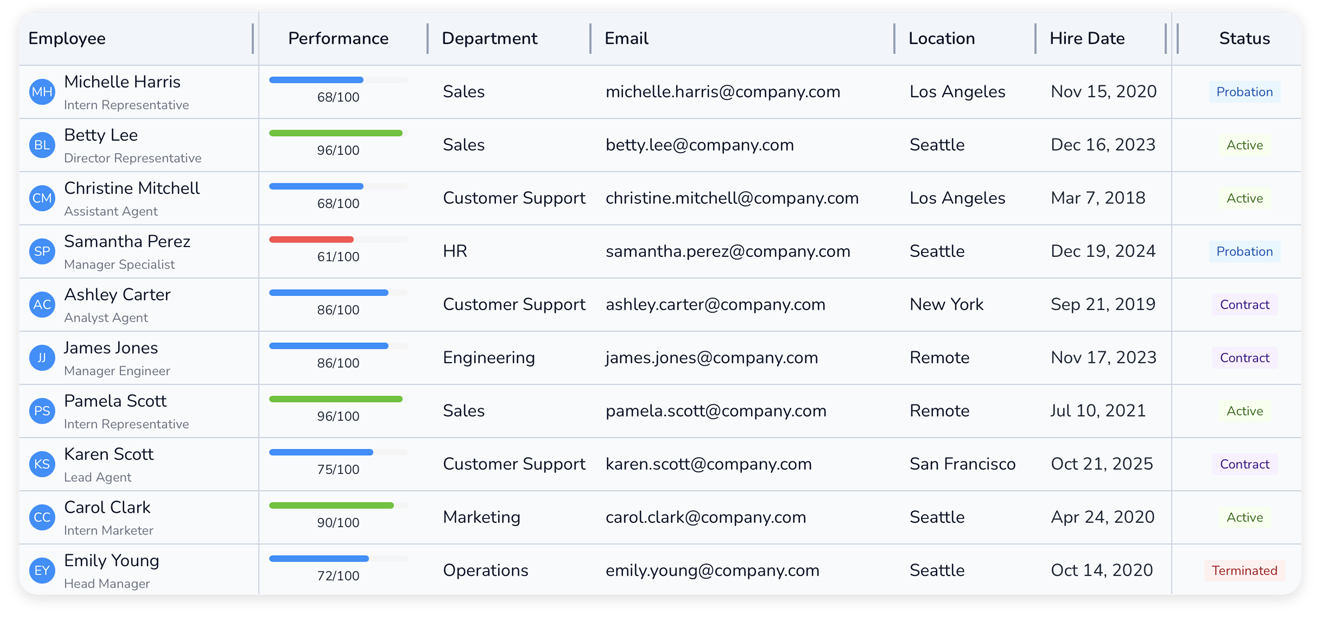
6. Mantine React Table
Mantine React Table is a modern data grid component that uses TanStack Table engine for the table logic and Mantine React UI framework for styling. This way it provides a full suite of advanced table features (filtering, sorting, pagination, row selection, virtualization) and supports modern UI patterns and comprehensive styling options.
By combining both libraries, it inherits their best practices for performance and usability, integrating most smoothly into projects already using Mantine.
Take a look at a basic Mantine React Table snippet:
import { useMemo } from 'react';import {  MantineReactTable,  useMantineReactTable,  type MRT_ColumnDef,} from 'mantine-react-table';
type Person = {  name: {    firstName: string;    lastName: string;  };  address: string;};
//nested data is ok, see accessorKeys in ColumnDef belowconst data: Person[] = [  {    name: {      firstName: 'Zachary',      lastName: 'Davis',    },    address: '261 Battle Ford',  },  {    name: {      firstName: 'Robert',      lastName: 'Smith',    },    address: '566 Brakus Inlet',  },];
const Example = () => {  //should be memoized or stable  const columns = useMemo<MRT_ColumnDef<Person>[]>(    () => [      {        accessorKey: 'name.firstName', //access nested data with dot notation        header: 'First Name',      },      {        accessorKey: 'name.lastName',        header: 'Last Name',      },      {        accessorKey: 'address', //normal accessorKey        header: 'Address',      },    ],    [],  );
  const table = useMantineReactTable({    columns,    data,  });
  return <MantineReactTable table={table} />;};
export default Example;
Technical Characteristics: The bundle size of Mantine React Table is about 45 kB (gzipped), meaning it’s well-optimized while still providing advanced functionality together with a rich UI.
Licensing: The table is open-source and free, released under the MIT license.
Bundle Size and Licensing Comparison
When choosing a data grid, it’s essential to consider not just the features but also the performance impact and licensing terms. The table below compares bundle sizes and licensing models to help you make an informed decision based on your project’s requirements and constraints:
| Library | Bundle Size (gzipped) | Enterprise Features | License |
|---|---|---|---|
| Ag‑Grid | ~90–100 kB (Community), 200 kB+ (Enterprise) | Pivoting, formulas, advanced filtering, grouping, etc | Community (MIT) + Paid Enterprise ($999 per developer) |
| TanStack Table | ~15 kB | Headless, filtering, aggregation, virtualization, row expansion | MIT |
| SVAR DataGrid | ~80 kB | Advanced filtering, virtualization, accessibility, tree data | MIT |
| Simple Table | ~39 kB | Advanced features (sorting, filtering, real time updates) | MIT for non-profit + PRO for business ($85/month, $850/year) |
| react‑data‑grid (Comcast) | ~14.8 kB | Virtualization, grouping, resizing, accessibility | MIT |
| MUI X Data Grid | ~90–95 kB (Community), up to 200 kB (PRO) | Some enterprise features are in Pro/Premium | Community (MIT) + PRO ($180/year) + Premium ($588/year) |
| Mantine React Table | ~45 kB | Filtering, row expansion, virtualization, aggregation, grouping | MIT |
Detailed Feature Comparison
Beyond bundle size and licensing, specific features can make or break your choice of data grid. The comparison table below highlights the key functionality across different data grid libraries. Note that some components have PRO versions with additional features under a paywall, while others offer all features for free:
| Feature | TanStack Table | SVAR DataGrid | Simple Table | react-data-grid | MUI X | Mantine Table |
|---|---|---|---|---|---|---|
| In-cell editing | Custom | ✔️ | ✔️ | Limited | ✔️ | ✔️ |
| Virtual scrolling | ✔️ | ✔️ | ✔️ | ✔️ | ✔️ | ✔️ |
| Advanced filtering | ✔️ | ✔️ | ✔️ | ✖️ | ✔️ | ✔️ |
| Built-in context menu | ✖️ | ✔️ | ✖️ | ✔️ | ✖️ | ✖️ |
| Tree data | Expanding sub-rows | ✔️ | ✔️ | ✔️ | PRO | ✔️ |
| Column grouping | ✔️ | ✔️ | ✔️ | ✔️ | ✔️ | ✔️ |
| Frozen columns | ✔️ | ✔️ | ✔️ | ✔️ | ✔️ | ✔️ |
| Responsive mode | ✖️ | ✔️ | ✖️ | ✖️ | ✖️ | ✖️ |
| Master rows | Custom | ✖️ | ✖️ | ✖️ | PRO | ✖️ |
| Keyboard navigation | Custom | ✔️ | ✔️ | ✔️ | ✖️ | ✔️ |
| Feature | TanStack Table | SVAR DataGrid | Simple Table | react-data-grid | MUI X | Mantine Table |
Other Noteworthy Options
In addition to the grids listed above, we suggest considering the following strong alternatives:
-
PrimeReact DataTable – provides extensive functionality and broad customization opportunities. Well‑suited for projects that rely on PrimeReact in their architecture. Free, MIT license.
-
LyteNyte Grid – a promising, full-featured React data grid library that prioritizes simplicity and robust performance without dependency overhead. Core version is available under Apache 2.0, and the PRO version is $399/year/developer.
Conclusion
The grid components presented in this article differ in their design philosophy, focus, and the opportunities they provide to developers. Some prioritize simplicity and minimal bundle size, while others specialize in enterprise‑grade functionality with comprehensive out-of-the-box features.
TanStack Table remains the go‑to choice for maximum flexibility and customization, ideal when you need complete control over the UI and have the resources to build custom implementations.
SVAR React DataGrid stands out as a production-ready data grid that strikes an excellent balance between rich functionality and ease of implementation. With built-in accessibility, tree data support, advanced filtering, and modern theming – all available under the MIT license – it’s particularly well-suited for teams that need a rock-solid solution for their table data.
For lightweight performance with minimal dependencies, react-data-grid (Comcast) and Simple Table are excellent picks, offering solid core functionality in compact packages. And if your project already relies on an established UI ecosystem, MUI X Data Grid or Mantine React Table provide the most seamless integration, inheriting the design language and patterns you’re already using.
Ultimately, the best choice depends on your specific requirements. Each of these alternatives represents a viable path forward for teams looking to move beyond Ag-Grid’s licensing model while maintaining professional-grade data grid functionality.