

Introduction
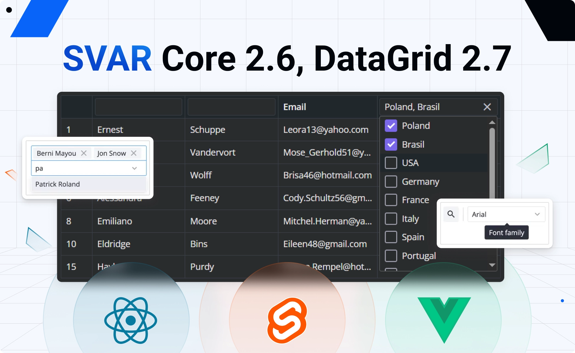
SVAR Core 2.6 and DataGrid 2.7 are here with a fresh batch of improvements. This release brings to the SVAR Core library a new Tooltip component, unified styling through the new css prop, and improvements to MultiCombo. DataGrid is extended with a multiselect column filter, and a new pixel-based scroll-to action.
All changes are shipped simultaneously for Svelte, React, and Vue components. Let’s look closer at what’s new.
SVAR Core 2.6
SVAR Core library for Svelte, React and Vue has been improved with:
🔹 Tooltip component
The Core library was extended with a standalone Tooltip component that can wrap Core controls, Toolbar buttons, or arbitrary HTML. It allows you to attach rich tooltips anywhere in your UI and supports configurable delay, css, position, arrow, touch behavior, and custom content.
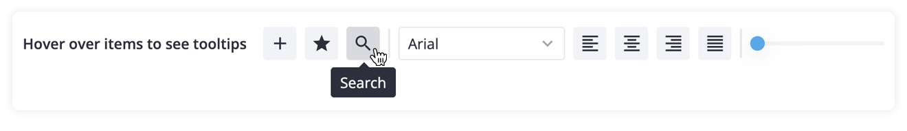
The text for the tooltip can be provided through a new tooltip prop now available on Core controls and Toolbar buttons.
<Tooltip at="bottom" arrow> <Button tooltip="This is a tooltip!"> Hover to see the tooltip </Button></Tooltip>Tooltips demo: React • Svelte • Vue
🔹 CSS for all controls
In this release, we introduced a new css prop for all Core controls. Previously, only a few components had a dedicated styling prop; for the rest, you had to rely on an extra div if you wanted to change the look and feel of the element.
Now you can pass a class name straight to the component via css, and it will be applied to the control’s topmost HTML element, giving you styling control without a wrapper.
Svelte code example:
<div class="demo-box"> <ColorBoard css="my-class" /></div>
<style> .demo-box :global(.my-class) {   background-color: gold; }</style>
⚠️ Please mind that, in order to unify styling across the library, we removed the style prop for Checkbox and the inputStyle prop for Text.
🔹 MultiCombo: keepText setting
The MultiCombo component now supports a new keepText property that determines whether the text typed into the filter input is preserved after selecting an option. This setting lets you define how the dropdown reacts to user input.
By default, keepText is set to false, meaning the filter text is cleared after selection and the dropdown list resets to show all options. When set to true, the typed text remains in the input and the list stays filtered.
<MultiCombo options={users} keepText={true} />MultiCombo demo: React • Svelte • Vue
SVAR DataGrid 2.7
Here is what’s new for SVAR DataGrid for Svelte, React and Vue:
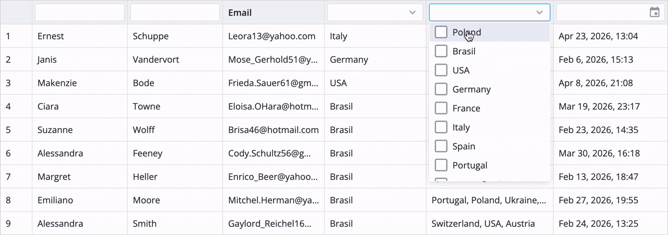
🔹 Multiselect filter
We added a new multiselect filter for DataGrid columns. It lets users select multiple values from a dropdown and shows all rows that match any of those selections. The filter can be customized with a user-defined set of options, a template, placeholder text, or a component that renders the selected values.
Multiselect filter demo: React • Svelte • Vue
To enable the multiselect filter in a column header, specify type: "multiselect" in the filter settings.
{ id: "destinations", header: { filter: { type: "multiselect" } }, options: countries, width: 200,}🔹 “scroll-to” action
The DataGrid now supports a new scroll-to action for precise pixel‑based scrolling. It accepts optional top (vertical) and left (horizontal) offsets, letting you move the viewport to an exact scroll position.
api.exec("scroll-to", { top, left });This update also adds two reactive state properties – scrollTop and scrollLeft. They reflect the current scroll position in pixels and update automatically as the user scrolls. You can also set them programmatically through scroll-to, making it easy to track real scrolling and control the viewport with exact pixel offsets.
Demo with scroll: React • Svelte • Vue
🔹 Updated tooltips
SVAR DataGrid now uses the upgraded Tooltip system from Core, giving you the same new capabilities – configurable delay, position, arrow, touch handling, and fully custom content. The data grid keeps its familiar tooltip workflow, but the update makes it more consistent and flexible.
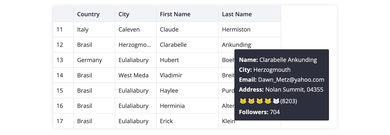
⚠️ Please note that parameters of Tooltip content component changed from { row, column } to { data: row, column }.
Summing Up
SVAR Core 2.6 and DataGrid 2.7 make the library more flexible, consistent, and easier to use across Svelte, React, and Vue. With a new standalone Tooltip component, the unified css prop, better MultiCombo behavior, multiselect filtering in DataGrid, and pixel-accurate scroll control, this release gives developers more control over both UI and interaction.
Learn more:
This release ships alongside SVAR Gantt 2.7, which adds resource planning, workload visualization, and individual calendars for advanced project planning.