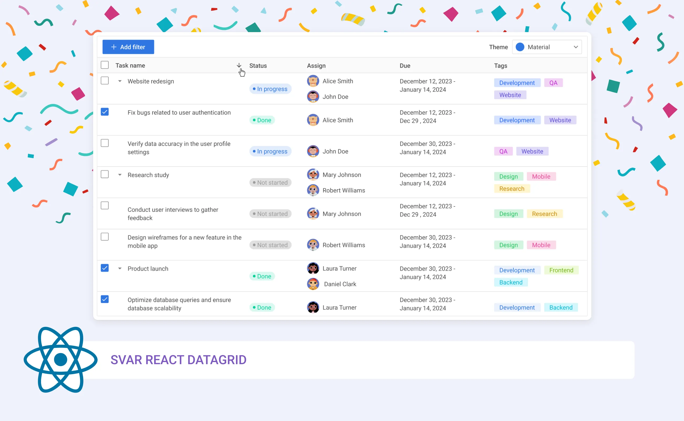
We are thrilled to introduce our first pure React component - SVAR React DataGrid. This ready-to-use UI component is an excellent choice for developers who need to quickly add a responsive and fast data table to their React web applications.
Featuring outstanding performance, multiple in-cell editors, keyboard navigation, a user-friendly context menu, sorting, paging, and flexible customization options, this React DataGrid can be a significant time-saver in your development process.
UPD: As of October 2025, SVAR React DataGrid is now available on GitHub (MIT license) and can be installed via npm:
npm install @svar-ui/react-gridLearn more about the lates major update in this blog post and find the detailed instructions on how to get started in the docs.

Here’s why you should give SVAR React DataGrid a try:
Lightning Fast
No matter how much data you need to fetch for your data table, SVAR React DataGrid will handle it with ease and lightning-fast rendering speed. With virtual scrolling (for both rows and columns), lazy loading, and paging support, you can be confident that your end users won’t experience any delays, even when working with large datasets. If needed, you can also set up server-side pagination for an additional performance boost.
See how amazingly fast SVAR React DataGrid renders 200.000 rows and columns or loads big data dynamically during scroll.
Responsive Design
With SVAR React DataGrid, you don’t have to worry about your table layout on different screens. You can turn on the flexible column widths and the data grid will be auto-sized to the screen size or parent container. Whether on desktop or mobile devices, the DataGrid’s interface supports both mouse and touch interactions, ensuring consistent behavior on smartphones and tablets.
Extensive Column Settings
SVAR React DataGrid offers many flexible ways to define column layouts. The component can auto-size column width to header text, cell content or both. For compact data presentation, vertical text in headers is supported.
You can also use column spans in the header or footer, pin columns to the left, collapse columns to streamline their view, or easily hide or show columns using a context menu. Additionally, users can resize column widths to suit their needs for custom data presentation.
In-Cell Editing
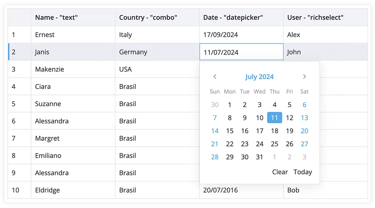
The DataGrid introduces powerful in-cell editing capabilities, making data management more efficient. Users can quickly edit and update data directly within the grid with support for multiple cell editors, e.g. text, combo, richselect, datepicker.

If needed, you can also add a custom component/template to a cell or style the supported editors to your app requirements.
Tree Data Support
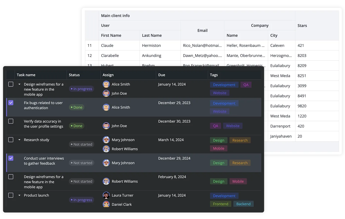
For those working with hierarchical data, our React DataGrid supports a tree layout that displays data in expandable rows. This feature makes it easier to manage and visualize complex datasets in a hierarchical format. Take a look at this demo to see how it works.
RestDataProvider
SVAR React DataGrid is a client-side component but we’ve made it easier for you to bind it to the backend with the RestDataProvider service. This built-in helper automatically listens for user actions such as adding, updating, deleting, or editing rows and cells, sending the appropriate REST requests to your server to keep data in sync.
Additionally, RestDataProvider simplifies data loading with its getData() method, which retrieves data in a promise-based format. To further enhance performance, it includes a debounce functionality, reducing unnecessary server requests and ensuring smoother data handling.
Export to CSV
SVAR React DataGrid supports export to CSV. You can enable the export feature using the export action, allowing for seamless integration with your workflow.
In addition to the features mentioned, SVAR React DataGrid supports multiple row selection, multi-column sorting, a context menu, and more out-of-the-box. If you need a stable, lightweight, high-performance React data table for your app, check out our DataGrid component — it might be exactly what you’re looking for.
Explore the demos or just start using SVAR React DataGrid, and let the power of React be with you!


