

How often in your developer’s life have you faced a need to create a data table? Clearly, it’s quite a common task and each time you have an option to build it from the ground or use a ready-to-use solution.
We’ve created our open-source SVAR Svelte DataGrid so you can quickly add full-features data tables to your Svelte projects. You don’t have to use or build any wrappers to utilize JavaScript components. Just add a few lines of code to integrate a native Svelte data grid to your app.
This tutorial will guide you through the creation of an interactive data table that shows a list of users and include sorting functionality, paging, inline editing, and the ability to search users by name. You’ll learn how to install SVAR DataGrid, define table structure, enable needed functionality and customize its appearance to your design preferences.
Online Demo: see the table
Demo Package: download the demo package
Get Started Guide: see the docs
Prerequisites: Svelte framework and a Vite-based toolchain.
Including Sources
We start from installing SVAR Datagrid as described here. For npm it will be:
//npmnpm install wx-svelte-gridAlso, we will need to install SVAR Core library, a MIT-licensed set of controls. Some of them will be used in our data table for paging and search features.
npm install wx-svelte-core⚠️ Note
Starting with version 2.3 (released in September 2025), all SVAR Svelte packages were moved to:
wx-svelte-grid→@svar-ui/svelte-gridwx-svelte-core→@svar-ui/svelte-core
This tutorial demonstrates a previous version of the component and uses the legacy package names shown above.
Adding DataGrid on a Page
Import SVAR DataGrid and the desired theme. The datagrid comes with the light and dark skins: Willow and WillowDark. In our tutorial we chose to use the light one.
import { Willow } from "wx-svelte-grid";import { Grid } from "wx-svelte-grid";Add the DataGrid on page and define a theme for it:
<Willow> <Grid /></Willow>Defining Table Structure
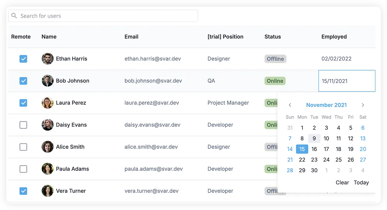
Now it’s time to define what columns our table will have. To display the user’s data, we will create 6 columns: Remote (working from office or from home), Name, Email, Position, Status (offline or online), and Employed (date of employment).
Let’s describe these columns in JSON array where each object has the following properties:
idto define data field to visualizeheaderto provide a label on a column’s headerwidthfor columns with fixed size, orflexgrowvalue for flexible columnsresizeflag set to true to allow users resize columns by dragging the column separator
const columns = [ { id: "remote", header: "Remote", width: 80, resize:true }, { id: "name", header: "Name", flexgrow: 1, resize: true }, /* other columns */];And set these columns to our DataGrid via the same-name property:
<Grid {columns} />Feeding Table with Data
SVAR DataGrid is flexible with your data source and doesn’t preprocess it — simply provide a valid JSON array to populate the table. Dates, if any, should be parsed to JS Date objects for proper sorting and editing. So, this time no backend, just feed the Grid with an array like this:
<script>const data = [ { id: 1, name: "Ethan Harris", avatar: 5, email: "ethan.harris@svar.dev", position: 1, remote: true, status: 1, employed: new Date(2022, 1, 2) }, { id: 2, name: "Bob Johnson", avatar: 2, email: "bob.johnson@svar.dev", position: 3, remote: true, status: 2, employed: new Date(2021, 10, 15) }, /* other records */];</script><Grid {data} />Defining Templates
Let’s have a look at what we have - some columns (Remote, Status, Position) need extra tuning to present the raw data in a more user-friendly way.
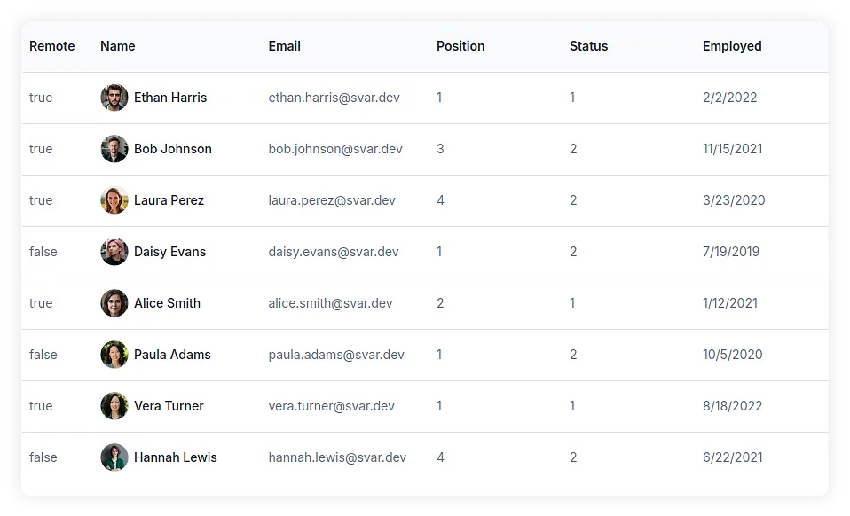
For columns displaying ids from other collections we can provide text labels by feeding the collection into the options array. It will instruct DataGrid to display name instead of id:
{ id: "position", header: "Position", options: [ { id: 1, name: "Developer" }, { id: 2, name: "Designer" },]},{ id: "status", header:"Status", options:[ { id: 1, name: "Offline" }, { id: 2, name: "Online" },]}If you want to display something other than text in a cell, DataGrid allows you to inject a custom template as a Svelte component. For example, let’s display a checkbox instead of a boolean remote field:
<script>  import { Checkbox } from "wx-svelte-core";  import { Cell } from "wx-svelte-grid";
  export let row;  export let col;</script>
<Cell {row} {col} >  <Checkbox bind:value={row[col.id]} /></Cell>
Custom checkbox template:
import CheckboxCell from "./cells/CheckboxCell.svelte";
{ id: "remote", header: "Remote", cell: CheckboxCell, width: 80 }
The similar approach is used to stylize the Status column to show online/offline tags and the Name column to display user’s photo and full name. Check the demo code for precise cell templates.
Adding Sorting for All Columns
Adding a sorting feature to the columns is rather simple. Just use sort:true for all columns:
const columns = [ { id: "remote", header: "Remote", width: 80, resize:true, sort: true }, { id: "name", header: "Name", flexgrow: 1, resize: true, sort: true }, /* other columns */];Inline Editors
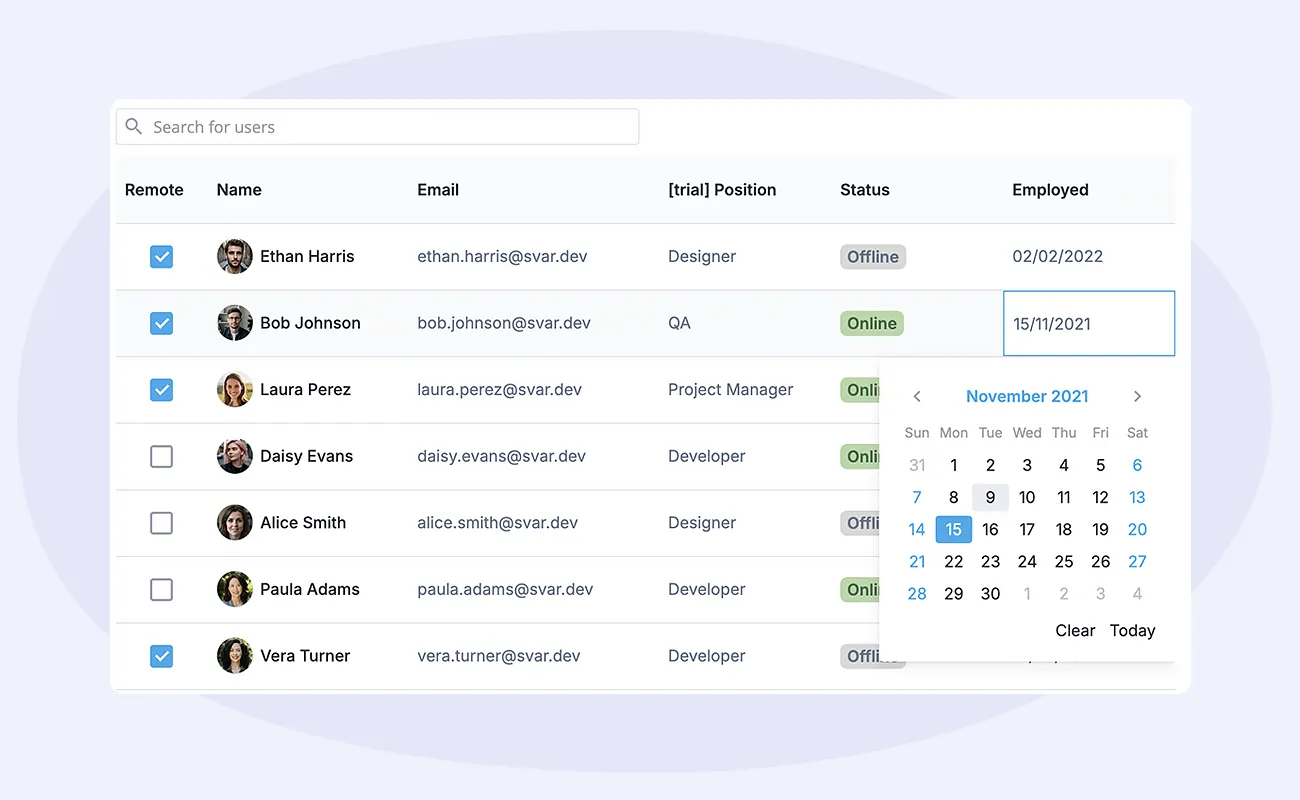
SVAR DataGrid allows editing within the grid body by double-clicking on a cell. The editor type may vary based on the column content. We will use datepicker for the Employed column, and richselect - for the Position column. Here is the example of how cell editor can be defined for a column:
editor: "text" | "datepicker" | "richselect" | and moreNote that richselect editor requires an array of options, but we have already defined them on a templating stage.
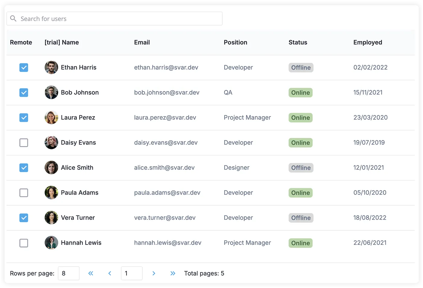
Adding Paging
If you’re working with large datasets and want to organize them into pages, SVAR DataGrid makes it simple to implement. Paging helps improve performance and user experience by breaking down the data into manageable chunks. To set this up, you’ll need to import the Pager control from the SVAR Svelte Core library and link it to your data.

Basically, the idea is that DataGrid will display only the data for the current page, thus loading can be implemented dynamically. In its turn, Pager will control the number of records per page and the current page value, for which it will need the total number of records.
<script> let data = [ /*all records*/ ]; let pageData = []; let page; let pageSize = 8;</script><Grid data={pageData} /><Pager total={data.length} bind:pageSize bind:value={page} on:change={setPage}/>As the above code suggests, you can listen to the change event of the Pager control and use the handler to define the records for the page in question:
function setPage(ev) { let { from, to } = ev.detail; // data indices pageData = data.slice(from, to);}Enabling Search Functionality
As with paging, search logic can be implemented with a separate control from SVAR Svelte Core.
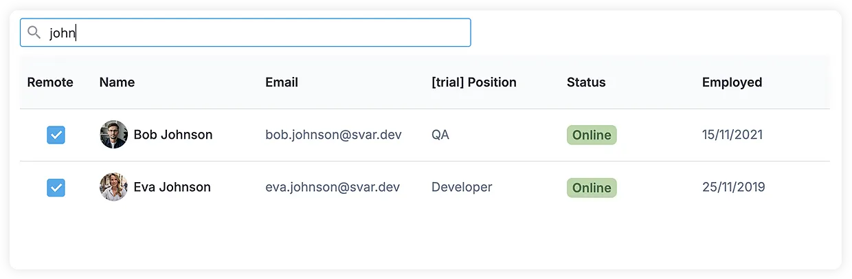
We can use the Text field. It fires the change event while the user types in a value.
<Text icon="wxi-search" css="wx-icon-left" placeholder="Search for users" on:change={filterData}/>The logic filters all the data and defines pageData to show. Here you may issue a request to the server to find records on the backend, but for our demo we keep it simple and filter on the client side.
function filterData(ev) { const value = ev.detail.value.toLowerCase(); filteredData = data.filter( item => item.name.toLowerCase().includes(value) || item.email.toLowerCase().includes(value) );// preserve current page or go to the first, if data is not enough const index = page - 1; let from = 0; if(filteredData.length/pageSize > index) from = index*pageSize; else page = 1; pageData = filteredData.slice(from, from + pageSize);}Tuning Look and Feel
SVAR DataGrid comes with a predefined style but you can adjust it to your design needs. For example, you can change the default row height through the DataGrid properties:
<Grid sizes={{ rowHeight: 58, headerHeight: 58 }} />Or use dynamic CSS class based on column id:
<Grid cellStyle={(row, col) => { let css = "valign-center"; if (col.id === "name") css += " bold"; return css;}}>Additionally, DataGrid styling can be controlled via CSS variables for most popular parameters:
<div class="grid"><Grid /></div><style>.grid { border-bottom: var(--wx-table-border); --wx-table-header-cell-border: none; --wx-table-footer-cell-border: none; --wx-table-header-background: #f9fafb;}</style>If you need to adjust something that can’t be changed with CSS variables, you can use standard CSS rules. Just make sure to create global rules to access the inner HTML of the DataGrid widget.
.grid > :global(.wx-grid .wx-row:hover) { background-color: #f9fafb;}You can find the complete list of rules in the related demo. With that, you’re all set to enjoy the fully functional data table built with Svelte and SVAR DataGrid - see the live demo here.
Conclusion
As you can see, creating Svelte data tables can be a less stressful task with SVAR DataGrid. Of course, you still will need to build client-server relationships for CRUD operations but the frontend Svelte part is explained above.
We invite you to try our open-source SVAR Svelte DataGrid and share your feedback by email or on our community forum. We’ll be happy to hear from you!