Introduction
SVAR Svelte Gantt is an open-source project management component written in Svelte. It combines essential task management features like drag-and-drop, sorting, editing, and multiple task types with advanced capabilities including zooming, and task tooltips. While the component works great out of the box, it also provides wide opportunities for customization.
This guide showcases 8 practical ways to adjust SVAR Svelte Gantt to your specific project needs, from custom time scales to personalized edit forms. Customize it your way and seamlessly integrate it into any Svelte app where a Gantt chart is part of the workflow.
Custom Time Scales
The time scale is at the core of any Gantt chart. SVAR Svelte Gantt lets you easily tailor it to align with your project’s architecture and scheduling needs. By default, you can visualize time in years, months, weeks, days, or hours.
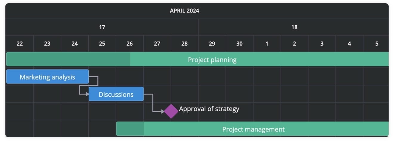
Want something more specific? You can define custom time units like half-years or agile sprints, and even stack multiple levels (e.g. Year → Quarter → Month) to enhance project visibility.
<script>   const scales = [   //Default time unit   { unit: "year", step: 1, format: "%Y" },    {      unit: "halfYear",      step: 1,      format: d => (d.getMonth() < 6 ? "H1" : "H2"),    },
  //Default time unit  { unit: "month", step: 1, format: "%M" },  ];</script>

<Gantt {scales} {tasks} />
Here is how multiple levels look like on the time scale:
👉 See demo
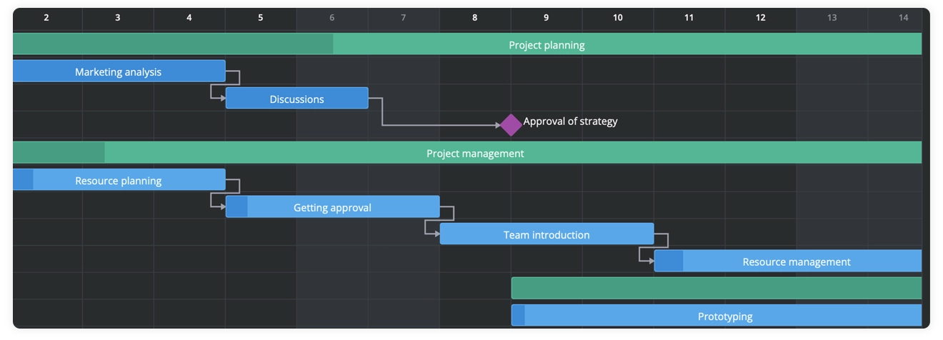
You can also improve timeline readability by highlighting weekends or off-hours with custom CSS classes:
<script>  //Defining logic and styling weekends with the built-in “wx-weekend” css class  function highlightTime(date, unit) {    const isWeekend = [0,6].includes(date.getDay());    if (unit === "day" && isWeekend) return "wx-weekend";    return "";  }</script>

<Gantt {scales} {tasks} {highlightTime}/>
This way the weekends are highlighted and are easily traceable on the scale:
👉 See demo
Custom Time Units and Rendering
Beyond scales, you can also control how time is measured and displayed in SVAR Svelte Gantt.
durationUnit defines the unit for task duration. By default, it’s days – but switching to hour gives you more granular scheduling (great for sprints or short-term tasks):
<Gantt {tasks} durationUnit="hour" />👉 See demo
lengthUnit controls the visual representation of the task duration. This property defines the minimal unit in which a task length is rendered on the timeline. Choose from minute, hour, day, week, month, quarter, or year. Here’s an example of rendering tasks in weekly chunks:
<Gantt {tasks} lengthUnit="week" />👉 See demo
Task Tree Configuration
SVAR Svelte Gantt comes with a built-in Task Tree that shows task information in four default columns: “Task name”, “Start date”, “Duration”, and the ”+” column for adding new tasks. But you’re not stuck with the defaults – modifying the grid is intuitive and flexible.
Adding Extra Columns
SVAR Svelte Gantt provides a default array of columns that can be reused, so you don’t need to configure everything from scratch, but can simply add a new column. Specify custom data columns by extending the columns array and referencing their id values in your task objects:
<script>  import {defaultColumns} from "@svar-ui/svelte-gantt";
  const columns = [    ...defaultColumns,    { id: "holder", header: "Holder", width: 90, align: "center" },    //other columns  ];
  const tasks = [   {    id: 1,    start: new Date(2022, 3, 4),    end: new Date(2023, 3, 4),    progress: 20,    parent: 1,    type: "task",    holder: "Nick",   },  //other tasks];
</script>
<Gantt {tasks} {columns} />
Removing Columns
If you’d like a clean timeline without the Task Tree, you can turn off the grid by assigning false
the columns property:
<Gantt {tasks} columns={false} />Hiding/Showing Columns with Context Menu
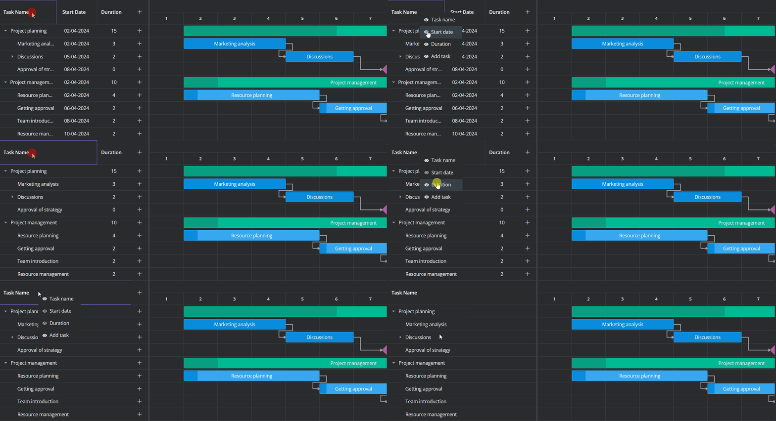
For role-based UIs or personalized dashboards, SVAR Svelte Gantt offers built-in control over column visibility. By wrapping your chart with the HeaderMenu component you can activate a context menu on the grid header. From there, users can interactively toggle columns on and off.
<script>let api = $state();</script>

<HeaderMenu {api} {columns}>  <Gantt      bind:this={api}      tasks={tasks}      links={links}      scales={scales}  /></HeaderMenu>
You can now show/hide columns using the context menu in the header:
👉 See demo
Custom HTML
Need to display avatars, status badges, or icons directly inside your task tree? SVAR Svelte Gantt makes it easy to insert custom HTML into column cells using your own Svelte components.
Simply create a reusable component – like an Avatar – and assign it to the cell property within the column configuration:
//the Avatar component<script>  let { row } = $props();

  const url = "https://svar.dev/demos/grid/assets/avatars/";  const user = $derived(users.find(u => u.id == row.assigned));  const avatar = $derived(   user ? `${url}${user.label.replace(" ", "_")}.png` : ""  );</script>

<div class="container">  <div class="avatar">   {#if avatar}    <div class="user-avatar">      <img class="user-photo" alt="" src={avatar} />    </div>   {/if}  </div>  <div>{user?.label ?? ""}</div></div>

<style>/* Add your custom styles here */</style>
import Avatar from "../custom/Avatar.svelte";const columns = [ { id: "text", header: "Task name", width: 250 }, { id: "assigned", header: "Assigned", width: 150, cell: Avatar }, { id: "start", header: "Start Date", width: 110 },];Adding avatars makes it much easier to quickly see who’s assigned to each task.
👉 See demo
In-cell Editing
By default, SVAR Svelte Gantt displays Task Tree cells in read-only mode. But when your workflow requires live updates of the tasks, you can easily switch to in-cell editing.
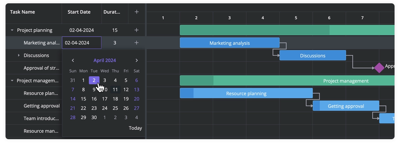
For instance, use a text editor for columns like “Task Name” and “Duration”, or integrate a datepicker for “Start/End Date”. To activate this functionality, simply set the editor property in the column you want to make interactive:
const columns = [//other columns { id: "start", header: "Start date", width: 200, align: "center", sort: true, editor: "datepicker", }, ];All changes made in the task grid are immediately updated on the chart. Here is how in-cell datepicker looks like:
👉 See demo
Tasks: Custom Types, Styling & Behavior
SVAR Svelte Gantt offers three built-in task types: Task, Milestone, and Summary. Need more? Just extend the taskTypes array with your own custom types:
  const taskTypes = [    // Default task types    { id: "task", label: "Task" },    { id: "summary", label: "Summary task" },    { id: "milestone", label: "Milestone" },

    // Custom task types    { id: "urgent", label: "Urgent" },    { id: "narrow", label: "Narrow" },];
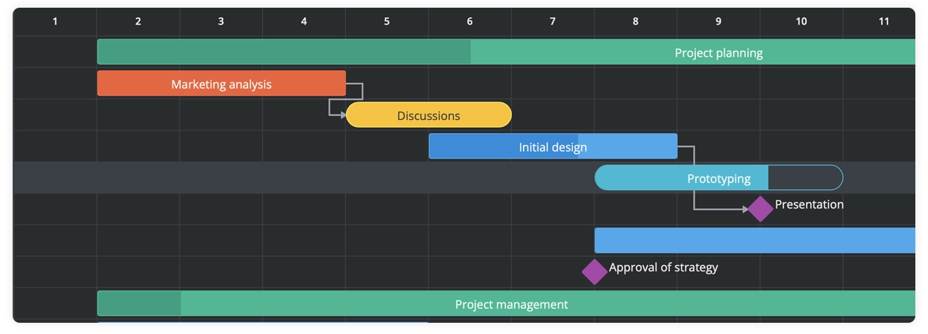
Once you’ve defined your custom task types, it’s time to give them a visual identity. SVAR Svelte Gantt makes this easy: just target each task type id using CSS. Let’s say we’ve added an “urgent” task type to highlight high-priority items. Here’s how you can style it with red color:
<script>  const taskTypes = [    // Custom task type    { id: "urgent", label: "Urgent" },  ];</script>

<style>    .demo > :global(.wx-gantt .wx-bar.wx-task.urgent) {        background-color: #f49a82;        border: 1px solid #f45e36;    }    .demo > :global(.wx-gantt .wx-bar.wx-task.urgent .wx-progress-percent) {        background-color: #f45e36;    }</style>
You can freely change the color, form, and entire look of the task bars with CSS styling:
👉 See demo
Interactive Tooltips
Want to show task details on hover? SVAR Svelte Gantt supports interactive tooltips out of the box. To enable the default tooltip (which displays the task name), just wrap your Gantt with the Tooltip component and pass in the api object:
<script>  let api = $state();</script>

<Tooltip {api}>    <Gantt        tasks={tasks}        links={links}        scales={scales}        bind:this={api}    /></Tooltip>
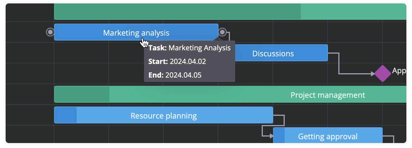
SVAR Svelte Gantt lets you fully customize tooltip content and styling to match your project’s design and logic. Just create a Svelte template with your desired layout, then pass its name to the content attribute of the Tooltip component:
<script>  import MyTooltipContent from "../custom/MyTooltipContent.svelte";  let api = $state();</script>

<Tooltip {api} content={MyTooltipContent}>    <Gantt        tasks={tasks}        links={links}        scales={scales}        bind:this={api}    /></Tooltip>
And display any additional details of the tasks right on the chart:
👉 See demo
Personalized Task Edit Forms
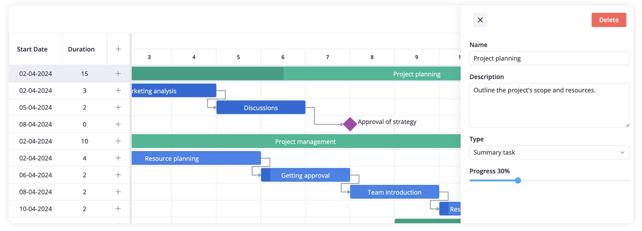
To let users edit tasks, you can use SVAR Svelte Editor, which integrates seamlessly with the Gantt interface. To add the edit form, import the Editor component and pass the api reference to both Gantt and Editor:
<script>  let api = $state();</script>

<Gantt bind:this={api} {tasks} /><Editor {api} />
This is how the editor looks as a sidebar, but you can also integrate it as a popup modal:
Custom Fields
You can configure fields of the task edit form by using supported input types: text, textarea, date, slider, select, counter and links. To configure the editor, populate the items array with the desired fields, and then pass your custom configuration to the Editor component.
<script>  const items = [   {    key: "text",    comp: "text",    label: "Name",    config: {      placeholder: "Add task name"    },  },];
let api = $state();
</script>
<Gantt bind:this={api} {tasks} /><Editor {api} {items} />
SVAR Svelte Gantt lets you tailor the task editor by modifying its default fields. Just update the defaultEditorItems array to match your needs – for example, to remove the “Description” field:
const items = defaultEditorItems.filter(item => item.key !== "details");Custom Edit Form
If you want to take customization even further, SVAR Svelte Gantt lets you swap out the default editor with your own custom form component. You can check this guide for the implementation details.
Toolbar & Context Menu Setup
Configuring the Toolbar
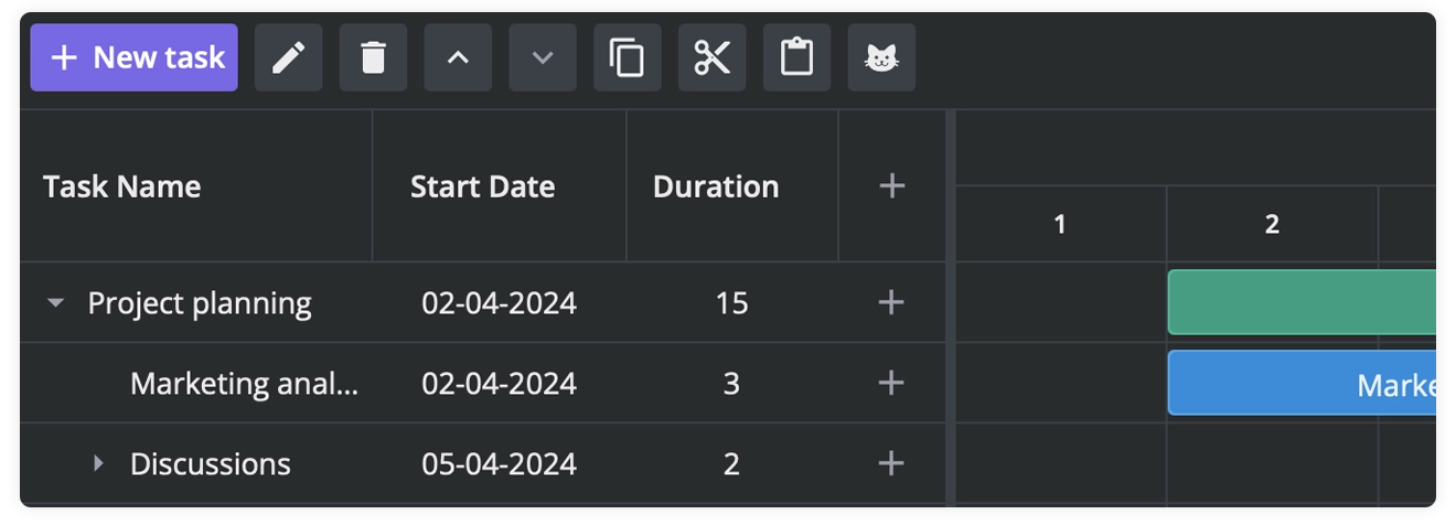
Both the toolbar and menu provide a default set of buttons/options, which can be replaced by custom configurations. To avoid starting from scratch, you can modify ContextMenu using getMenuOptions helper. To customize the Toolbar, use the getToolbarButtons helper to get the default array.
Here is how you can add your custom buttons to the toolbar: modify the items array to match your project’s requirements and then pass it to the Toolbar component. To obtain the full toolbar configuration, including conditional items, use getToolbarButtons().
<script>import { getData } from "../data";import { Gantt, Toolbar, getToolbarButtons } from "@svar-ui/svelte-gantt";
let api = $state();const data = getData();
//remove indentation buttonsconst items = getToolbarButtons().filter(b => {return b.id?.indexOf("indent") === -1;});
</script>
<Toolbar {api} {items} /><Gantt bind:this={api} tasks={data.tasks} />
You can choose which buttons to display in the toolbar, making your Gantt chart more convenient for end users.
👉 See demo
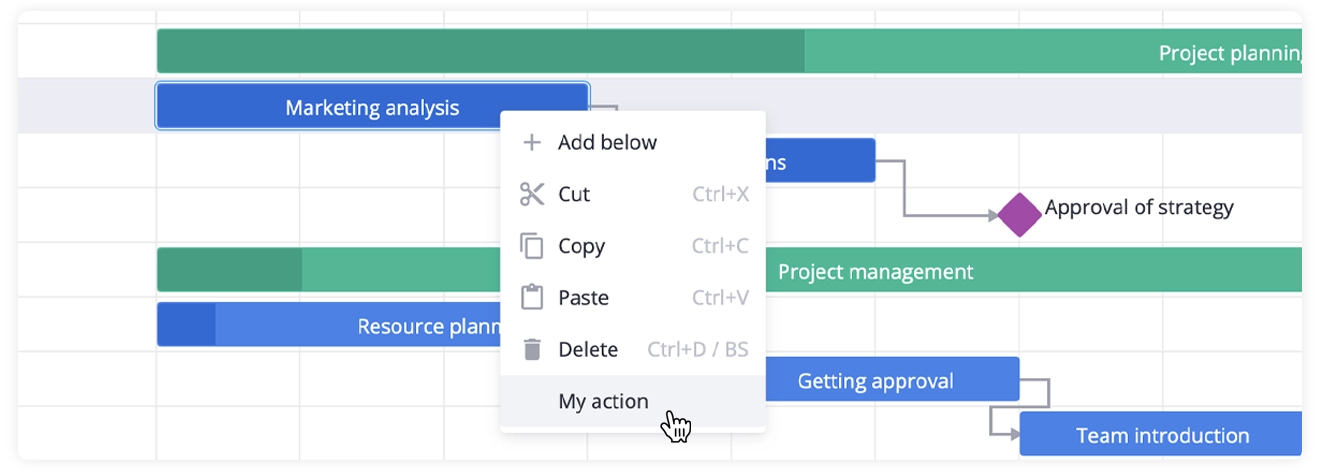
In the case of customizing the context menu, you need to modify the options array and pass it to the ContextMenu component:
<script>import { getData } from "../data";import { Gantt, getMenuOptions } from "@svar-ui/svelte-gantt";
let api = $state();
const data = getData();
const options = [...getMenuOptions,{id: "add-task",text: "Add",icon: "wxi-plus",data: [{ id: "add-task:child", text: "Child task" }],},//other options];</script>

<ContextMenu {api} {options} ><Ganttbind:this={api}tasks={tasks}scales={scales} /></ContextMenu>
This is how the context menu looks like:
👉 See demo
Advanced CSS Theming
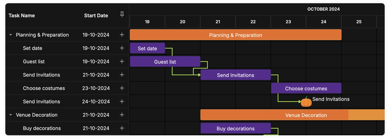
SVAR Svelte Gantt comes with two preconfigured themes – Willow for light mode and WillowDark for dark mode. To apply a built-in theme, simply import it and wrap your Gantt component with the theme wrapper:
<Willow> <Gantt tasks={tasks} /></Willow>In addition to its pre-built themes, SVAR Svelte Gantt supports theme customization. Since SVAR uses CSS variables to define its visual styles – such as colors, borders, and fonts – you can override these variables to match your design system.
To do this, apply a custom CSS class to the container that wraps your Gantt chart, and redefine the relevant CSS variables inside the class.
<WillowDark><!--Applying a custom CSS class to the container--><div class="demo" style="padding: 20px;">

        <Gantt        tasks={tasks}        links={links}        scales={scales} />
 </div></WillowDark>

<style>/*Overriding default CSS variables inside a custom class*/    .demo {        --wx-gantt-border: 1px solid #a8ae69;        --wx-gantt-form-header-border: solid;        --wx-gantt-icon-color: #9d95bc;        --wx-gantt-task-color: #9d95bc;    }</style>
For a deeper dive into full theme customization, check out our blog article: “Creating a Halloween-Themed Svelte Gantt Chart with SVAR Gantt”.
👉 See demo
Wrapping Up
In this guide, we intended to show that SVAR Svelte Gantt is a highly flexible solution packed with customization options to help you tailor it precisely to your project’s unique requirements. The techniques we explored empower you to move beyond default settings and design a Gantt experience that works your way.
We’ve provided demos, code snippets, and practical examples of the most common use cases to help you get started. Now it’s your turn: experiment, extend, and make SVAR Svelte Gantt truly your own! Check out the GitHub repository for the source code and to share your feedback and love ⭐


