

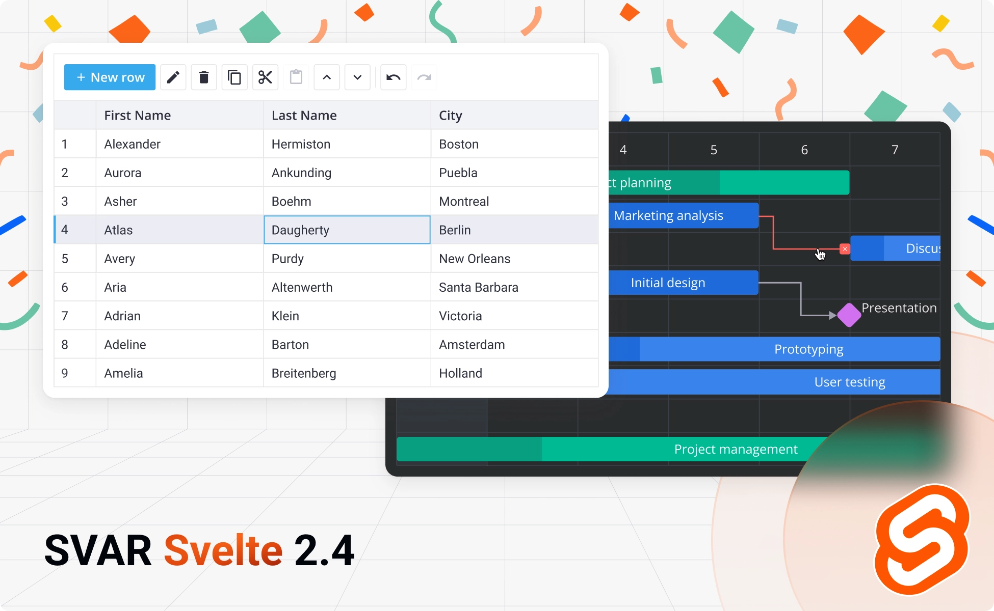
Together with the release of SVAR Svelte Gantt 2.4 and its new PRO Edition, we’re excited to announce SVAR Svelte v2.4, a comprehensive update to our open-source Svelte component library.
This version focuses on performance refinements, more predictable behavior across controls, and small but useful additions you’ve been asking for.
Installation
You can install the update via npm:
npm install @svar-ui/svelte-corenpm install @svar-ui/svelte-gridnpm install @svar-ui/svelte-ganttRead on to discover the key enhancements introduced across SVAR Svelte components.
What’s New in Core
The Core library got a number of small but impactful updates that improve consistency and add more control over UI elements.
Disabled Items in Menu
The Menu component now supports a disabled property for individual items, letting you show unavailable options instead of hiding them. This improves UX by revealing the full menu structure while clearly indicating which actions aren’t currently accessible.
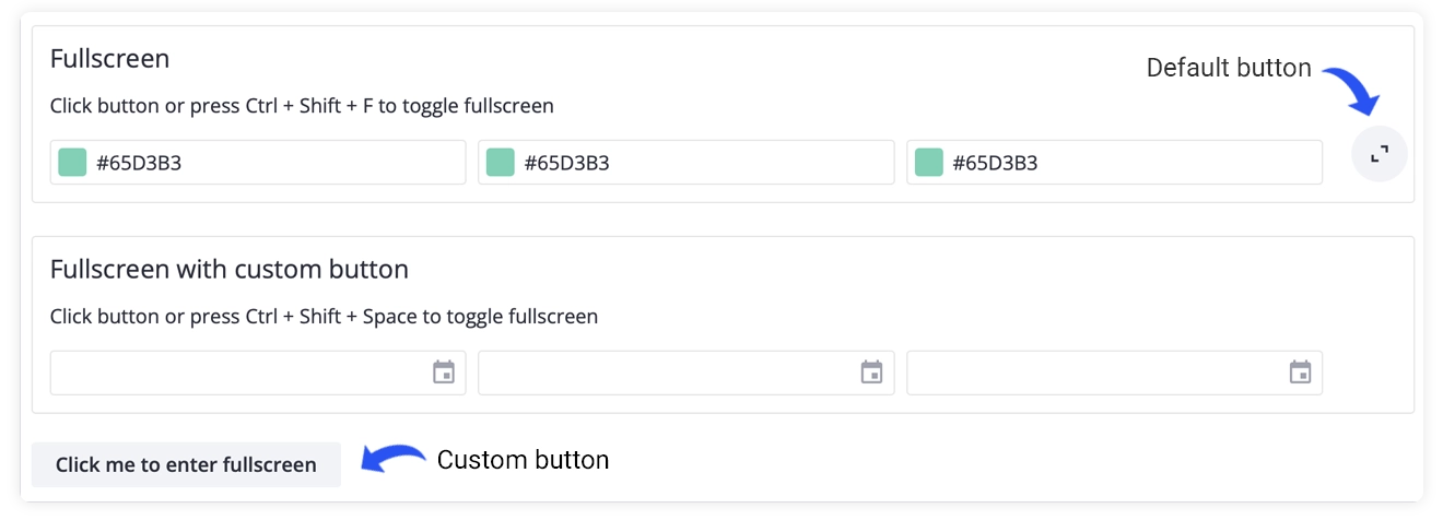
New Fullscreen Component
Version 2.4 introduces a new Fullscreen component that can wrap any content and switch it into fullscreen mode on demand. It includes a built-in fullscreen button and lets you define your own triggers: custom buttons or hotkeys.
New Syntax for Field Label
The Field component now handles label–input association with a cleaner and more intuitive syntax. You no longer need to pass an id through a snippet. Simply wrap any SVAR input control in a <Field label="…"/> block, and the component will automatically link the label to the first inner input. This keeps your markup cleaner while preserving the same behavior.
Improved Popup Positioning
In earlier versions, Popups placed inside relatively positioned containers could appear in the wrong place. Version 2.4 updates the positioning logic so the Popup recalculates its placement on mount, ensuring correct alignment whether it’s used locally or rendered through a Portal.
The update also introduces more flexible alignment options for the at property, making it easier to position Popups and Dropdown menus precisely. You can anchor them to specific sides or corners of the parent element, or use start/center/end alignment for more natural behavior across different layouts.
👉 See the full changelog in the docs.
What’s New in DataGrid
This release expands the grid’s editing and navigation capabilities and gives more flexibility to sorting feature.
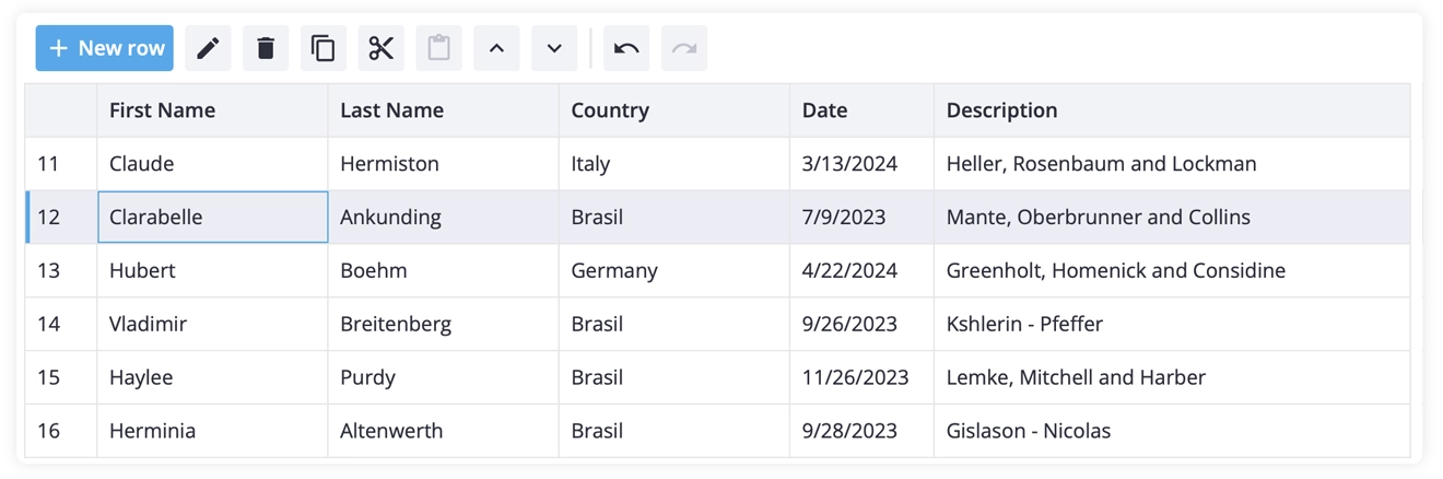
Built-in Toolbar
You can now add a toolbar above the DataGrid to streamline common actions. By default, it provides standard operations, some of them appear only when a row is selected:
- add row
- delete selected row
- clone selected row
- move up / move down
- edit row
- undo / redo
The toolbar is fully customizable, so you can add your own buttons and logic when needed.
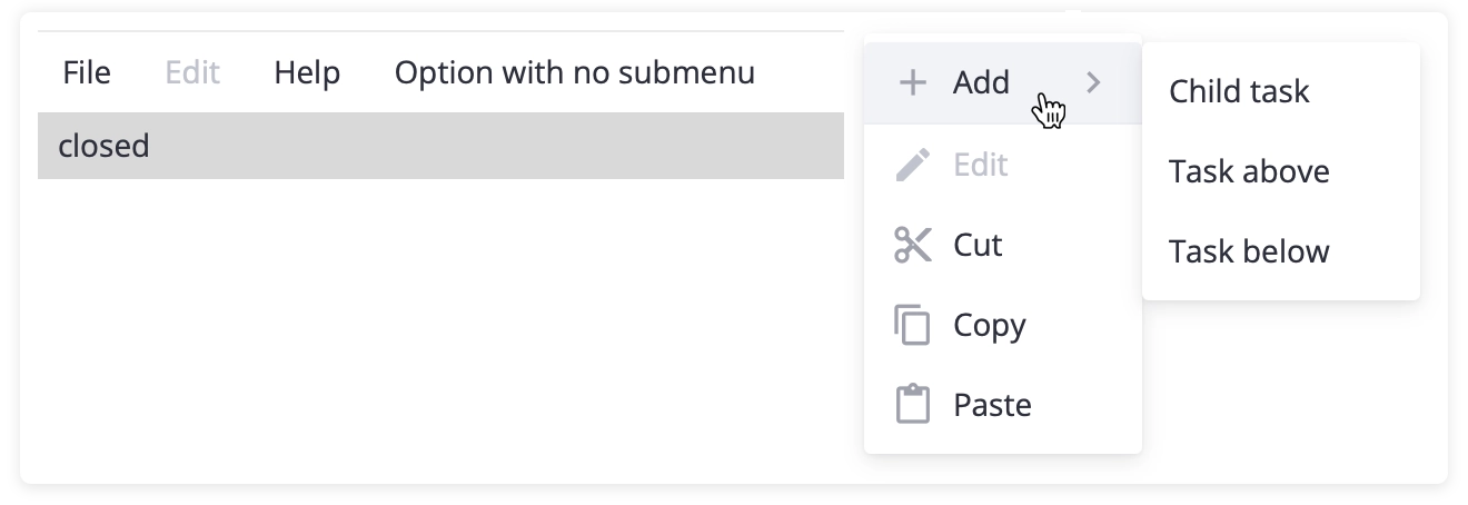
More Actions in Context Menu
While working on the built-in toolbar, we also added new context-menu actions: Copy, Cut, Paste, Move Up, and Move Down. This gives you a richer set of quick operations out of the box and makes the menu more useful in editable or workflow-heavy grids.
Custom Row Height
SVAR Svelte DataGrid now supports custom row heights, giving you full control over individual rows. You can define a specific height directly in the data item using the rowHeight property, which takes priority over the global sizes.rowHeight setting.

This makes it easy to highlight certain rows or place custom content without relying on the default row height.
Custom Sorting
We’ve also added fully customizable sorting, giving you more control over how data is ordered in the data grid. You can define custom comparators at the column level or apply your own sorting function directly to the underlying data through the sort-rows API.
The update also improves multi-column sorting, allowing you to insert a sorting rule at a specific position rather than simply appending it.
👉 See the full changelog in the docs.
What’s New in Gantt Chart
The Gantt update focuses on usability and localization, making scheduling more intuitive and better aligned with your app’s locale.
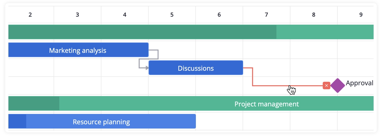
Remove Dependencies Directly on the Chart
You can now remove task dependencies right from the timeline. Clicking a dependency line highlights it and shows a “remove” icon. This makes it much easier to manage relationships between tasks without opening the task editor.
Locale-Based Scales Formatting
SVAR Svelte Gantt component now uses SVAR’s own locale-aware formatting for scale labels instead of relying on date-fns. As a result, the labels on the timeline now automatically adapt when the locale changes, keeping them consistent with the rest of the library.
You can now define custom scale formats using the same syntax as other SVAR components (e.g., format: "%M%Y" for monthly scales). The component also respects your locale’s weekStart value instead of using hardcoded settings.
👉 See the full changelog in the docs.
Summing Up
SVAR Svelte v2.4 adds a set of small but meaningful improvements that streamline development and make the components more predictable, flexible, and aligned across the library.
Get started with SVAR Svelte v2.4:
🛠️ View on GitHub
📚 Read the docs
✨ Try the demos
Whether you’re building with Core, DataGrid, or Gantt, v2.4 brings more flexibility and refinement to your Svelte projects.