

In this tutorial, we’ll create a Svelte 5 Gantt chart using the SVAR Svelte Gantt, a free, open-source Gantt chart component. By the end, you’ll have a demo that includes the core features expected from a practical project-management tool: summary tasks, task dependencies, a custom assignee column, weekend shading, hover tooltips, an inline editor, and a toolbar with bulk actions.
The goal isn’t just code that runs. When we’re done, you’ll understand why each part is shaped the way it is – how the data model is organized, how the API binding works, and how the columns and editor fields interact. This foundation makes it much easier to adapt the solution to your own project later on.
What We’ll Build
In this tutorial, we’ll put together a Svelte Gantt chart that includes the core features of a project scheduling interface.
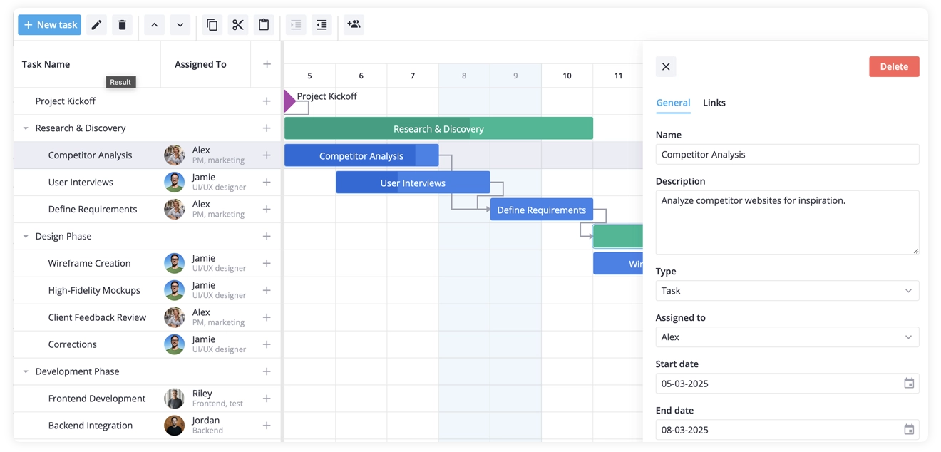
Here is what our Gantt chart will include:
- Tasks, milestones, and summary rows
- End-to-start dependency links
- A custom “Assigned to” column with avatars
- A built-in “add task” action column
- A custom tooltip on hover
- An inline editor with a custom assignee select field
- A toolbar with default user actions plus a bulk “assign to” dropdown
- Default values for new tasks
- Weekend column shading
Gantt setup is easy and lives in one file, and only custom tooltip content and the custom grid cell are separate components.
Before We Start
If you don’t already have a Svelte 5 project set up, create one with Vite:
npm create vite@latest my-gantt -- --template sveltecd my-ganttnpm installNext, install SVAR Svelte Gantt component along with its companion package:
npm install @svar-ui/svelte-gantt @svar-ui/svelte-coreThe @svar-ui/svelte-gantt package provides the chart itself, while @svar-ui/svelte-core includes shared UI widgets. We’ll use the RichSelect component from this package later when configuring the inline editor.
Step 1: Define the Data
To begin, create three arrays that describe the project structure and save them in src/data.js:
export const tasks = [  {    id: 1,    start: new Date(2025, 2, 5),    text: "Project Kickoff",    type: "milestone",    parent: 0,  },
  {    id: 2,    text: "Research & Discovery",    type: "summary",    parent: 0,    open: true,  },  {    id: 21,    start: new Date(2025, 2, 5),    end: new Date(2025, 2, 8),    text: "Competitor Analysis",    parent: 2,    type: "task",    progress: 85,    assigned: 1,  },  {    id: 22,    start: new Date(2025, 2, 6),    end: new Date(2025, 2, 9),    text: "User Interviews",    parent: 2,    type: "task",    progress: 40,    assigned: 2,  },  {    id: 23,    start: new Date(2025, 2, 9),    end: new Date(2025, 2, 11),    text: "Define Requirements",    parent: 2,    type: "task",    assigned: 1,  },
  { id: 3, text: "Design Phase", type: "summary", parent: 0, open: true },  {    id: 31,    start: new Date(2025, 2, 11),    end: new Date(2025, 2, 14),    text: "Wireframe Creation",    parent: 3,    type: "task",    assigned: 2,  },  {    id: 32,    start: new Date(2025, 2, 14),    end: new Date(2025, 2, 17),    text: "High-Fidelity Mockups",    parent: 3,    type: "task",    assigned: 2,  },];
export const links = [  { id: 1, source: 1, target: 2, type: "e2s" },  { id: 2, source: 21, target: 23, type: "e2s" },  { id: 3, source: 22, target: 23, type: "e2s" },  { id: 4, source: 31, target: 32, type: "e2s" },];
export const teamMembers = [  { id: 1, label: "Alex", role: "PM", src: "./assets/pm.jpg" },  { id: 2, label: "Jamie", role: "Designer", src: "./assets/designer.jpg" },  { id: 3, label: "Riley", role: "Frontend", src: "./assets/frontend.jpg" },];
Why the data looks this way
Several details in this snippet determine how the Gantt chart behaves later on:
parent: 0puts a task at the root. Set it to another task’sidto nest under it.- Summary rows usually omit
startandend. Gantt computes them from the children (earliest start, latest end). If you set both yourself, that overrides the initial computation — so it’s best to leave them out. - Links are a separate array. Tasks don’t know about their dependencies; the Gantt joins them by
id.type: "e2s"means end-to-start – the target task starts when the source ends. It’s the most common dependency type.
Step 2: Render the Basic Gantt
Create src/App.svelte:
<script>  import { Gantt, Willow } from "@svar-ui/svelte-gantt";  import { tasks, links } from "./data.js";</script>
<Willow>  <div class="gantt-container">    <Gantt {tasks} {links} />  </div></Willow>
<style>  :global(html, body) {    height: 100%;    margin: 0;  }  .gantt-container {    height: 100vh;  }</style>
Run npm run dev. You’ll see the timeline with bars, milestone diamonds, summary rows, and dependency arrows.
Why the container needs an explicit height
This is the single most common stumble for any embedded timeline. Svelte components don’t reserve space – the parent has to give them some. Without height: 100vh (or a fixed pixel value) the Gantt component renders into zero pixels and looks broken. It’s not a Gantt-specific quirk; the same applies to any virtualized scrolling component.
Using the Willow Theme
Willow is the default light theme of SVAR Svelte Gantt. Without it, the Gantt renders unstyled, which is useful only if you plan to create a custom theme.
Step 3: Configure the Columns
By default the left grid shows just a task-name column. In this step, we’ll define three columns: the task name, an “Assigned to” column with assignee avatars, and a small action column with a built-in ”+” button.
First, create the custom cell component for “Assigned to” column and save it as src/UserCell.svelte:
<script>  import { teamMembers } from "./data.js";  let { row, column } = $props();  const member = $derived(teamMembers.find((m) => m.id === row.assigned));</script>
<div class="container">  {#if member}    <img class="avatar" src={member.src} alt="" />    <div class="info">      <span class="name">{member.label}</span>      <span class="role">{member.role}</span>    </div>  {/if}</div>
<style>  .container {    display: flex;    align-items: center;    gap: 12px;  }  .avatar {    width: 32px;    height: 32px;    border-radius: 50%;    object-fit: cover;  }  .info {    display: flex;    flex-direction: column;  }  .name {    line-height: 16px;  }  .role {    font-size: 12px;    color: var(--wx-color-font-alt);  }</style>
Then define the columns in App.svelte:
<script>  import { Gantt, Willow } from "@svar-ui/svelte-gantt";  import { tasks, links, teamMembers } from "./data.js";  import UserCell from "./UserCell.svelte";
  const columns = [    { id: "text", header: "Task name", width: 230 },    {      id: "assigned",      header: "Assigned to",      width: 140,      align: "center",      cell: UserCell,      options: teamMembers,    },    { id: "add-task", header: "", width: 50, align: "center" },  ];</script>
<Willow>  <div class="gantt-container">    <Gantt {tasks} {links} {columns} />  </div></Willow>
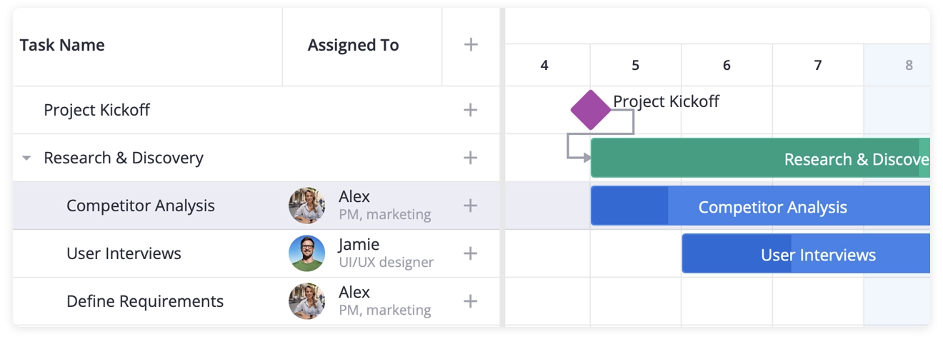
Reload the page. The grid now has three columns: the task name, the assignee with avatar, and a ”+” button on each row.
How the column configuration works
Three pieces of columns decide the behavior:
cell: UserCellreplaces the default text rendering. SVAR Svelte Gantt passes the current row into the component as arowprop. Conceptually, it works like a typed slot.options: teamMembersisn’t just decoration. The built-in editor and other components read it to know what choices a cell can have. We’ll lean on this in Step 5 when setting up an editor.id: "add-task"is a reserved column id. The Gantt renders a ”+” button automatically and wires it to the add-task action. You don’t need to write a handler.
Step 4: A Custom Tooltip on Hover
The default tooltip on a task bar shows only the task name. Here we’ll create a richer tooltip that includes dates and the assignee and save it as src/CustomTooltip.svelte:
<script>  import { teamMembers } from "./data.js";  let { data } = $props();  const task = $derived(data?.task);</script>
{#if task}  <div class="tooltip">    <div><strong>{task.text}</strong></div>    {#if task.start}<div>Start: {task.start.toLocaleDateString()}</div>{/if}    {#if task.end}<div>End: {task.end.toLocaleDateString()}</div>{/if}    {#if task.assigned}      <div>        Assigned: {teamMembers.find((m) => m.id === task.assigned)?.label}      </div>    {/if}  </div>{/if}
<style>  .tooltip {    background: #2b343b;    color: #fff;    padding: 8px 12px;    border-radius: 4px;    width: 240px;  }</style>
Now we’ll wire it up in App.svelte:
<script>  import { Gantt, Willow, Tooltip } from "@svar-ui/svelte-gantt";  import CustomTooltip from "./CustomTooltip.svelte";  // ... other imports
  let api = $state();</script>
<Willow>  <div class="gantt-container">    <Tooltip {api} content={CustomTooltip}>      <Gantt {tasks} {links} {columns} bind:this={api} />    </Tooltip>  </div></Willow>
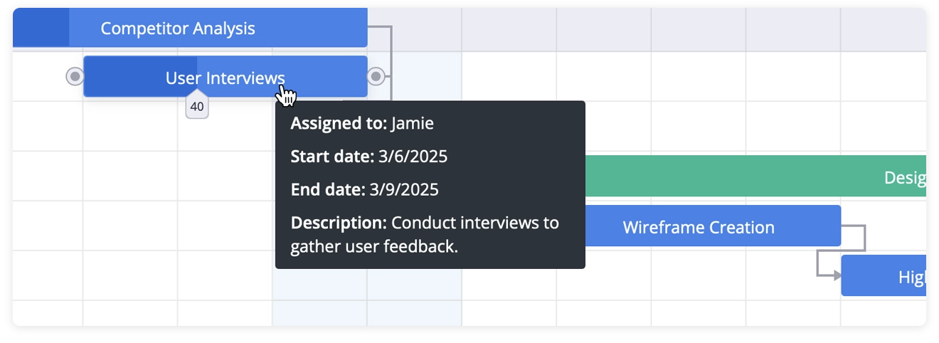
Hover over any task bar – you’ll see a tooltip with the name, dates, and assignee.
Why Tooltip wraps Gantt – and why we need bind:this
The Tooltip listens for hover events anywhere inside its subtree and asks the Gantt’s API which task sits under the cursor. That’s why it wraps the chart and why it needs a reference to Gantt’s imperative API.
bind:this={api} exposes that API – methods like getState, exec, intercept, and on. We’ll use these same methods in Steps 5 and Step 6 for the editor, the toolbar, and the bulk-assignment action. One API object, several consumers.
The data prop on CustomTooltip is the task object being hovered – same shape as items in your tasks array.
Step 5: An Inline Editor with a Custom Assignee Field
SVAR Svelte Gantt ships with a side-panel task editor, powered by SVAR Svelte Editor. By default, the editor comes with the usual fields (text, dates, type, progress). We want to add an “Assigned to” field that uses RichSelect from @svar-ui/svelte-core to show team members with names and roles.
First, register RichSelect so the editor can refer to it by a name. This is a one-time call:
<script>  import {    Gantt,    Willow,    Tooltip,    Editor,    getEditorItems,    registerEditorItem,  } from "@svar-ui/svelte-gantt";  import { RichSelect } from "@svar-ui/svelte-core";
  registerEditorItem("select", RichSelect);</script>
Then take the default editor fields and add your custom one:
const fields = getEditorItems();fields.splice(3, 0, { key: "assigned", comp: "select", label: "Assigned to", options: teamMembers, config: { placeholder: "Select the team member" }, isHidden: (task) => task.type === "summary",});Add the editor inside the tooltip wrapper:
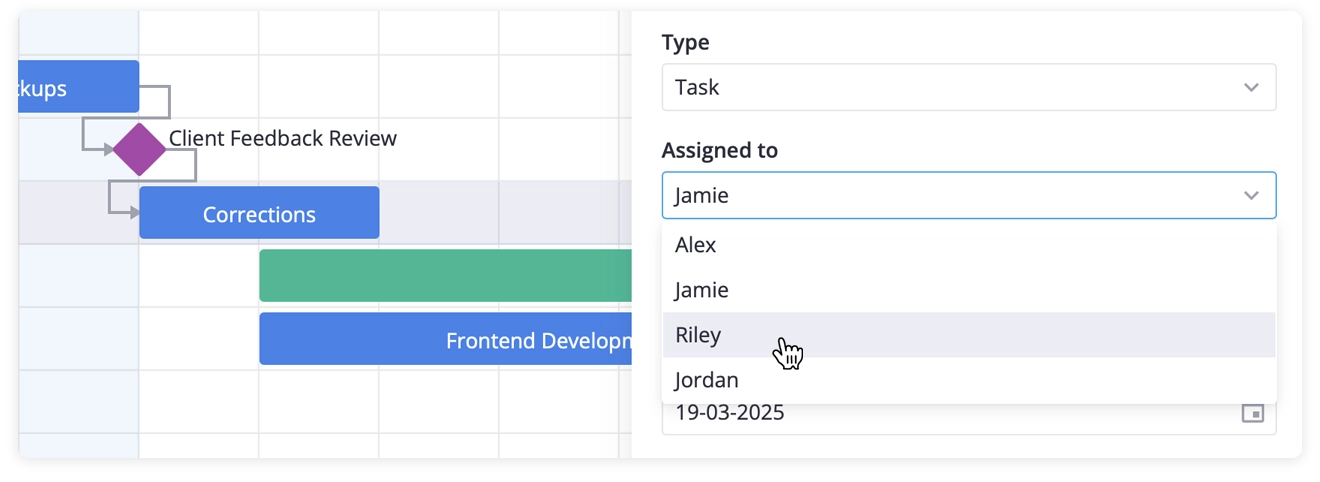
<Tooltip {api} content={CustomTooltip}> <Editor {api} items={fields} /> <Gantt {tasks} {links} {columns} bind:this={api} /></Tooltip>Now, if you click a task on the timeline, the right-side panel opens with all the default fields plus the new “Assigned to” selector.
Why we splice rather than replace
getEditorItems() returns a fresh array of the default field configs. You’re free to mutate it – splice, push, filter, reorder. We land the assignee field between the existing date and progress fields, which is where it reads most naturally.
comp: "select"is the name we just registered forRichSelect. The editor finds the component by that name and renders it.isHidden: task => task.type === "summary"hides the field when a summary row is selected – assignees don’t apply to phase rows. The function receives the currently-edited task. Use it for any conditional field visibility.
Step 6: A Toolbar with a Bulk-Assign Dropdown
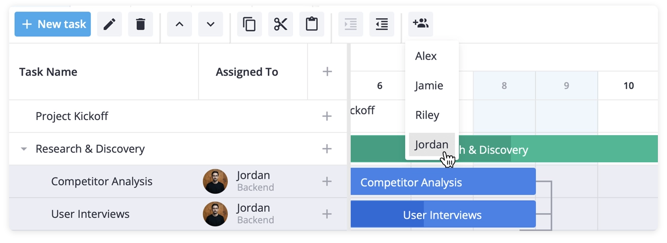
The toolbar above the chart gets the same treatment. We take the defaults, add a separator, then a dropdown that shows team members. Selecting a team member assigns that person to all currently selected tasks.
<script>  import {    Toolbar,    getToolbarButtons /* ...other imports... */,  } from "@svar-ui/svelte-gantt";
  function actionHandler(ev) {    const member = ev.id;    const { selected } = api.getState();    selected.forEach((id) => {      api.exec("update-task", { id, task: { assigned: member } });    });  }
  const buttons = getToolbarButtons().concat([    { comp: "separator" },    {      id: "assign",      icon: "wxi-assign",      collapsed: true,      layout: "column",      isHidden: (task) => task.type === "summary",      items: teamMembers.map((t) => ({        ...t,        comp: "item",        text: t.label,        handler: actionHandler,      })),    },  ]);</script>
Place the toolbar above the chart:
<Willow>  <div class="content">    <Toolbar {api} items={buttons} />    <div class="gantt-container">      <Tooltip {api} content={CustomTooltip}>        <Editor {api} items={fields} />        <Gantt {tasks} {links} {columns} bind:this={api} />      </Tooltip>    </div>  </div></Willow>
<style>  .content {    height: 100%;    display: flex;    flex-direction: column;  }  .gantt-container {    flex: 1;    min-height: 0;  }</style>
Select one or more tasks (Ctrl+click), open the assign dropdown, choose a team member. All selected tasks are updated at once.
How actionHandler works
Two API calls do the work:
api.getState()returns the live Gantt state. We pullselectedout of it – an array of currently selected task ids.api.exec("update-task", ...)triggers an update through the same code path a UI edit would. Listeners fire, the chart re-renders, the editor refreshes if it’s open. Don’t mutate the task array directly; always go throughexec.
Additional toolbar configuration:
menu: truewithcollapsed: truemakes the button a dropdown that collapses to an icon.itemsis the menu content.isHiddenon the button hides the whole dropdown when a summary row is the active task.- Nested
itemsarray is what turns the button into a dropdown. collapsed: truecollapses it down to just its icon, andlayout: "column"stacks the menu items vertically.
Step 7: Defaults for New Tasks
The action column gives the user a ”+” button. The default add-task payload has no assigned field – so the editor opens with the dropdown empty. The fix is an init callback that intercepts the action and adds the default:
<script>  // ... other code ...
  function init(api) {    api.intercept("add-task", (ev) => {      ev.task = { ...ev.task, assigned: "" };    });  }</script>
Pass it to the Gantt:
<Gantt {init} {tasks} {links} {columns} bind:this={api} />Why intercept and not on
The Gantt’s API exposes two related listeners:
interceptruns before the action is processed and can mutate the event payload – or cancel the action by returningfalse. Use it for defaults, validation, and guards.onruns after the action has completed. Use it for backend sync, undo history, telemetry – anything that reacts to a finished change.
We use intercept here because we want the new task to carry assigned: "" into the rest of the pipeline, not be patched after the fact.
Step 8: Weekend Shading and Cell Sizing
Two small cosmetic touches make the chart feel more user-friendly. First, weekend shading:
function highlightTime(date, unit) { if (unit === "day") { const day = date.getDay(); if (day === 0 || day === 6) return "wx-weekend"; } return "";}The function returns a CSS class for any given date. wx-weekend is built into the Willow theme. The Gantt calls highlightTime for every scale level (day, week, month), so checking unit === "day" keeps the highlight on the daily column only.
The default cell sizes are intentionally compact, so let’s give them a little more room:
<Gantt {init} {tasks} {links} {columns} cellWidth={80} cellHeight={42} {highlightTime} bind:this={api}/>If you reload the demo now, weekends are shaded, and the chart feels more comfortable with larger spacing.
Recap
In about eighty lines of App.svelte plus three small files (data.js, UserCell.svelte, CustomTooltip.svelte), we’ve built a Svelte Gantt chart with summaries, milestones, and dependency links.
We’ve configured grid columns including a custom assignee cell and a built-in action column, added a custom tooltip for task bars, extended a task editor with a RichSelect-based assignee field, and added a toolbar with default actions plus a bulk-assignment dropdown.
More importantly, you now understand the shape underneath:
- Tasks, summaries, milestones, and links – the data model
- The role of the
apireference and why every wrapper component needs it - How
cell,options,isHidden, andcompglue user data to the Gantt chart UI - The difference between
intercept(before) andon(after) on the API
This is a good starting point to adapt SVAR Svelte Gantt to your own project and build an interactive project timeline with a basic resource allocation. The demo uses the free version of the Gantt that can be found on GitHub. If you found this tutorial and SVAR Svelte Gantt useful, give it a star ⭐
What’s Next
Find more information about how to adjust SVAR Svelte Gantt to your needs in the docs and see a SvelteKit integration guide to help you embed the Gantt chart into a production app.
If you need advanced scheduling and planning features, the PRO Edition includes a resource planning out-of-the-box for team-capacity planning with reource load view, auto-scheduling, critical path, baselines, and more. Compare the editions and see the demos to learn more.