Introduction
In the era of complex solutions, the elegance of simplicity stands out. Today we proudly introduce our brand new component - SVAR DataGrid for Svelte framework. This new data table widget is a balance of richness and simplicity, all in one well-designed UI component.
If you want to try its functionality right away, follow the getting started guide, or read further to learn more about SVAR DataGrid, its features, design and configuration.
Fundamentals First
Going back to basics means laying a solid groundwork. SVAR DataGrid has all the fundamental features found in web-based data tables:
- inline text editing
- single and multiple row selection
- keyboard navigation
- context menu support
- localization
- sorting functionality
- resizable, fixed, and hidden columns
- export to CSV.
Expanded Capabilities
While DataGrid delivers core functionalities, it also has exceptional capabilities that enhance its usability, flexibility and performance. Some of them include:
Big data handling
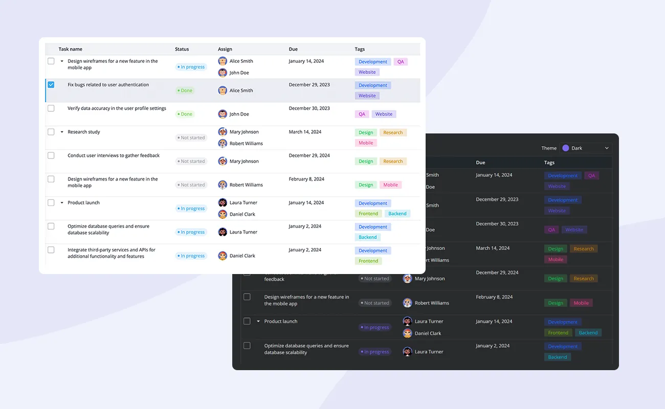
SVAR DataGrid is optimized to handle and render extremely large datasets without performance issues. Special rendering techniques only display the visible table data, minimizing memory usage. You can test performance on big data in DataGrid’s demos.
Speed and responsiveness
The DataGrid component demonstrates exceptional rendering and scrolling speed, showcasing its impressive performance within its category. It behaves like a regular HTML element, adjusting layout smoothly without custom code.
CSS variables and themes
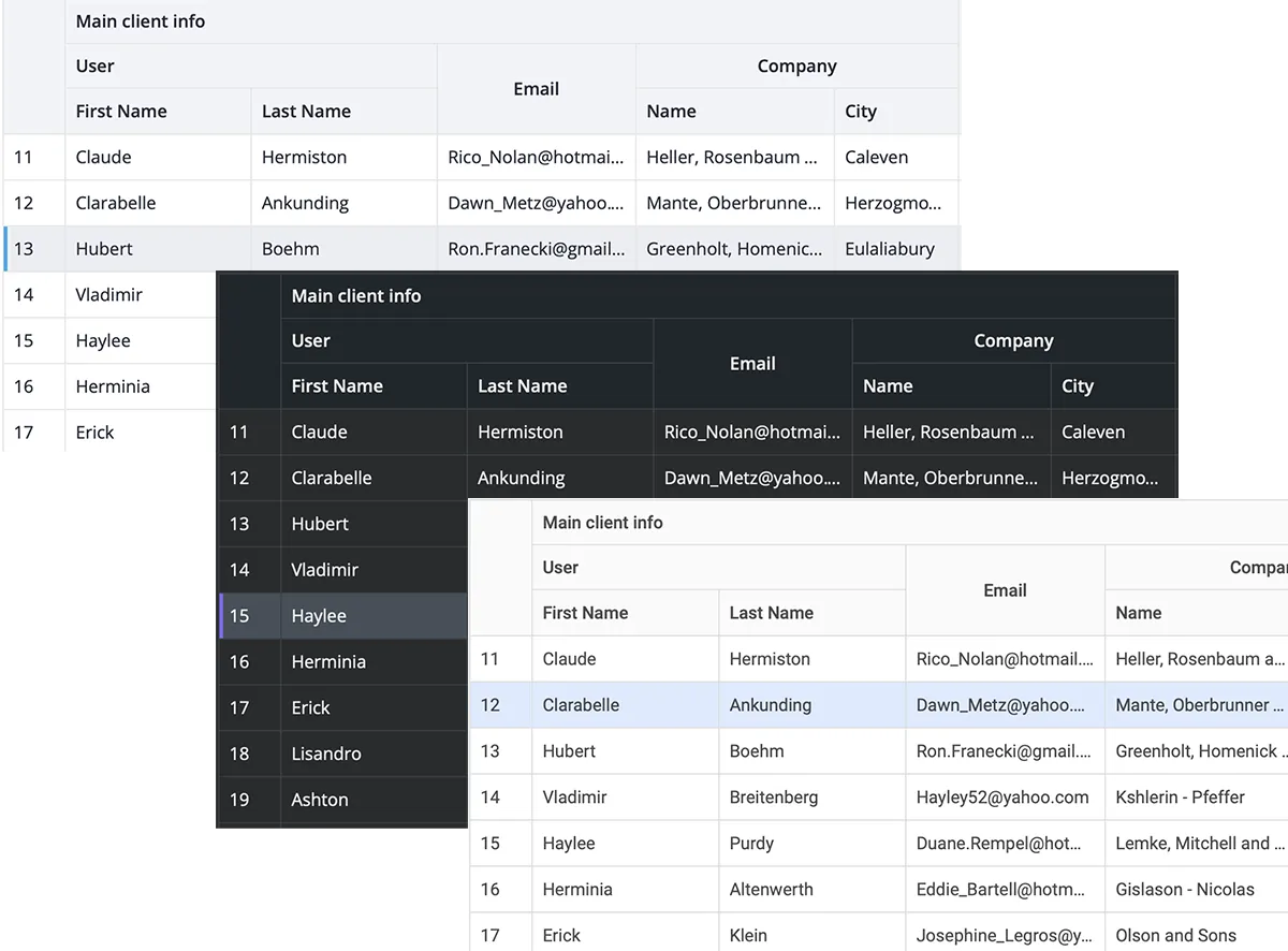
A wide range of CSS variables enable easy customization of colors, sizes, effects, and more. SVAR DataGrid also includes 3 built-in color themes that can be used to quickly change the look and feel: Material, Willow and Dark.

Multi-column sorting
DataGrid supports multi-column sorting by allowing any number of columns to be used for sorting simultaneously. The sort order precedence goes from the first column header clicked to the last.

Collapsible columns
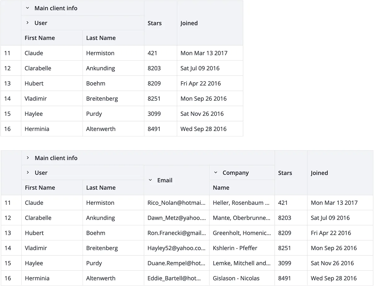
For tables with a lot of columns, there is an option to combine columns under a single header. Additionally, users can collapse some columns temporarily to hide the information that is not immediately relevant to their current task or analysis, thereby focusing on the most important information. The columns can be easily expanded again when needed.

TreeGrid view
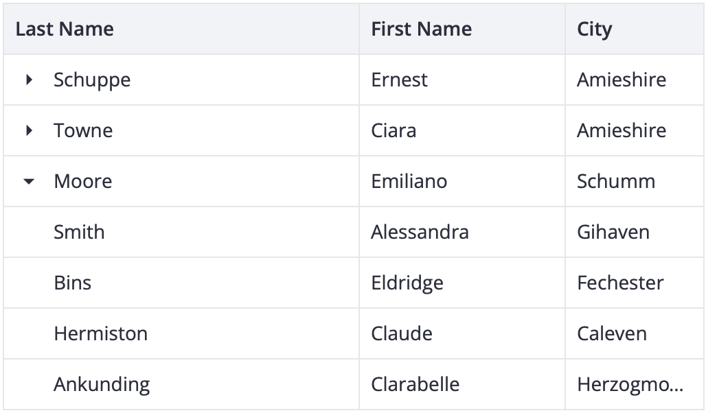
Even though DataGrid is not a full-fledged TreeGrid, it can be configured to display hierarchical, tree-like data with parent and child rows.

How to start
Just dive into our detailed Getting started guide to see how easy it is to add a data grid on a page and use all its powerful features.
You can also see the demos and explore the docs for further information on styling, configuring, and backend connection of the DataGrid component.
What’s next
This release marks a significant milestone for us as the first complex UI component in our SVAR collection. Now we are working on releasing the React version of DataGrid, so stay tuned and subscribe to early access now!


